Stay Connected With The Latest Posts

  • This field is for validation purposes and should be left unchanged.

Stay Connected With The Latest Posts

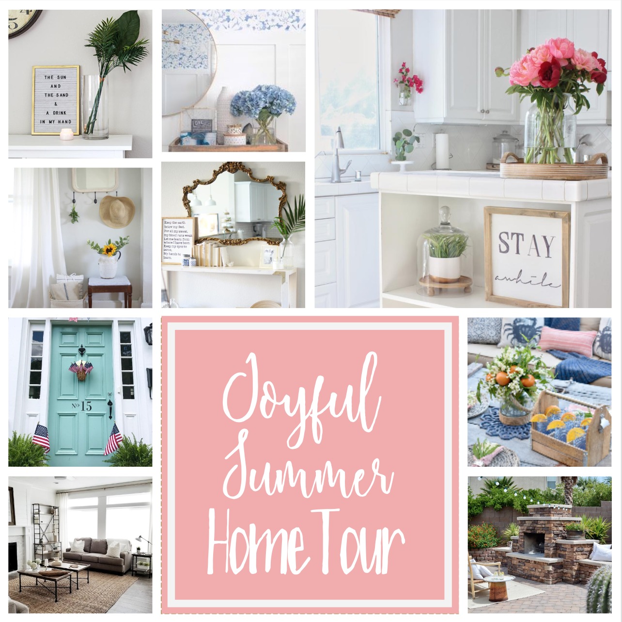
Joyful Summer Home Tour 2017

I am so happy to be a part of the Joyful Spring Home Tour this week. If you’re coming from Farm House on Boone or My Vintage Porch, welcome!  There are so many talented bloggers that I have teamed up with to bring you this tour. Their homes are gorgeous and you will just love having a peek at how they have styled their homes for the summer. Be sure to follow the schedule at the bottom of this post to see all the homes.
Summer is one of my favorite times of the year. It may sound crazy but I love having my kids home from school! There are no schedules or routines. Just fun days of spontaneous activities that we can do. No alarm clocks or rushing our the door. It is nice to just slow down and enjoy the day or whatever may come our way. We really enjoy spending time at all our local splash pads. The cities around us all have splash pads that the kids can play at for free. We usually take a bunch of snacks, water toys, and blankets or lawn chairs. We can easily spend the entire day camped out there playing.

I feel like this laid back summer vibe crosses over into my decor in my home for the summer. I like to keep it simple and clean (big surprise). My mantel has no garland or banners. When I first took down my Easter decor, it felt a little sparse and naked. I quickly got used to the simplicity and now I love it.  The coffee tables keep that neutral look with a few wood and white elements. I really think having a neutral canvas creates a calm atmosphere for a space. It is fun to add in my pops of color for holidays. However, I still love a simple neutral palette, when all that is gone.
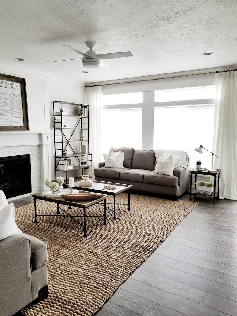
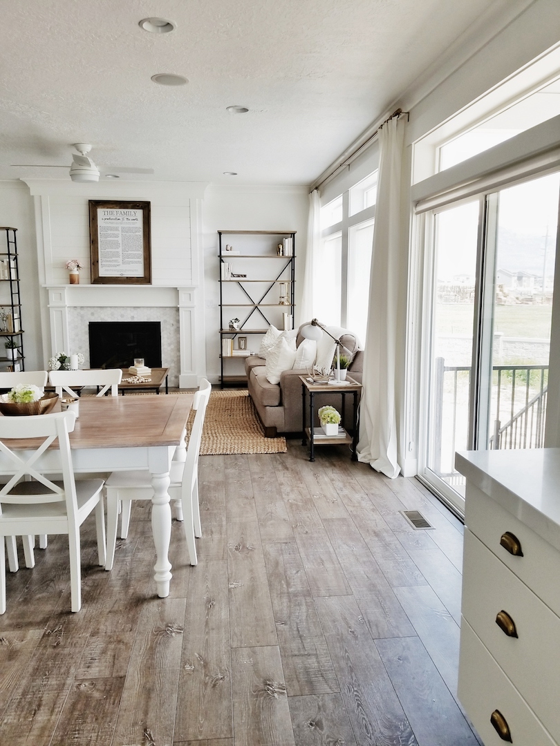
My dining table just has a small centerpiece. A brass bowl with some white hydrangeas. I don’t like to put anything too tall in the center of my table. It just gets in the way at dinner time. It makes it easy for the family to pull out a chair, start eating and share the day. We thought about doing built in shelves next to the fireplace when we moved into the house. I found these Ballard Design shelves instead. They were a great price and it is something we can take with us if we ever move.
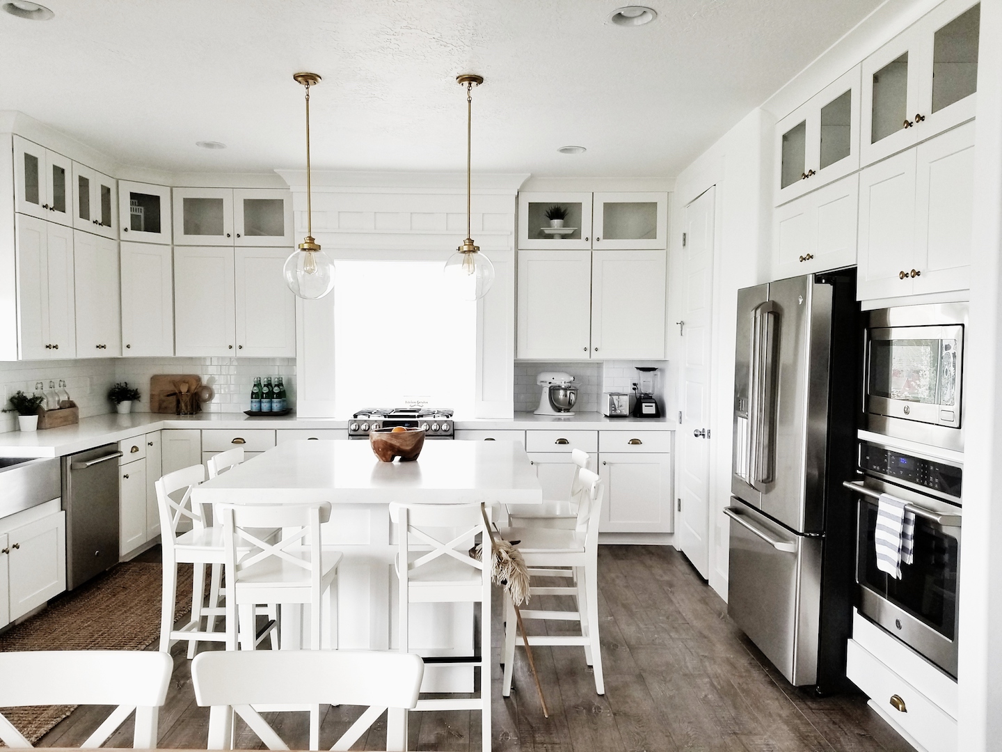
My kitchen is easily the room we spend the most time in. After school snacks (now summer snacks), all the meals we cook and just talking. It is the gathering spot in our home. My daughter left her stick horse on the bar stool. I was going to move it out of the picture. I decided to leave it because it reminds me of the sweet moments we share as a family in this room. It was just fitting for this area. It is fun to hear and see them playing while Mr. Whitelane and I cook (mostly Mr. Whitelane). 🙂
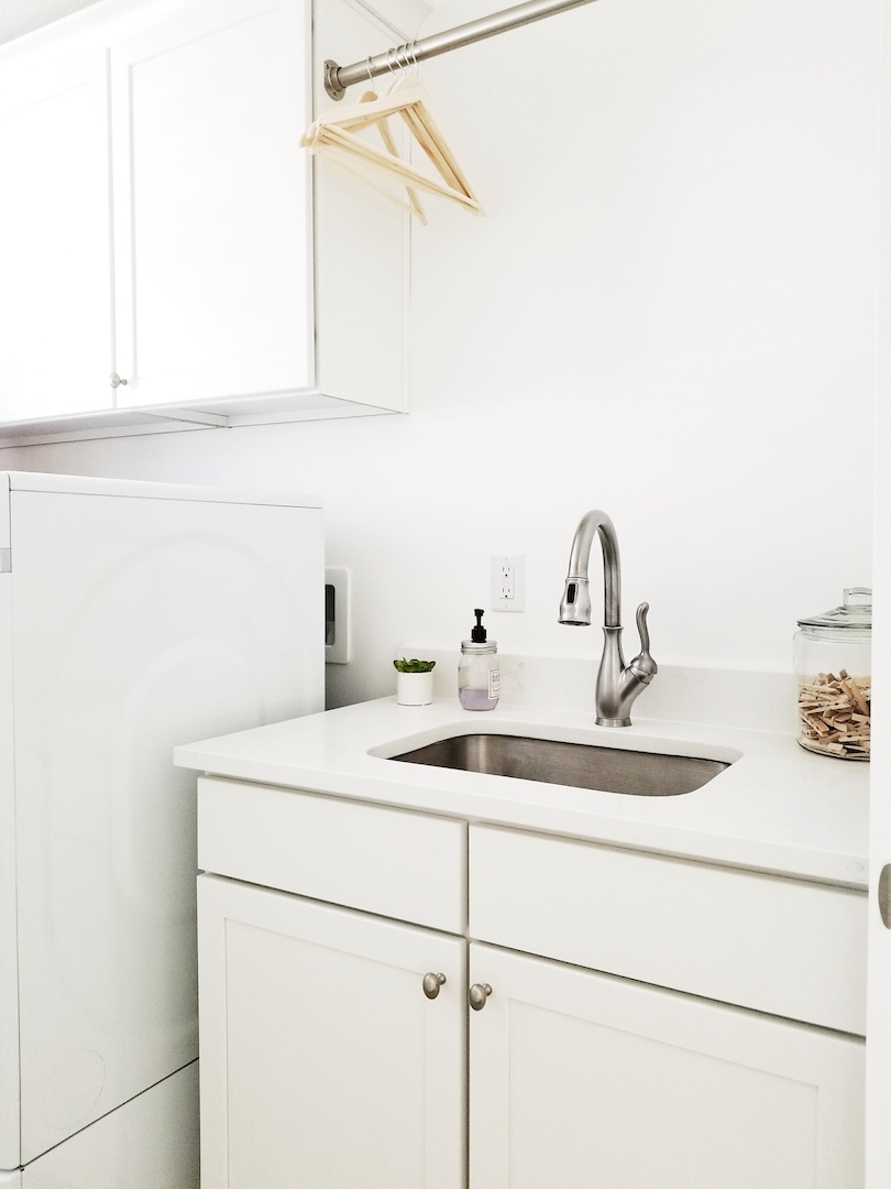
Finally, I wanted to show the summer refresh I did in the laundry room. I know, it’s just a laundry room. I feel like I spend the other half of my life in here though. It might as well be cute, right? It is a narrow room making it a little difficult to photograph. I am so glad we put a sink in this laundry room. It has come in handy so many times. We recently switched out the faucet in the kitchen and put it in here. I like this stainless faucet a lot better than the builder basic chrome faucet that was here previously. Mr. Whitelane and I also added the laundry drying pole across the top of the sink. I am a wierdo about drying certain clothes in the dryer. This drying pole has been a life saver. I also found this cute succulent at the Target Dollar Spot. The soap pump was a Home Goods Find from a few years ago. I finished off this little area of the laundry room with a glass jar of clothespins. I just think it’s cute and adds some depth to the space.
I hope you have enjoyed this little summer tour of mine. Be sure to continue the fun over the next few days and check out the other bloggers in the lineup below. Hop on over to Lisa at Farmhouse on Boone and Natalie at My Vintage Porch next to see their tours today!

June 1st- Laura at Meaningful Spaces, Stephanie at Belle Amour Blog, and Marci at Lemons to Lovelys. 

June 2nd- Hayley at A House with Books, Jordan at JorDecor, and Kim at Kim Power Style.


Faucet Change

The following post contains affiliate links. Read my full disclosure here.

I feel like we are in a rush to get as many projects done as we can before the baby comes. In my head, I am thinking that anything left undone will pretty much not ever get done. I know that is not true. It will probably get done at some point. It just will be a lot longer wait. It’s the nesting mode in me, I guess. We got a ton done over the past week. We worked a little each night on the wall in the upstairs hallway from my previous post. Mr. Whitlane and I were able to use our Ryobi Cordless Nail Gun while the kids were sleeping. I seriously love this nail gun. There are no cords or loud compressors. It is still a little loud when firing a nail but waaaayyyyy less noisy than a compressor nail gun. Our kids slept through nailing up the boards every night. Our three-year-old’s door was right by this hallway too!  By Saturday we had all the plans to get some other project done. I mean, we had finished the upstairs wall. So Instead, we got nothing done. You know when you have a million things to do, but decide to take a fun day instead? Mr. Whitelane and I were both tired by Saturday. We ended up taking the kids to this fun play center to skate, play arcade games, jump on bounce houses, and meet some princesses. Totally worth it!

So, this weekend I mean business. We have to get something done! Haha. A simple project on the list is to switch out faucets. I have been wanting to move our kitchen faucet to the laundry room sink. I haven’t been able to find what type of faucet I want for the kitchen. I finally, narrowed it down to two options. I really like this one because it is stainless steel and will flow with our farm sink seamlessly. It is a spring pull down faucet that has an industrial kitchen look. We had a similar one in our townhouse. I just loved the look and feel of this style. 

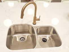
Then there is brass. We all know how much I love brass these days. My kitchen is sprinkled with brass accents. So, it is no surprise I fell in love with this brass faucet as well. Here is my dilemma with the brass faucet. I have a stainless steel farm sink. The large stainless apron can really clash with the brass faucet. If I didn’t have a stainless apron sink, or even if the farm sink was white, there would be no problem. In the picture below, you can see that the brass looks great with this traditional stainless bowl sink. Mixing metals is totally allowed in a room or house. My rule is usually two metals and no more than three. It just has to be mixed carefully so that it all meshes correctly. The brass faucet right in front of that huge stainless apron may be too much. The faucet is on the way and we will soon find out.

Which faucet do you love? I am leaning towards the brass IF it can mesh correctly with my sink. Otherwise, I will still love the Stainless spring pull down faucet. I already have the stainless Kohler faucet. It looks great and I am just waiting on the brass faucet to arrive to make my final decision. I am a visual person and I need to see them in the space on this decision. I can’t wait to show you the final choice on my Instagram next week!

Joyful Spring Home Tour

The following post contains affiliate links and sponsored by Hayneedle. Read my full disclosure here.

Today I am joining in on the Joyful Spring home tour, sponsored by hayneedle.com, along with 14 other amazing bloggers. If you are coming from The Porch Light Cottage or Delightfully Noted, welcome! Be sure to follow the schedule at the bottom of the post to check out all the spring tours. Also, there is an awesome hayneedle.com giveaway at the bottom of this post.  I love blog hopping and you will not be disappointed by these talented ladies.

Spring officially starts in a week. Considering it snowed last week, I am beyond excited for it to start warming up! I always get excited to decorate for Spring. It means that we are finally getting past the cold and ready to start fresh. Don’t get me wrong, I love having all four seasons in Utah. It is so fun to experience each new season.

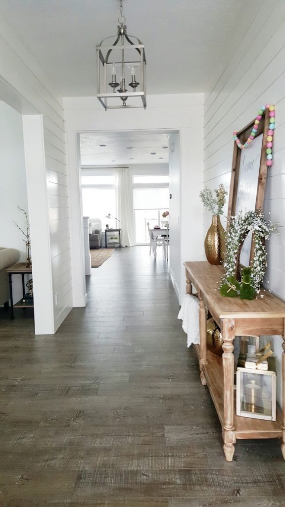
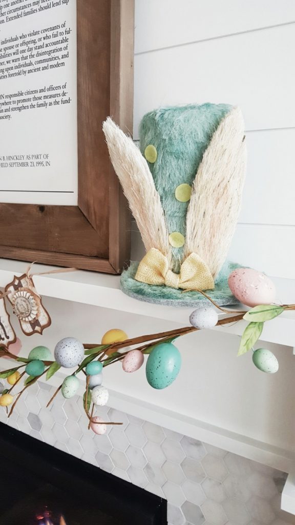
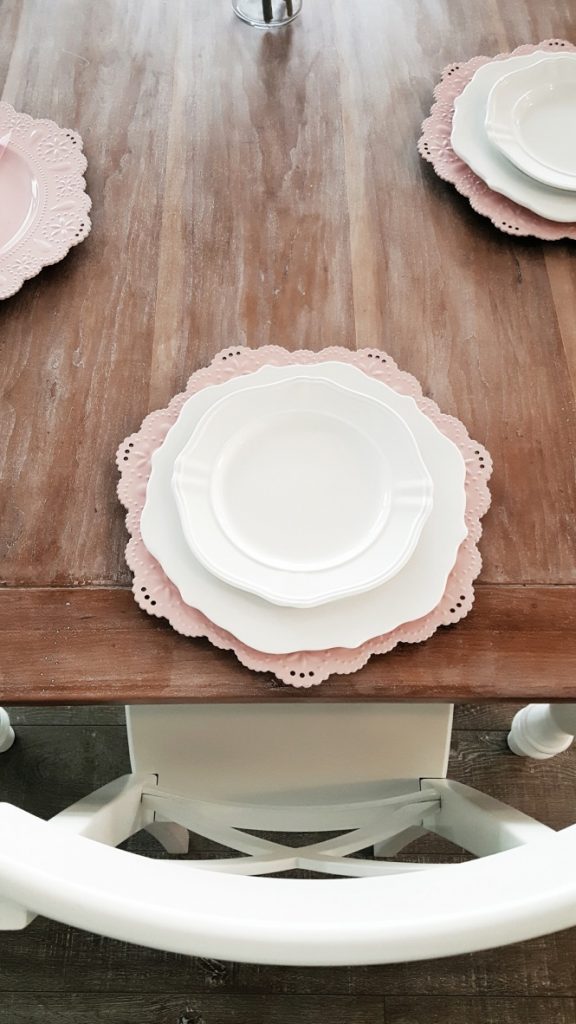
One of my favorite spots to decorate is my World Market Everett Table. Easter and Spring are when I venture out and add some color around the house. I picked up this egg garland and grass bunnies at Michael’s. The wreath was a Home Goods find. My husband refers to this as the hallway of shiplap. I just love the character that shiplap gives our entry.

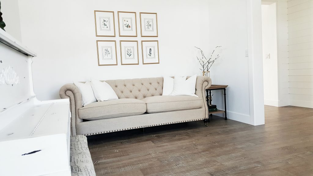
I haven’t shown much of this front room, right off the entry. It has been a work in progress. We have our piano and a sofa in here. I am still loving this DIY framed botanical gallery to go above the sofa. The perfect rug for this room is still out there. I just need to find it and bring it home.

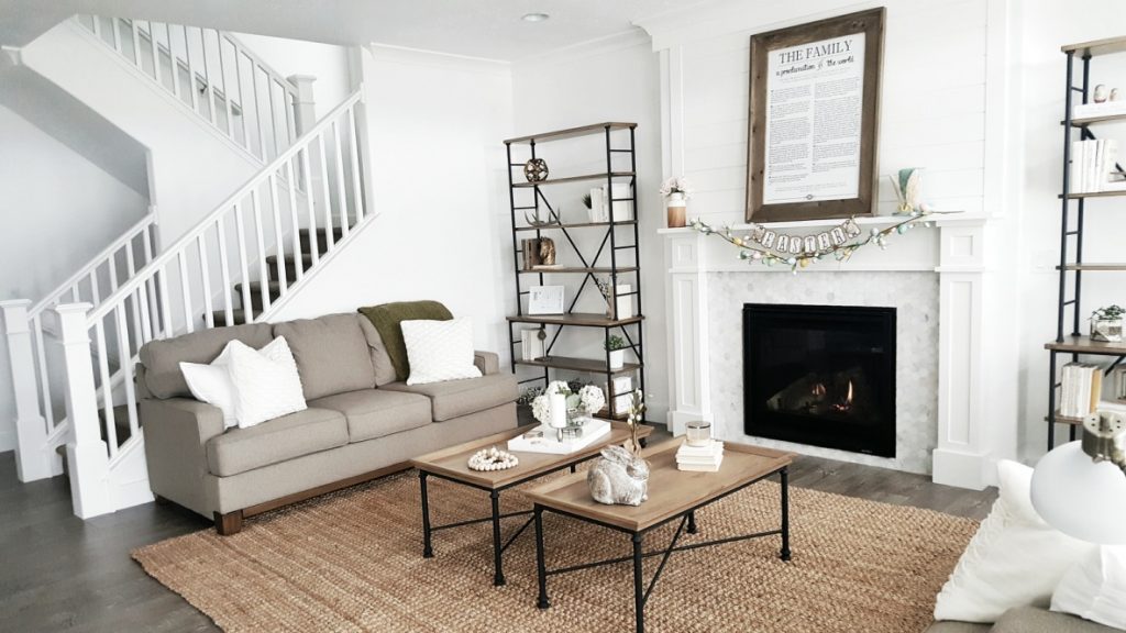
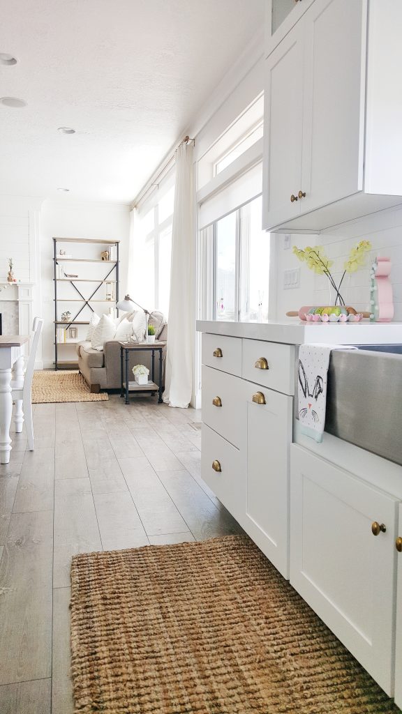
My living room, dining room, and kitchen are all open to each other. I love open concept spaces. It just feels like there is more room. I can also be a part of all the action going on in the other areas while cooking in the kitchen.

This adorable mad hatter hat, egg garland, and big bunny (on the coffee table) are from Michael’s.


This rolling pin was actually at the Target Dollar Spot for Valentine’s Day. I thought it carried over to Easter perfectly too.  My kids just love turning on this marquee bunny from Michael’s. The poor mini chicks have also taken quite the beating from my little ones. I don’t know if they will survive another Eater around here. 🙂


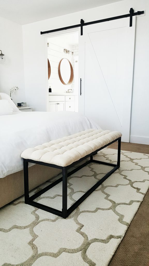
Ok, let me tell you about the best shopping experience ever, hayneedle.com. It is like Home Goods, T.J. Maxx, and Target all combined but better! Way cuter selection and the prices are AMAZING! The best part is that I get to do all my shopping while wearing my pajamas in bed. I don’t have to drag my kids in and out of a million stores to find one thing I am looking for. I had the hardest time trying to decide what I wanted to order for this spring tour. There may, or may not, be a whole cart full items still waiting to be purchased. 🙂 Hayneedle was so kind to send me this duvet set and bench for my master bedroom spring refresh. I have been searching for the perfect duvet for this bedroom since we moved in. I am in love with the look and feel of this duvet. It is like sleeping in luxury hotel bedding. Since the name is Luxury Hotel Microfiber Set, totally makes sense now!  Mr. Whitelane even thinks it feels super comfy.

A bench is a necessity in our bedroom. Mr. Whitelane wakes up way earlier than me. Every time he puts on his shoes, he sits on the end of the bed. I am a light sleeper and I would always wake up. Not anymore. This bench has saved me many minutes of sleep. I love the black metal base that ties into our barn door. Best of all, it was so easy to assemble and came right to my front door. It has also withstood the kid superhero test. Many jumps later, still going strong. It was my first time ordering with hayneedle.com and I am definitely hooked! Hayneedle is also giving away a $250 shopping spree to one of you! Click HERE to enter your email and follow @hayneedle on Instagram. Contest runs until March 20th. Good luck!

Don’t worry, the tour doesn’t stop here. Go check out these other awesome ladies in the schedule below. We have loved putting the Joyful Spring Home Tour together. It has been such fun showing you our spring decor and working with hayneedle.com. Tomorrow is the final day of the tour. So, don’t miss out! Make sure you visit all the blogs from earlier this week as well.

Tour Schedule

Monday March 13

Monday

Maison de Pax | Lemons to Lovelys | TIDBITS | Belle Amour Blog

Tuesday March 14

Tuesday

The Mountain View Cottage | Kim Power Style | Meaningful Spaces | My Vintage Porch

Wednesday March 15

Wednesday

The Porch Light Cottage | White Lane Decor | Delightfully Noted

March 16

Thursday

JorDecor | Farmhouse On Boone | A House With Books

Alfredo Recipe

Kate

Hi there, I’m Kate. Welcome to White Lane Decor. Thanks for stopping by. I love neutral, bright, and airy spaces. I’m always looking for new ways to turn our house into a home. Have a look around and find inspiration for your next project.

Disclosure

Some of my blog posts, ads, and banners contain "affiliate links." This means if you click on the link and purchase the item, I will receive an affiliate compensation. However, I only recommend products or services I use personally and truly feel you will enjoy too! I am disclosing this in accordance with the Federal Trade Commission's 16 CFR, Part 255: "Guides Concerning the Use of Endorsements and Testimonials in Advertising.” White Lane Decor is a participant in the Amazon Services LLC Associates Program, an affiliate advertising program designed to provide a means for sites to earn advertising fees by advertising and linking to amazon.com.

Shop My Home

Alfredo Recipe

I just finished dinner and I had to let you all in on the best Alfredo recipe ever! I am all for making things easy for dinner. I just can not eat bottled or store bought Alfredo. It has a weird taste to me and always seems fake. I want the real deal.


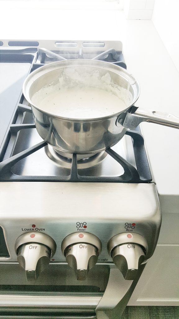
So, tonight I found the perfect recipe. We all love Olive Garden. Especially their Alfredo sauce. YUM! When I came across this copycat recipe, I had to give it try. I followed this recipe from CopyKat Recipes (duh, genius name). However, I added a secret ingredient. Half a block of Cream Cheese. I could eat cream cheese on everything. Sooooo good. I definitely think it made this extra yum! Is that possible?

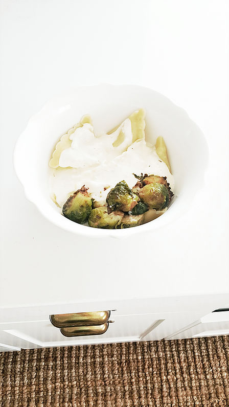
I poured this sauce over Costco (our staple store) chicken ravioli. Not only was this the best sauce ever, I discovered the best brussels sprouts. I’m telling you, this was a dinner success. It was random and thrown together but it worked out. I steamed some brussels sprouts and cut them in half. Then I sautéed them in a hot skillet with butter, salt, garlic, basil, and Italian seasoning bread crumbs. I know, what!? Italian seasoning bread crumbs? I had to improvise. I know people like to use the Trader Joe’s seasoning but this worked just as good. Who knew? I let them get a crisp edge on the outer layers.

Processed with VSCO with s2 preset

My kids devoured these brussels sprouts. Everything was so good, I had to share. Probably not the lowest calorie meal. When you eat Alfredo sauce, you go all out. Live a little sometimes. I am already craving the leftovers.

Processed with VSCO with s2 preset

Kate

Hi there, I’m Kate. Welcome to White Lane Decor. Thanks for stopping by. I love neutral, bright, and airy spaces. I’m always looking for new ways to turn our house into a home. Have a look around and find inspiration for your next project.

Disclosure

Some of my blog posts, ads, and banners contain "affiliate links." This means if you click on the link and purchase the item, I will receive an affiliate compensation. However, I only recommend products or services I use personally and truly feel you will enjoy too! I am disclosing this in accordance with the Federal Trade Commission's 16 CFR, Part 255: "Guides Concerning the Use of Endorsements and Testimonials in Advertising.” White Lane Decor is a participant in the Amazon Services LLC Associates Program, an affiliate advertising program designed to provide a means for sites to earn advertising fees by advertising and linking to amazon.com.

Shop My Home

Favorite Kitchen Features

When we started building a house, I knew I wanted to spend the most money in the kitchen. It is the heart of the home and where we spend the most time. I wanted to do things that would have a big impact and create a bright and open space. I thought I would share some of my favorite kitchen features and trends.

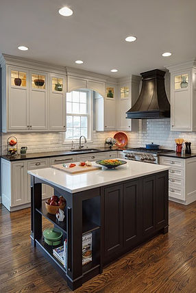
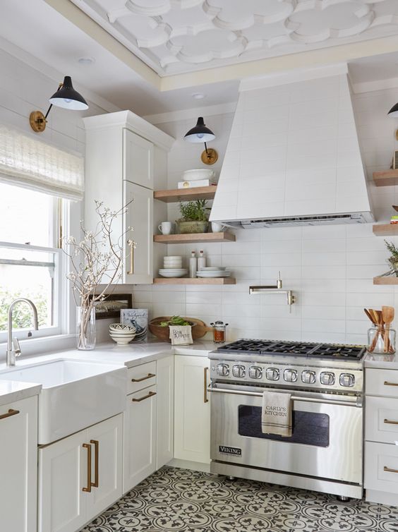
I have to say that one of my favorite kitchen elements is the Cabinets. I feel like they are the first thing that people see and take up the most space (if you’re lucky). I like Shaker style cabinets with clean lines. I know a lot of people can get real fancy and intricate with the detailing on cabinets. I like to just keep it simple. Taking your kitchen cabinets all the way to the ceiling will have a great impact! It can make the space feel so much more open. We chose to double stack our cabinets. So we have short cabinets stacked on top of our regular cabinets. The upper short cabinets have glass front doors. I think adding the glass makes it feel even airier. Now if you have the space for open shelving then that can also open up a kitchen. Having cute shelves creates a nice place to display your favorite dishes. Open shelves can also cut down on the bulk of where a cabinet once was. I think picking a light cabinet can also help open the space. If you are worried about them getting dirty, choose a darker color for the island. The island usually has a lot more traffic and sitting than other cabinets. Choosing a darker contrasting color can give the space character and be easier to clean. You still get the bright open feel of the light upper cabinets while having the darker lower island cabinets.

Pot fillers have become quite the statement in kitchens today. I love a good pot filler as much as the next person. They are so convenient when you’re cooking dinner. I would definitely recommend one in a kitchen design. I wish we could have had a pot filler in our new house. There is a window right in front of the oven, leaving no place to put a pot filler. I guess it is a trade-off. Beautiful view out the window in lieu of a pot filler.

kitchen-pinter
Ok people. Pick your backsplash carefully. I think it can enhance a kitchen or totally through it off. You will probably have that backsplash for years to come. Pick something neutral and complimentary to your color scheme. I can not stand when I walk into a home with some wild out of place tile, slapped on the kitchen wall. It really can ruin a space. I ended up going with white subway tile with a very light gray grout for the new house. If you must do something wild , try laying the tile in a fun pattern. Herringbone and staggered 50/50 are just a few ideas. It can create a fun pop without some wild tile choice.

Quartz counter tops are really popular right now. In fact, that’s the material we chose for our counter tops at the new house. I like quartz because it is virtually maintenance free. You never have to worry about sealing the stone. The only thing you have to worry about is heat. You can not set a hot pan right on the counter like you could with granite. The resin and glue that holds the man made stone together will melt. Even if there is a towel under the pot, the heat can go through to the counter and melt. Granite is nice because of its durability. However, it has to be sealed every so often. You already know how I feel about marble from my design options post. Beautiful, but so high maintenance and expensive. I really would try to choose something in quartz or granite. Again keep it simple and clean. Let your decor and accessories do the talking. Decorations can be swapped out and changed. Kitchen counter tops, cabinets, and tile can not easily be changed.

Ok, this is not a must but I just love a hidden trash can. Trash is stinky and ugly. If you can fit in your pantry, that is great. I just don’t like it in my pantry with my food. If you can find a way to have a trash can drawer built into your cabinets, DO IT! I am so excited about having this at the new house. No more big ugly silver trash can hanging out in our kitchen. I think it is just a neat feature that will hide the smelly ugly junk.

Hopefully, this gave you some good ideas about some key design features for your kitchen. I think some simple planning can go a long way to making a great kitchen.

The first three pictures found via www.pinterest.com. Click on each picture for link.

Kate

Hi there, I’m Kate. Welcome to White Lane Decor. Thanks for stopping by. I love neutral, bright, and airy spaces. I’m always looking for new ways to turn our house into a home. Have a look around and find inspiration for your next project.

Disclosure

Some of my blog posts, ads, and banners contain "affiliate links." This means if you click on the link and purchase the item, I will receive an affiliate compensation. However, I only recommend products or services I use personally and truly feel you will enjoy too! I am disclosing this in accordance with the Federal Trade Commission's 16 CFR, Part 255: "Guides Concerning the Use of Endorsements and Testimonials in Advertising.” White Lane Decor is a participant in the Amazon Services LLC Associates Program, an affiliate advertising program designed to provide a means for sites to earn advertising fees by advertising and linking to amazon.com.

Shop My Home

Bar Stools

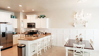
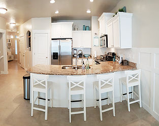
I have perfectly good barstools. There are four of them from IKEA. So in the new house, our island seats six. What does that mean!? Do I buy two more of the same white IKEA chairs I already have? Do I buy six new chairs, that are totally different? I haven’t decided what I will do yet. Two of the four white IKEA chairs, that I already have, are very well loved and used. In the meantime of trying to decide what I should do; I have picked out a few of my favorites. Just in case I need to buy all new barstools 😉 .

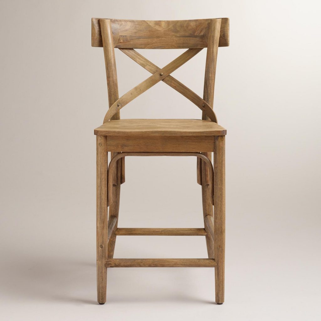
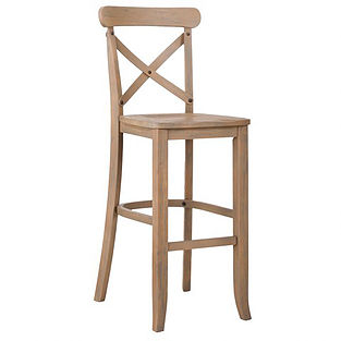
I am really loving the natural light wood furniture lately. These World Market French Bistro Barstools are just perfect. They still have the “X” back, which will match well with my dining room chairs. My dining room chairs are the same as the white IKEA barstools I have. I don’t want to buy all new dining room chairs too. I will definitely be keeping those six chairs, so the barstools need to coordinate. These would blend well and break up some of the white in the kitchen.

french-country
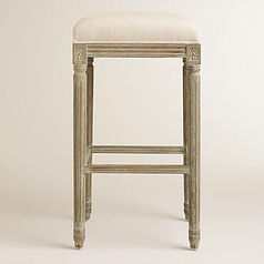
I thought about doing the Natural Linen Paige Backless Barstool from World Market too. Lets be honest, fabric chairs don’t work with my kids. I need something that won’t absorb food and wipes up easily. We mostly sit at the bar and not the dining room table. I don’t know why but we just always congregate there. I have to wipe up and mop the floor under my little one’s chairs after every meal. So I quickly threw this chair out of the options. It sure is beautiful but just not the right fit for our family.

Target always has such cute stuff. I came across a chair similar to the French Bistro barstools from World Market. They are called the French Country X-Back Barstool. A little bit cheaper and still really cute. Again they would still blend well with the dining room chairs. This is important since they will be all together in one open space. They even go on sale occasionally. I really am leaning toward these as a front runner.

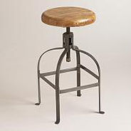
This last one is a bit of a wild card for me. It is the Adjustable Round Wood and Metal Stool from World Market. Can you tell I love World Market? I thought that it might be nice to tuck these away under the countertop. they have no backs so they won’t seem busy. They are more industrial than I usually tend to like. Definitely easy to clean with the wood and metal. I don’t really have dark metal anywhere else in the house. A fun option to think about none the less.

I still have some time to think over all the bar stool options. The new house is all sheet rocked! I am beyond excited to see the progress coming along. I will be doing another house updated soon to show you how it is going.

Individual images of Barstools are from WorldMarket.com and Target.com

Kate

Hi there, I’m Kate. Welcome to White Lane Decor. Thanks for stopping by. I love neutral, bright, and airy spaces. I’m always looking for new ways to turn our house into a home. Have a look around and find inspiration for your next project.

Disclosure

Some of my blog posts, ads, and banners contain "affiliate links." This means if you click on the link and purchase the item, I will receive an affiliate compensation. However, I only recommend products or services I use personally and truly feel you will enjoy too! I am disclosing this in accordance with the Federal Trade Commission's 16 CFR, Part 255: "Guides Concerning the Use of Endorsements and Testimonials in Advertising.” White Lane Decor is a participant in the Amazon Services LLC Associates Program, an affiliate advertising program designed to provide a means for sites to earn advertising fees by advertising and linking to amazon.com.

Shop My Home