Stay Connected With The Latest Posts

  • This field is for validation purposes and should be left unchanged.

Stay Connected With The Latest Posts

Gold And White Kitchen

The following post contains affiliate links and is sponsored by Joss & Main. Read my full disclosure here.

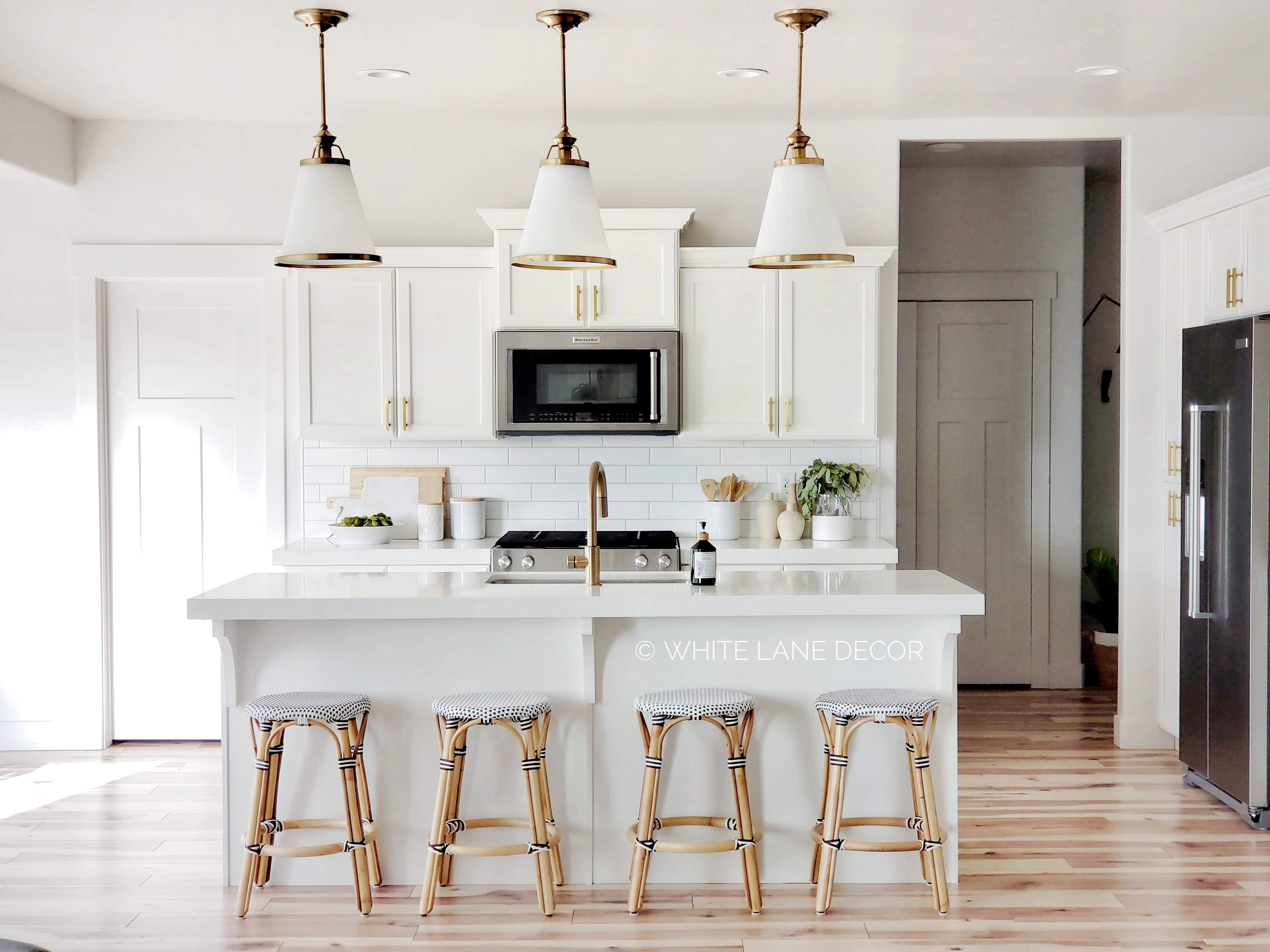
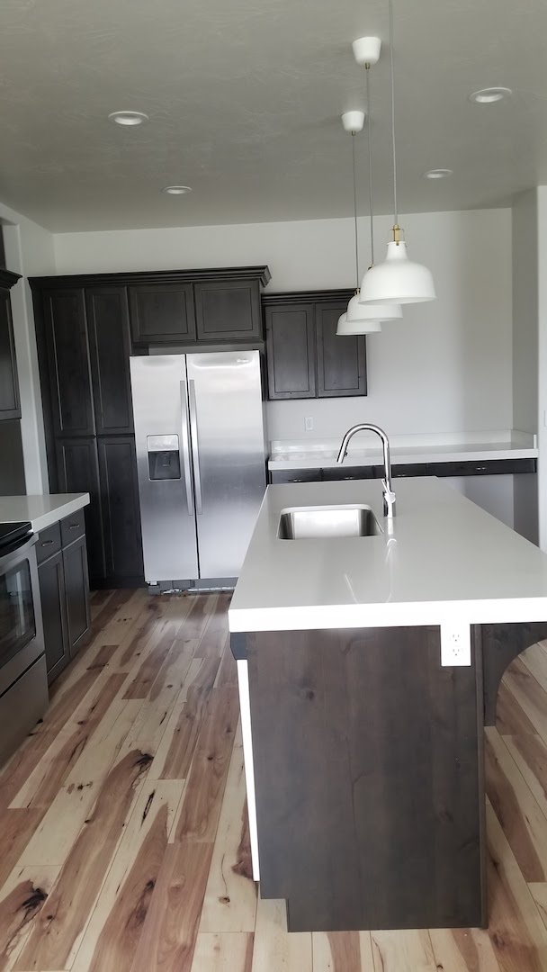
Today is the day I finally get to show you some updates we did to our kitchen. We have lived in this house for about nine months and we are constantly still making things feel like our style. If that makes any sense? Mr. Whitelane and I are always changing things and doing projects to make this home feel like it fits our family. That is part of the fun of buying a pre-existing house. The kitchen was one of the first projects we did. It went from dark to light and bright. Here is a look at the before from when we first bought the house.
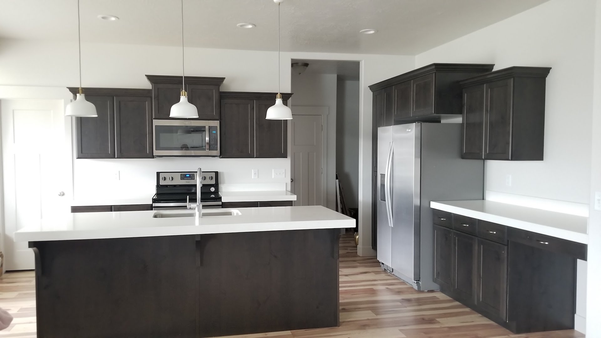
 

As we have lived in the home I feel like we got a better idea of what we really wanted. The kitchen is where we spend the majority of our time as a family. We made a lot of changes as soon as we moved in. You can see those here. I decided it was time to open things up and make some more changes. I wanted to give the kitchen a whole new look but not spend a lot of money. That is where Joss & Main comes in to save the day.

Have you done shopping on Joss & Main yet? If not, you are missing a whole world of savvy steals and markdowns on designer products. I am amazed at how I was able to change everything from lighting to barstools on a budget in a one-stop shop. The biggest bonus was that it all got delivered to my front door. I also shopped from home in my PJ’s. 🙂

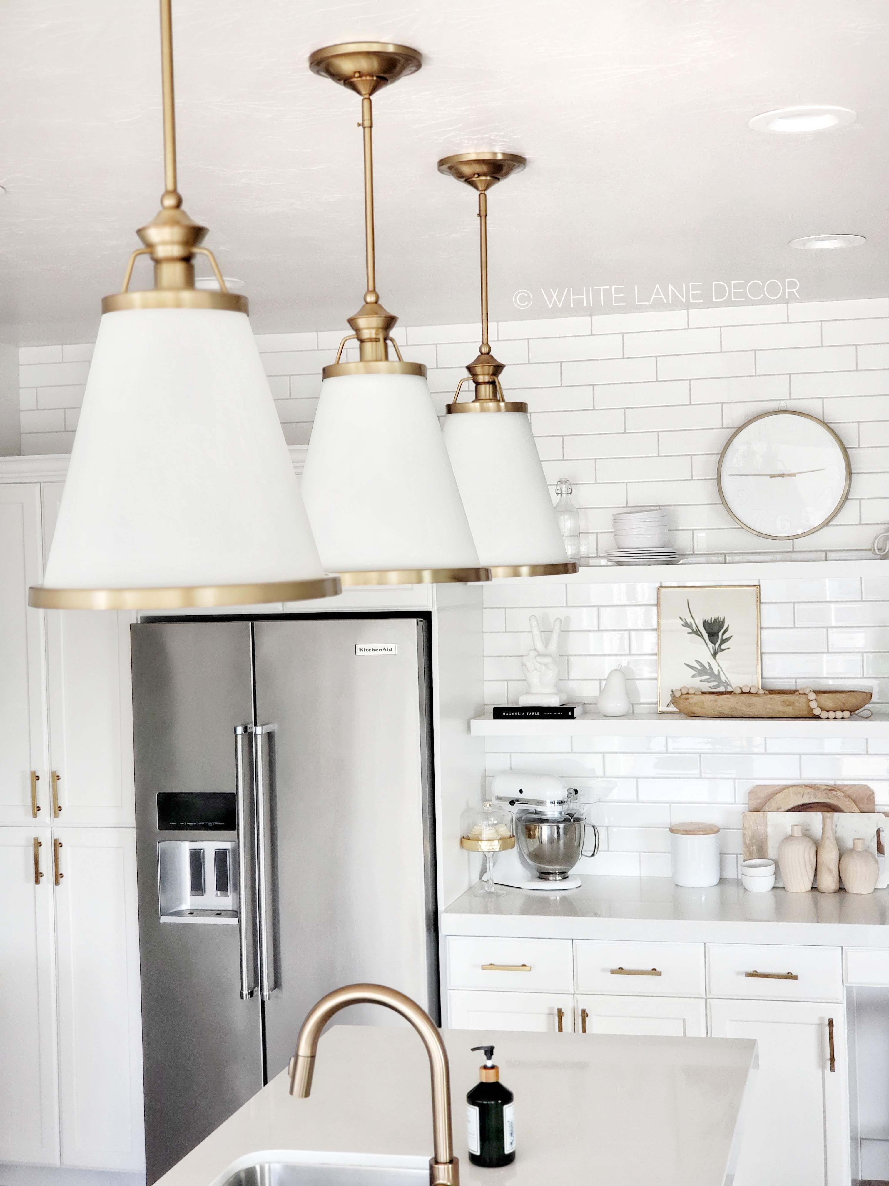
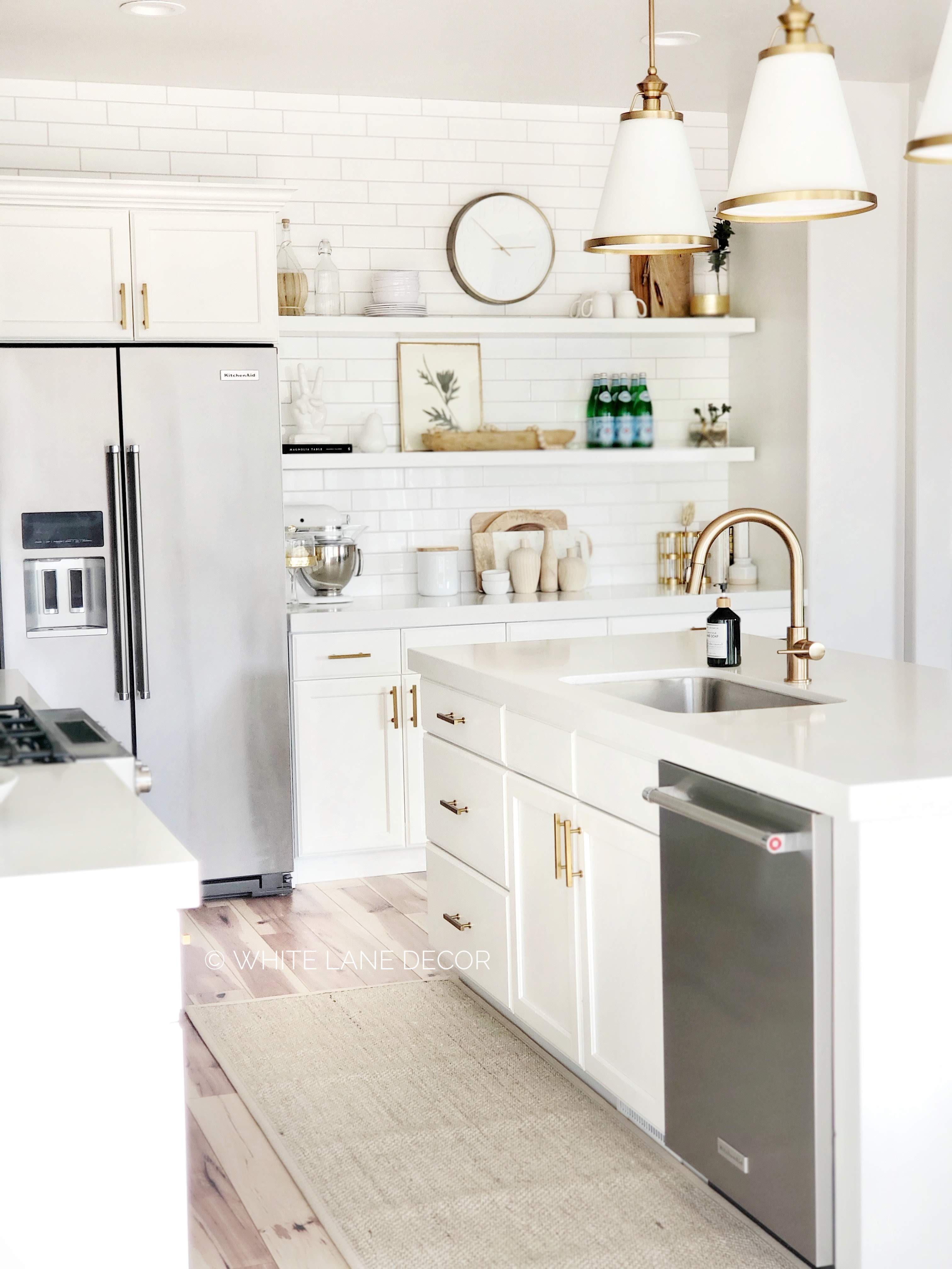
I chose these three Kayden Cone Pendants for over the island because they feel a lot lighter than my previous pendants. They make a definite statement without being too heavy and taking away from the overall design. The Heriberto Chandelier was the perfect compliment to the pendants. The shades are actually a frosted glass that pairs with the brass so well. This space feels so much lighter and airy with the new chandelier.
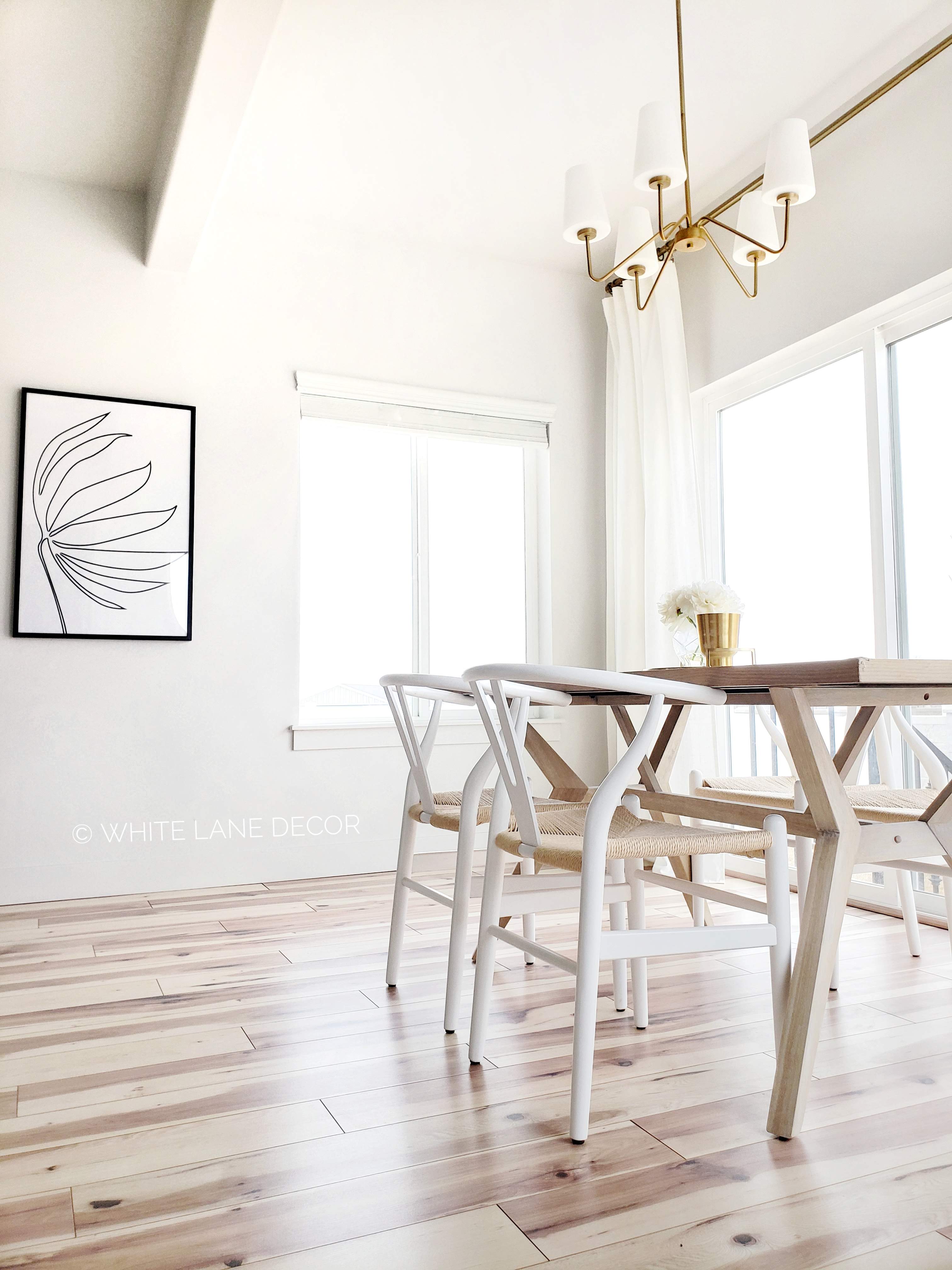
 

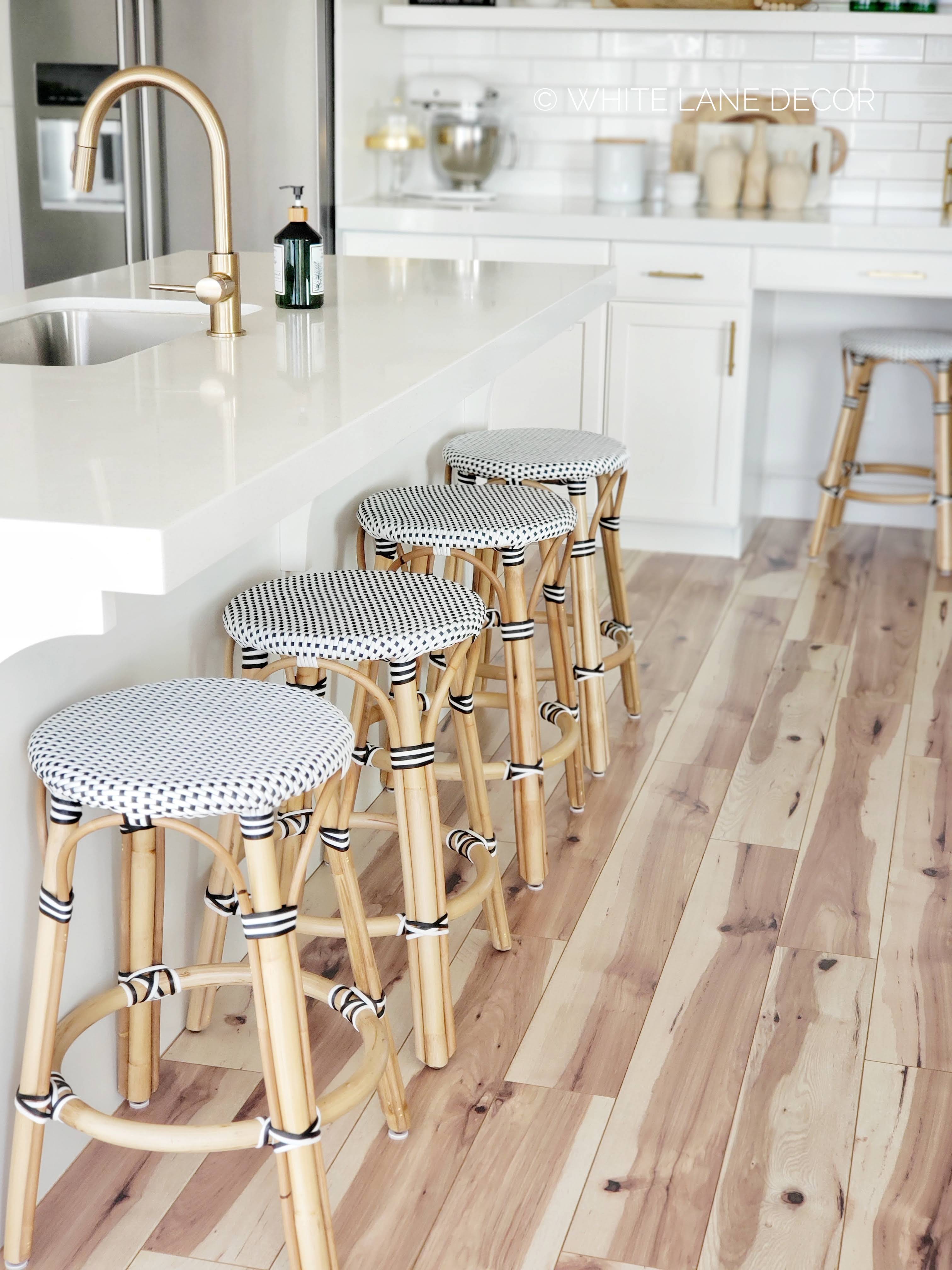
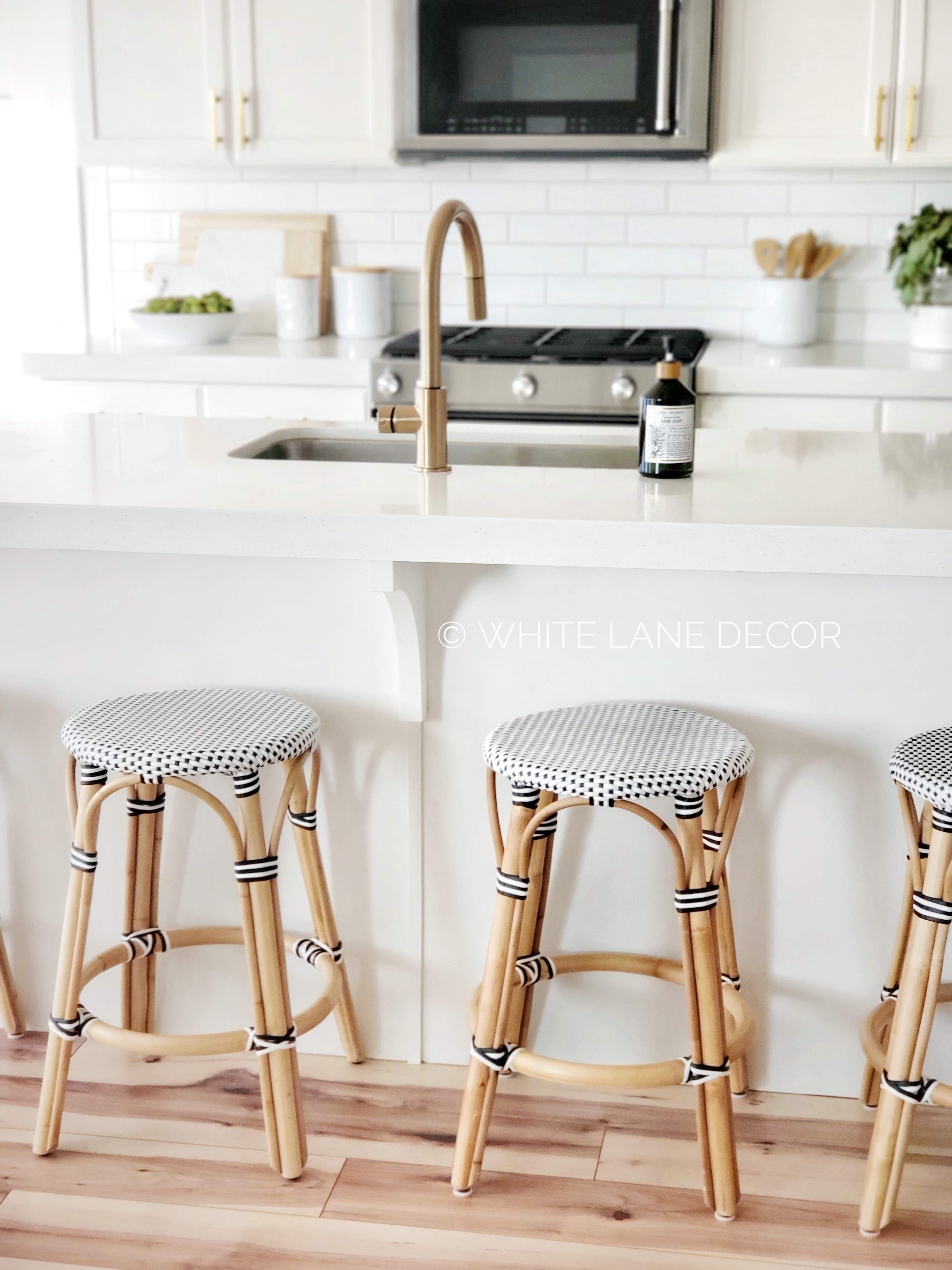
I have wanted these rattan coastal looking bar stools for a very long time. However, they are typically not affordable, especially if you need more than one. 😉 I was thrilled when I found these Campbellton stools for a killer price. They look identical to some of the much more expensive options I have seen. There were celebratory moments galore because of all the great pieces I was able to get within my budget.

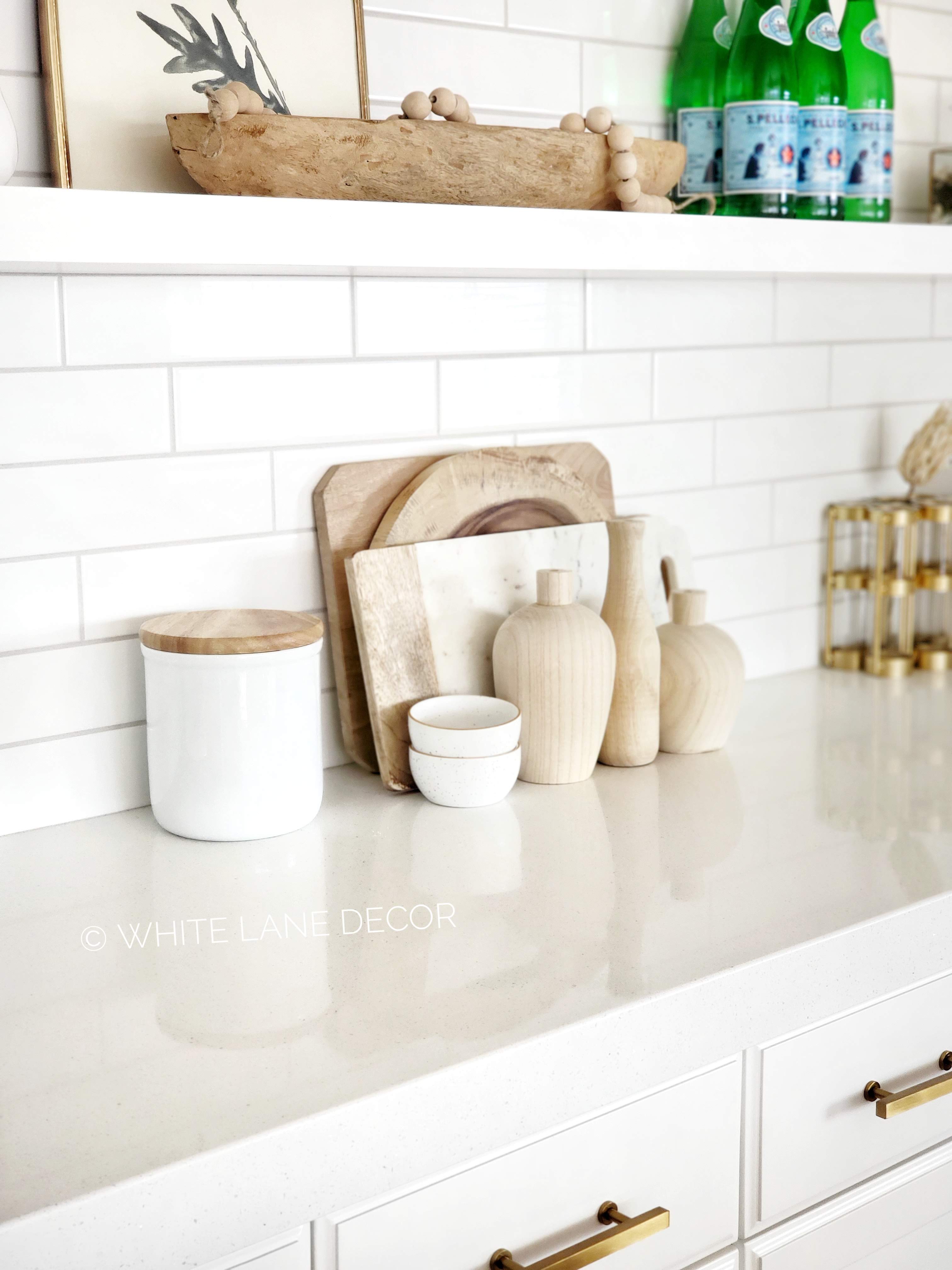
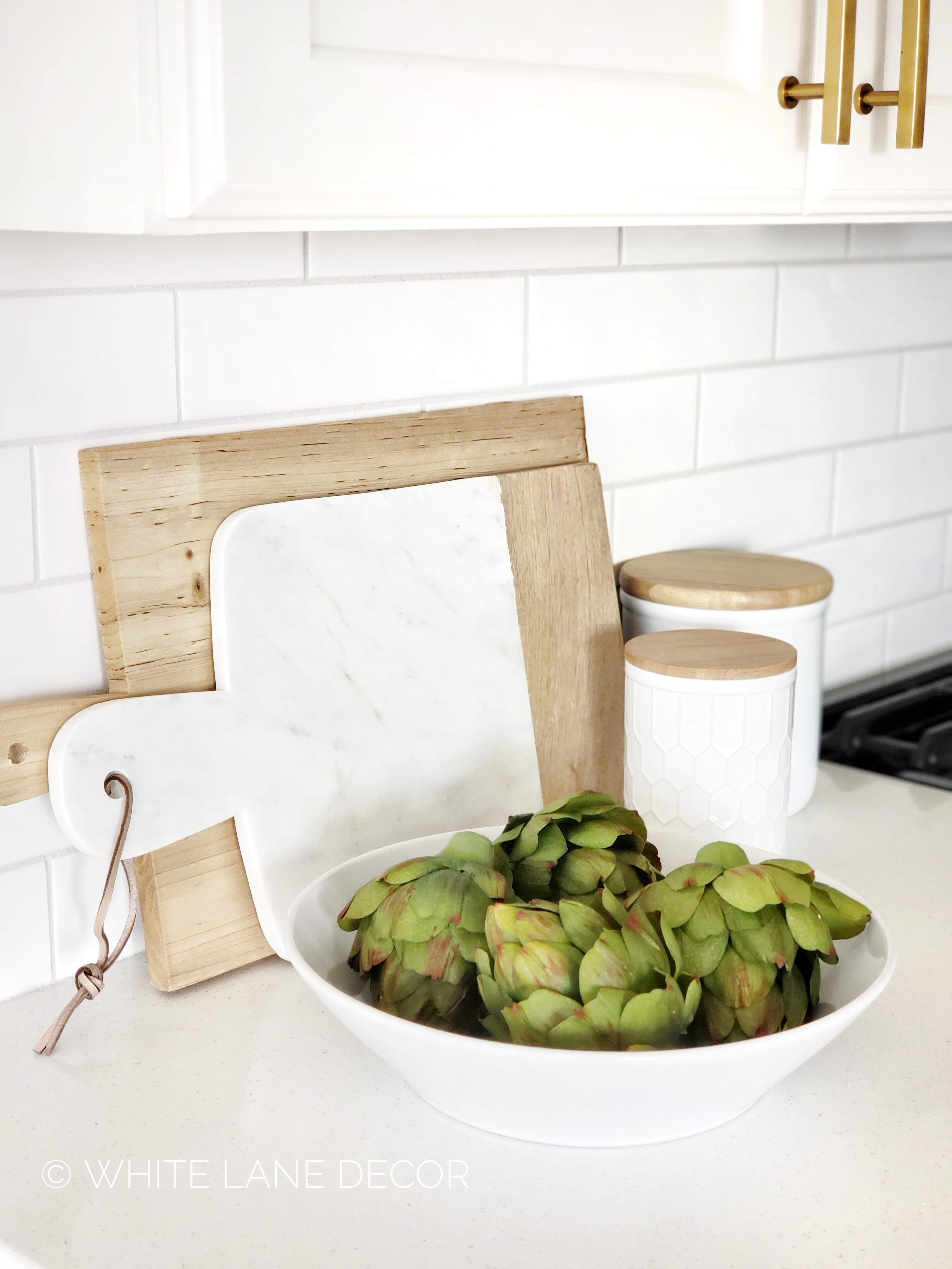
I also had to get a new runner that fit with my new changes. I am a neutral loving girl at heart. I have tried out many different options for this space but I always come back to my neutrals. This rug is so great because it has a rubber backing to help keep it in place. This Tillia marble cheeseboard is a must-have for countertops. The wood and marble together make such a beautiful statement. I filled in the rest of the counters with these awesome white canisters. They come in two sizes and I went with the ten-inch size. I even removed the lid to use one as a utensil holder. Finally, I found this wood vase set. I am obsessed with these vases. They can be used in so many applications for styling. A great staple to have around for any room.
 

I am so happy with how I was able to give me kitchen a completely new look. It really feels so much more open and airy. I am loving all the deals I found on Joss & Main. Designer pieces for any budget and any room. I also have another big update we are working on with this house. I will share it all soon. Be sure to subscribe to my email list and follow me on Instagram so you don’t miss anything!

 

Dining Nook With Inmod

The following post contains affiliate links and is sponsored by Inmod. Read my full disclosure here.

I did something fun to freshen up our dining space for after the holidays. I have always wanted a cute little dining nook with a round dining table. I just feel like it is cozy and out of the norm. Most tables we see now days are a rectangle. That is great and works for a lot of spaces. In fact, I have been using a rectangle table since we moved into this house. Well, not anymore.

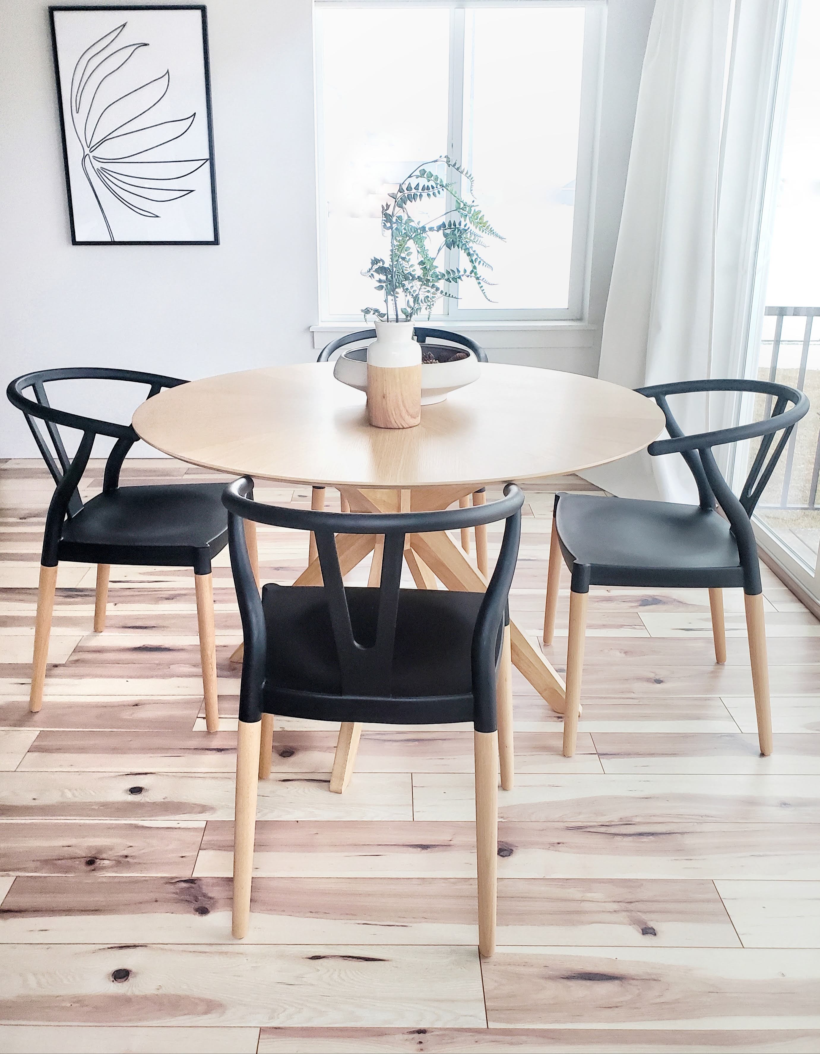
My design for this space was originally for a round table but I wimped out at the last minute. Our nook is mostly a rectangle and I thought a round table wouldn’t utilize the space. After months of living with the rectangle table, I threw caution to the wind and decided to get this Starburst Round Dining Table by Imod.

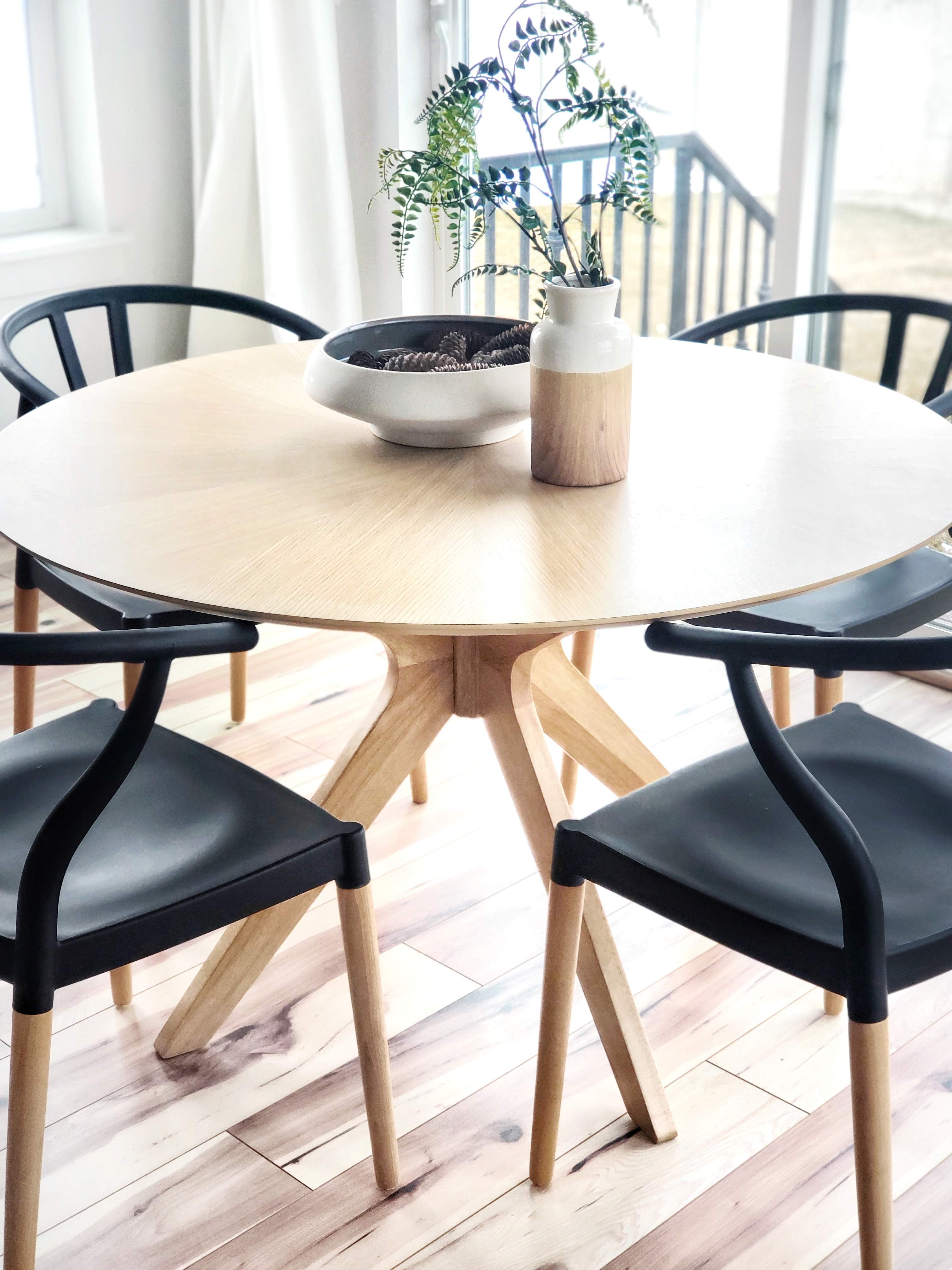
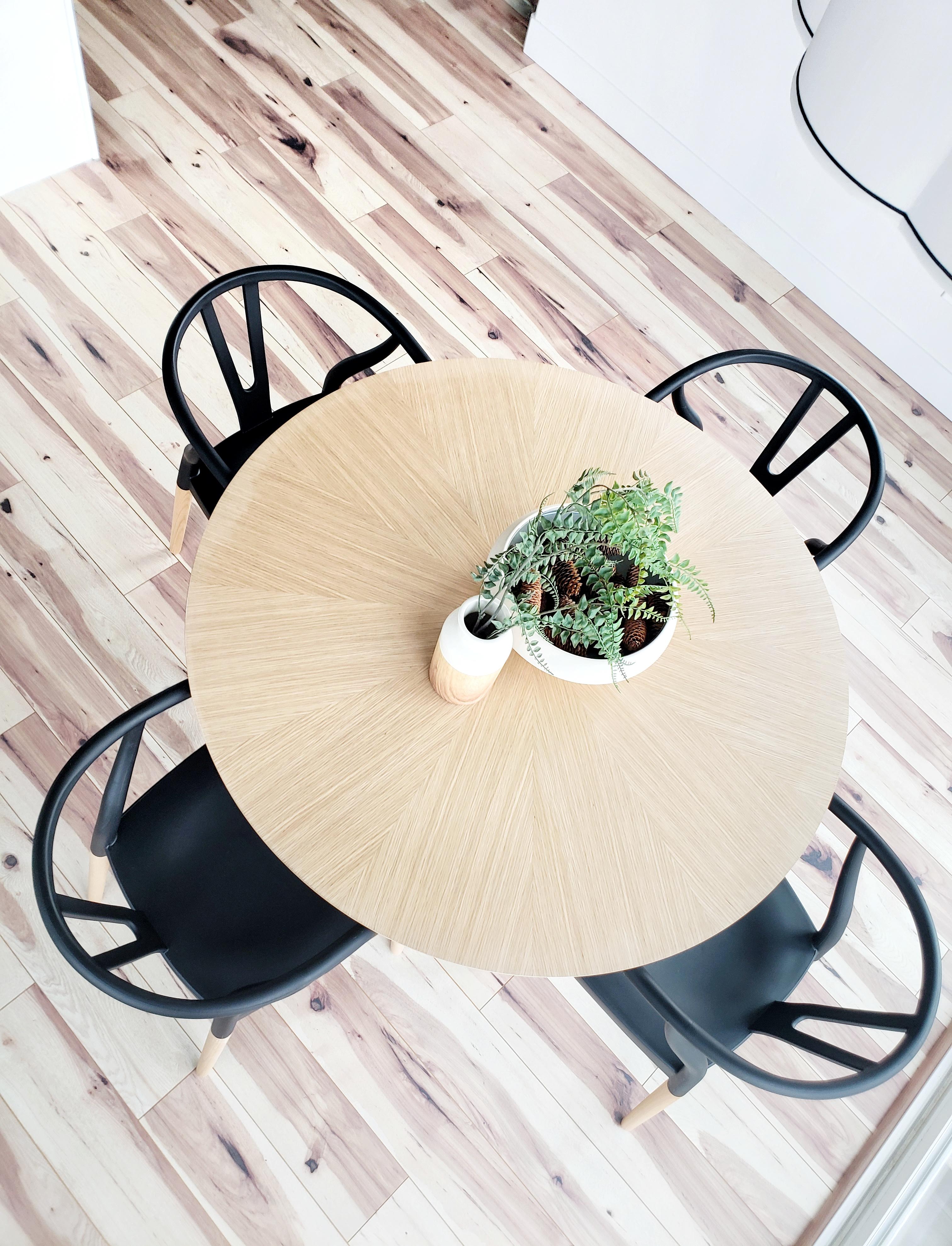
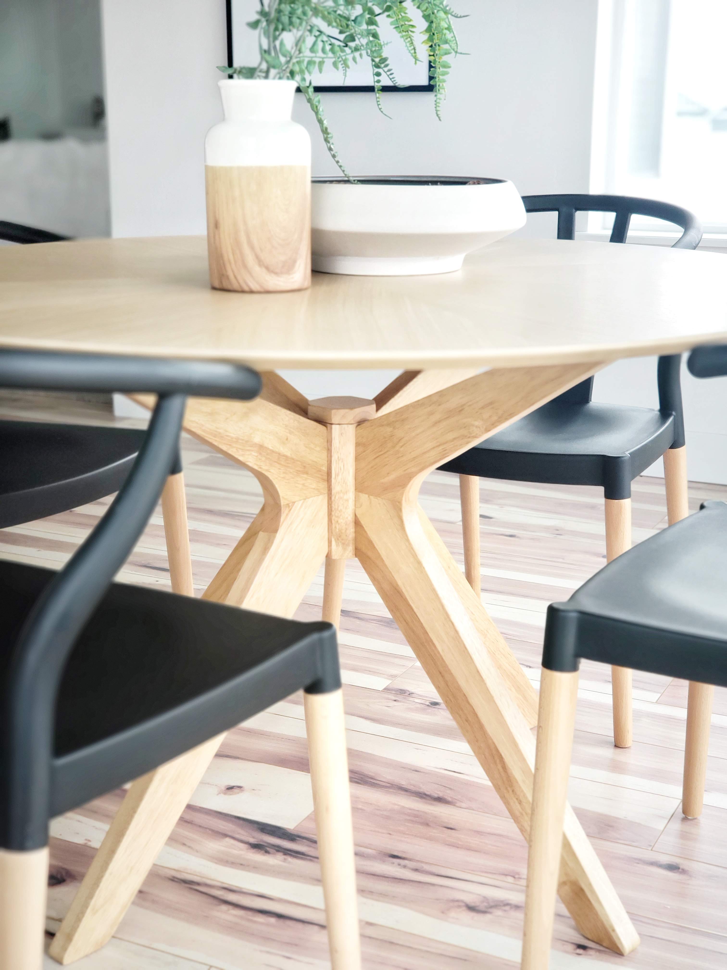
I don’t know why I waited so long to put a round table in this nook. It looks exactly as I had hoped. Let’s talk about the details of this beauty. This table is made of Malaysian Oak and features a starburst pattern on the table top. Subtle but beautiful details make this table a show stopper. The angular aesthetic of the base is edgy yet classic. Inmod’s Signature collection is completely on point with this stunning table. It has freed up space to get out the back door and created an intimate seating area for our family. The best part that is that it still fits four chairs. In fact, I think I could fit one or two more.

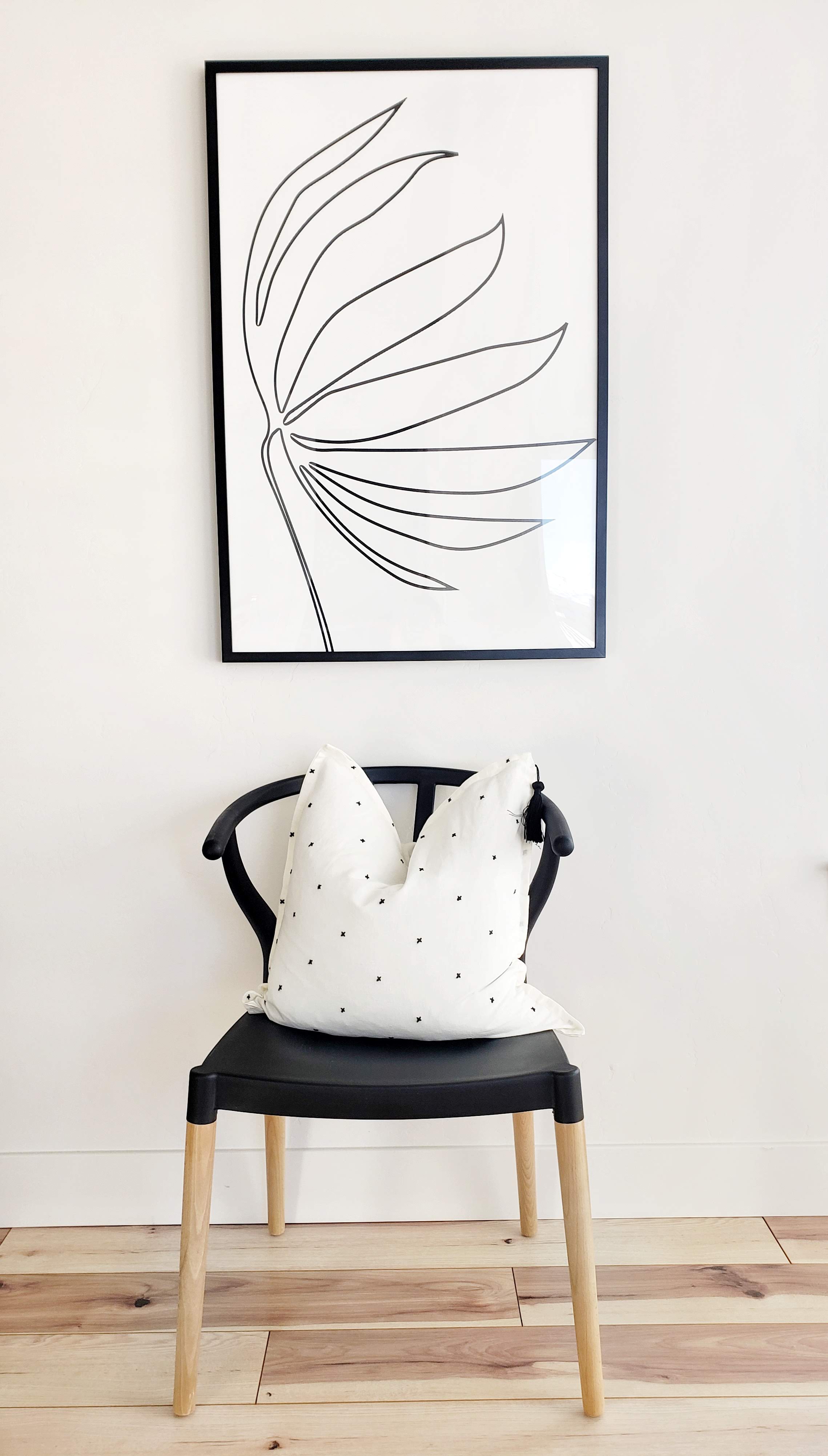
When I was shopping on Inmod’s site I also found the most incredible Wishbone Style Dining Chairs. I know you have seen this type of chair floating around the design world. The iconic style of this rendition was a must-have to pair with the round dining table. The great part about this chair is the kid-friendly design. The seat is an easy-to-clean molded plastic atop natural wood legs. I don’t have to worry about my kids spilling on my beautiful new chairs. Anything can be easily wiped off with no damage. I don’t have to sacrifice any style either. I love the sleek rounded back and arms. I chose black to pop the natural oak table but these chairs come in three other color options too. Another great feature about this chair is the affordability. I kind of want two more in white for my desk area. You can’t go wrong with these chairs!

I am excited to use this fresh space for the New Year. It feels so much more inviting and ready for whatever the year brings. Who knew a round dining table (and fabulous chairs) could completely change a space. Some simple statement pieces can really transform an area. Do yourself a favor and head on over to Imod to see what space you can update next. At least go get yourself one of these AMAZING chairs! 🙂


Lily Jade Giveaway

The following post contains affiliate links and is sponsored by Lily Jade. Read my full disclosure here.

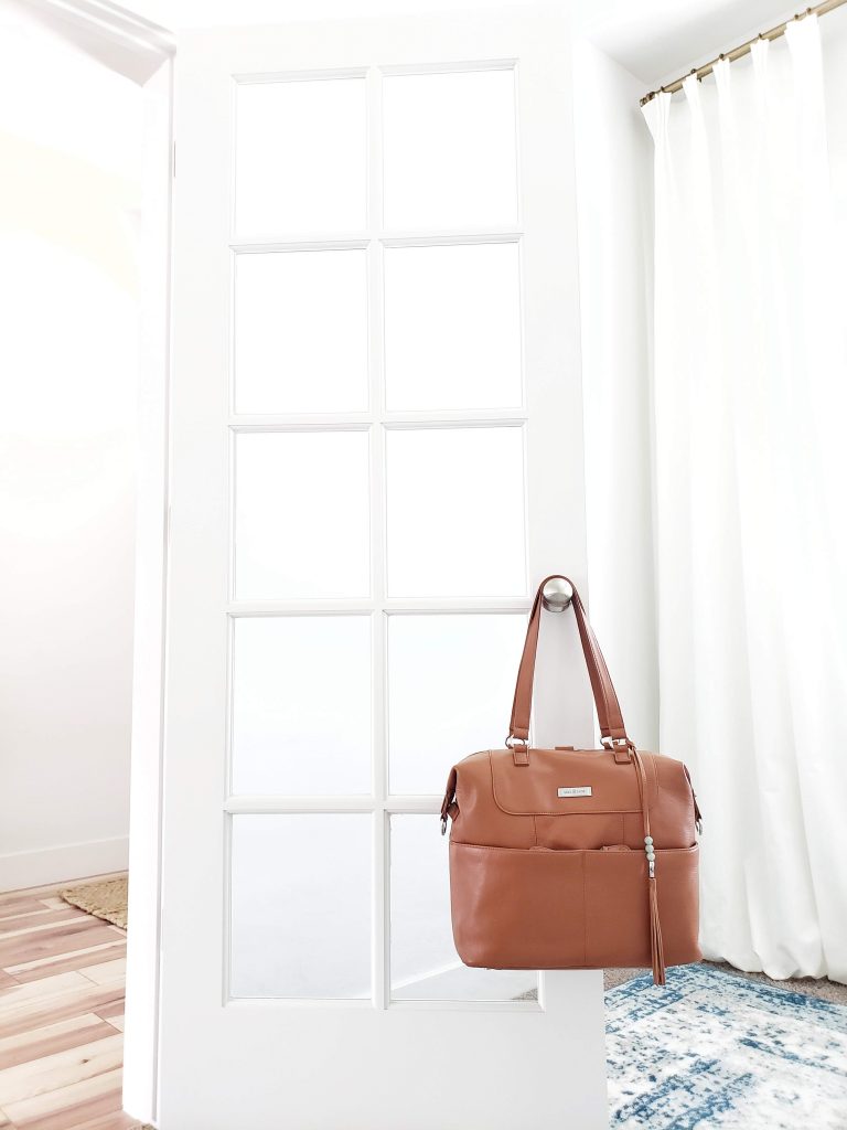
Ok, the day has come. I have graduated from a frumpy boring mom to a cool mom. My kids may still not think so and honestly, I may not be that cool. 😉 That’s okay because at least I look the part with my new Shaylee Diaper Bag from Lily Jade. The good news is that you can be a cool mom too. Be sure to scroll to the bottom to enter the GIVEAWAY.

I don’t know when it happened. Actually, yes I do know. Somewhere between kid number one and three I gave up. You know what I am saying? Of course not because I know you are all too cool and always stay on top of things. But for me, I just got into a frump of survival mode. Also known as a “mombie.” It happens to the best of us. One day I was all trendy and then next day I was cleaning up poop and cheerios. I’m not saying there is anything wrong with that either. It is all a part of the seasons of life we pass through.

Diaper bags became an ugly bottomless pit of stuff. Sometimes you could find what you needed in that mess of a bag and others times not so much. A catch-all for the “just in case” moments of motherhood. Oh yeah, and it was my purse too. So, yes in that baby bag of a disaster there was a wallet, lip gloss (if I was lucky), keys, and few other essentials. Just a big hot mess that I dreaded to take places. In fact, I would usually leave it in the car at all costs. Then I would have to make the dreaded trip back to the car if I needed anything out of that diaper bag. Gosh, it was bad. Realllllll bad!

At a low point, I will admit to dumping everything into a Wal-Mart sack. Ask Mr. Whitelane about that one. Not good people. I needed a diaper bag, purse, and style all in one. What if I told you that existed? It really does and you can graduate with me!

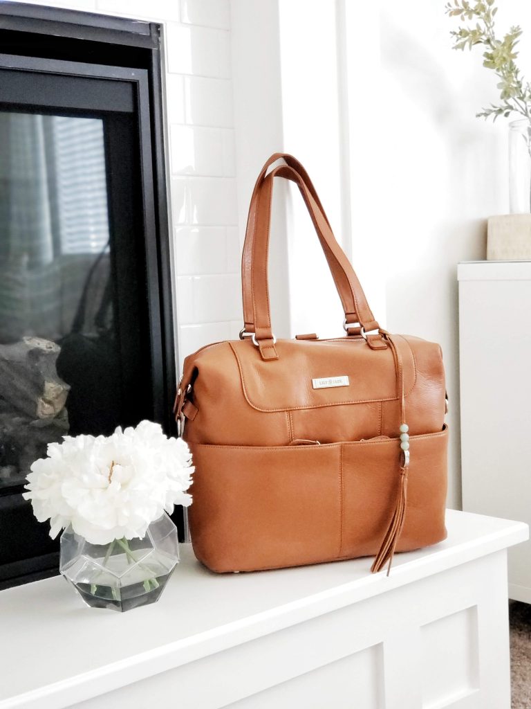
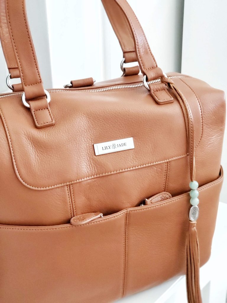
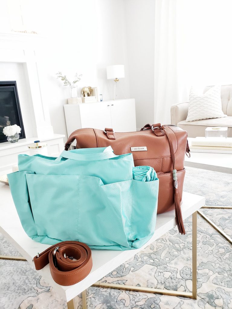
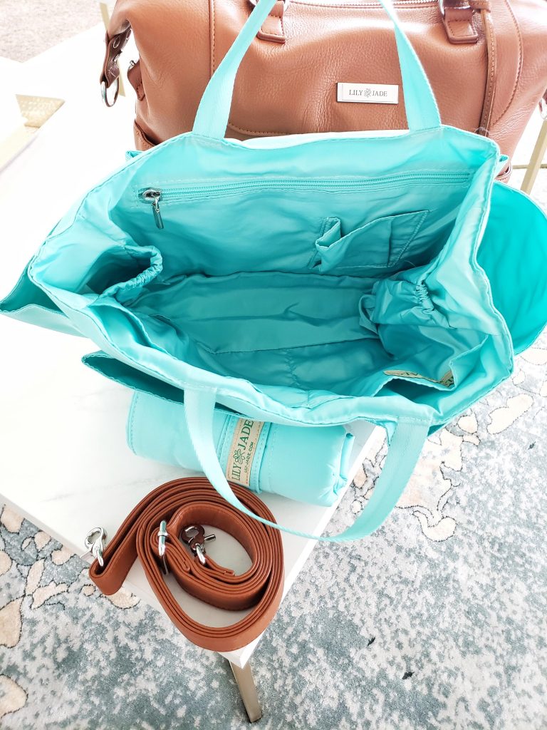
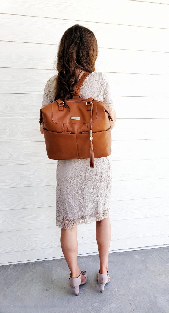
Meet Shaylee. She is this sophisticated and has so many features. There is a removable, washable 12 pocket organizer with two small handles that tuck away when not in use. It is like two bags in one. A diaper bag within a purse. I can simply pull this organizer out with all my baby stuff when I don’t have the kids. Then Shaylee becomes my cute purse.

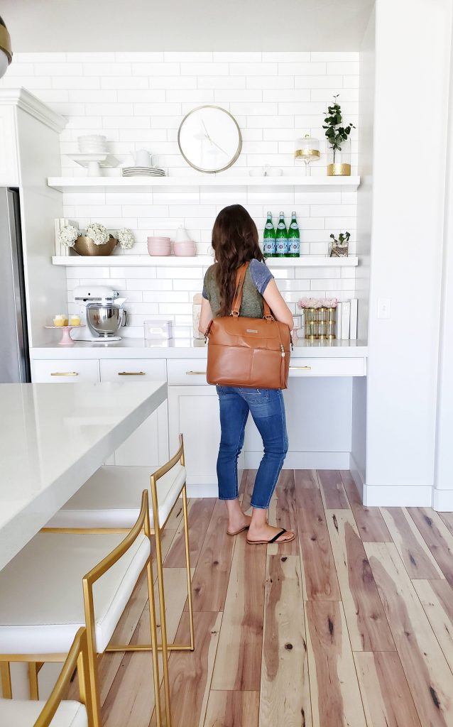
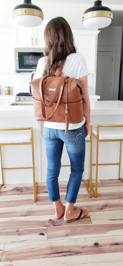
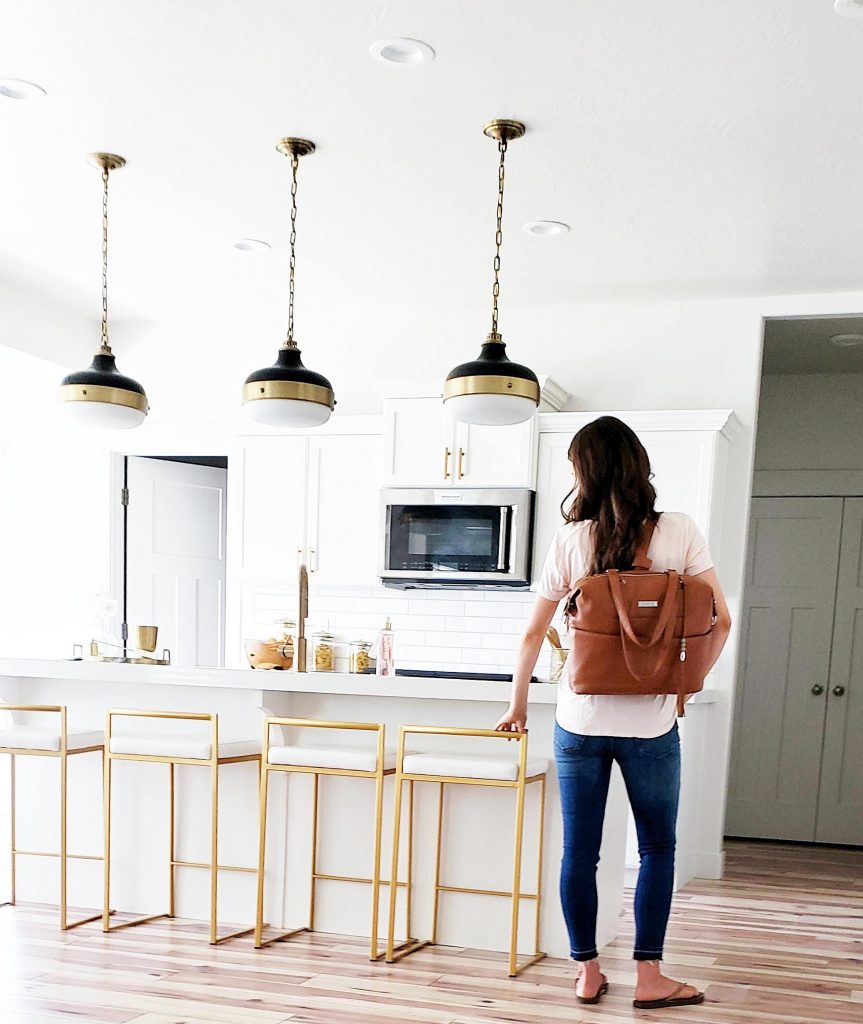
Let’s talk about all the ways you can wear this bag. It can be worn the shoulder, as a messenger bag, or as a backpack. I have worn this Shaylee in every position and love how versatile it can be with kids. The cute tassel is major eye candy. All the compartments and pockets are perfect for quick access to my go-to needs. The naturally tanned leather is absolutely stunning!
  

This bag is sophisticated and grows with me. So, guess what? When my kids are out of diapers and I just need a purse, this beauty is all mine. Out goes the organizer with diapers and bottles. This versatile bag can transition for each stage of life. I love that it is made out of real leather that can last for years to come. The perfect mom bag for every day.


Ok, this Shaylee has saved me from my slump. It is super stylish while being functional to meet all my mommy needs. Hallelejuah! Even if I am in a t-shirt and sweats I still feel put together with my Lily Jade on my arm. It really keeps me organized and looking like I know what I am doing. Hey, even if I am winging life, motherhood, and the day most of the time.

I am glad I have Shaylee on my back making me look cool doing my “mommin.” 🙂 You can win a beautiful bag for yourself too. Enter the giveaway HERE for a $375 Lily Jade Credit. Lily Jade has so many beautiful styles from diaper bags to lifestyle and travel totes. Be sure to go see more at Lily Jade.

Hudson Valley Lighting

The following post contains affiliate links & is sponsored by Hudson Valley Lighting. Read my full disclosure here.

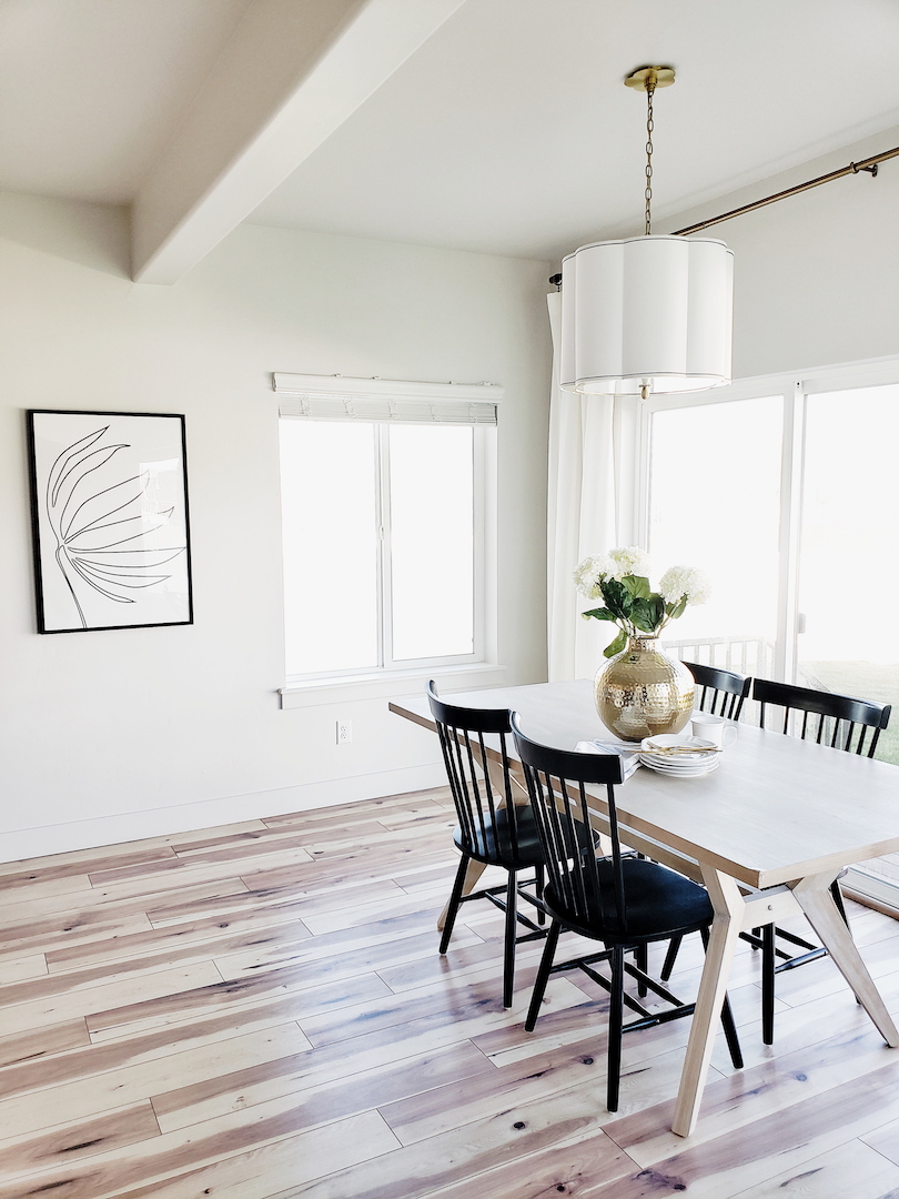
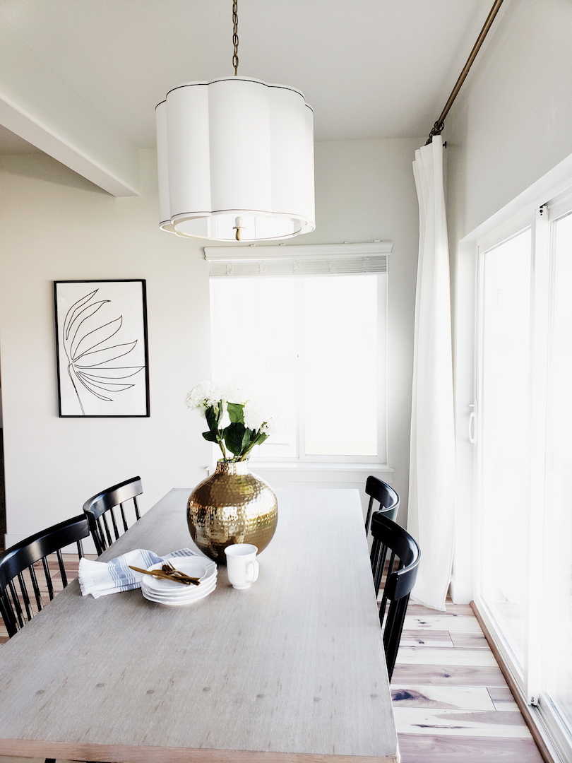
I am so excited to have some finished rooms here at our new house. I have been eagerly waiting to show you this dining room and front living room reveal. I could not be happier with how everything came together. I decided to go clean and simple for this little dining nook. I have always wanted a dining nook. Most of our previous homes have been an open concept with the dining room between the kitchen and living. Having the dining room to the side of the kitchen creates a better flow and works for our family. It is still open and bright. I really just like looking out from the kitchen to the living room with no dining room blocking the view.

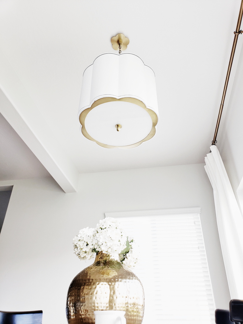
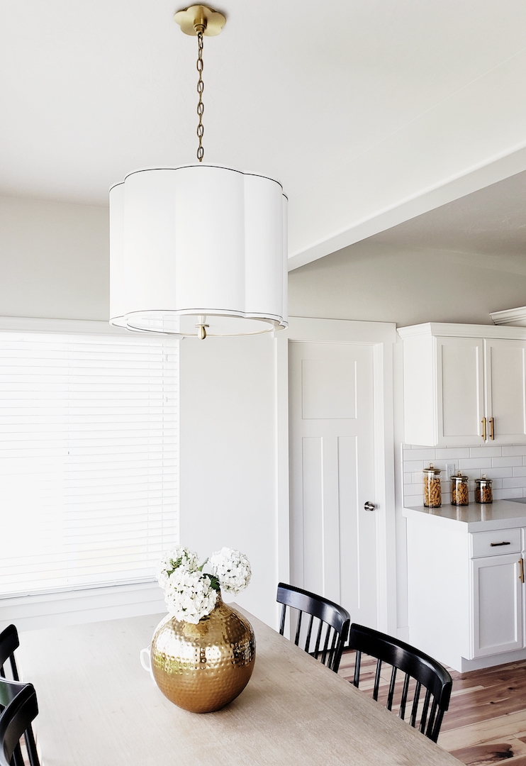
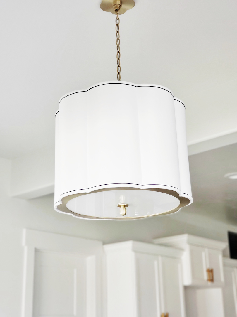
Ok, let’s talk about the gorgeous elephant in the room. I have said it a million times but lighting can make such a huge impact on a space. You can take a builder basic house and transform it into a curated home by just swapping out a few light fixtures. It really does make a statement and sets the tone for the rest of the room. I knew that Hudson Valley Lighting was my go-to for the dining room. I found several gorgeous contenders but then I stopped dead in my search. There it was, the perfect pendant. The Sweeny. Isn’t she a beauty? Look at those scalloped curves and perfect pinstripes. The aged brass chain and plate cover is the icing on the cake. I could go on all day about this pendant.

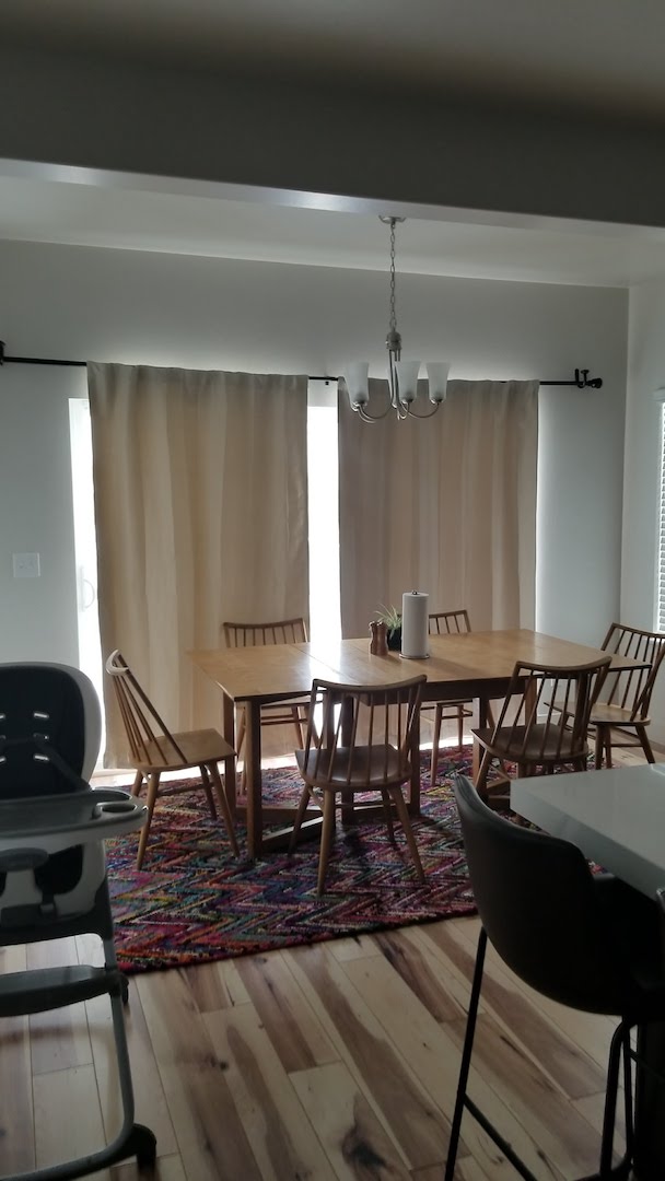
I’ll be honest. My husband was not sold on this light until it arrived and I got it installed. Once he saw it in our dining room he knew it was the one. I mean how could you not love this pendant? I went with the 20″ by 18″ pendant and it is the perfect size for our 72″ table. I almost went with the larger 25″ as well. I really think it would have been fine too. You really can’t go wrong with the Sweeny. You can see what a change this light made for the dining room by looking at the before picture below.

It is retro, modern, and timeless all at the same time. I love that this Sweeny Pendant can blend with so many styles to create the perfect ambiance.

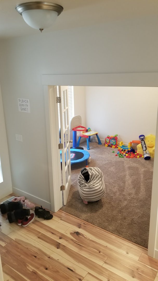
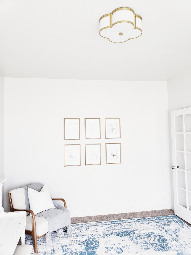
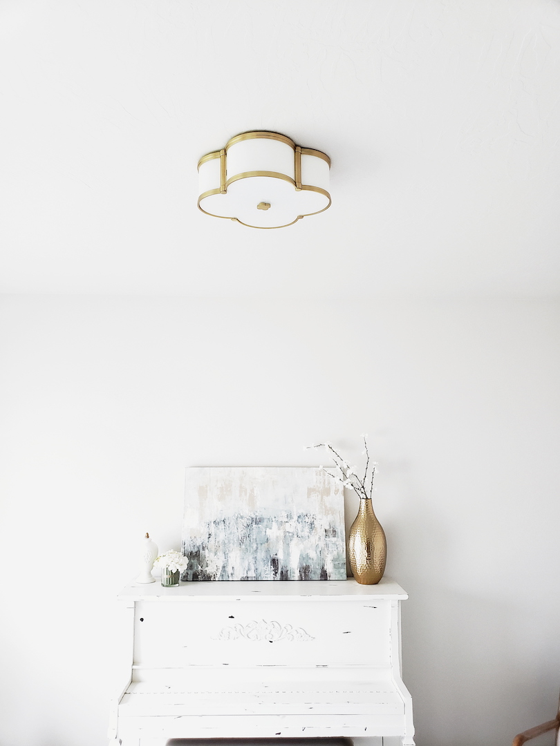
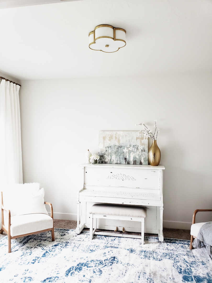
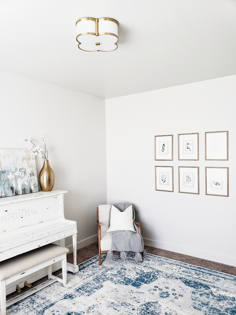
But wait there is more. 🙂 The front room had to get its own ceiling jewelry. This front living room is a lot smaller than in our previous home. However, it still fits the piano and a few chairs. It really works for our little family. Now, to fully appreciate the after you have to see the before. The previous owners used this room as a toy room. There were dome lights everywhere. A classic staple in tract homes. WHY!? They are the worst. Well, guess what? There is the cutest little flush mount that coordinates (in my opinion) with the Sweeny pendant.

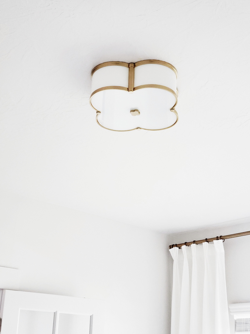
Meet Chandler. How cute is this little guy? The quatrefoil design with opal glass has me all heart eyes. Of course, it is aged brass because that is my new fav color. It flows so well with the touch of soft blue I have in this room. The Chandler is a great stylish alternative to dome lights. It is still a flush mount but with all the wow factor that this room needed. See what I mean? Lighting does wonders for updating a room!

Both light fixtures have been such a great finish to these two rooms. When style meets quality it is a rare combination these days. Often times you can find really cute lighting that has poor craftsmanship and doesn’t last. I have to say Hudson Valley Lighting is definitely well made. A breath of fresh air in the design vertical. I still have a few more rooms to update and I have been obsessing over some of their other lines too. What are you waiting for? Go give your room a whole new look and swap out your basic or outdated lighting!
Round Table Roundup

The following post contains affiliate links. Read my full disclosure here.

I have recently been working on a design that needs a round table. Although I love my rectangular table, the round is a fun change. I have always wanted a round dining area. I don’t know why but they make such a cozy fun space. Anyway, try saying round table roundup fast five times. 😉 Quite the tongue twister. 

Round wood tables are such a great way to add warmth to your dining area. The wood tones do a fabulous job of adding just the right amount of neutral character. You can really pair a wood table with any fun chair and make a statement. As you can see below, this round wood table paired with, wood chairs layered with cream slipcovered chairs, take on an elegant rustic look. The chandelier is really the icing on the cake (or table). The lighting coupled with the right table can really change the entire mood of the space too. I will have to save lighting for another post….

Image via here.

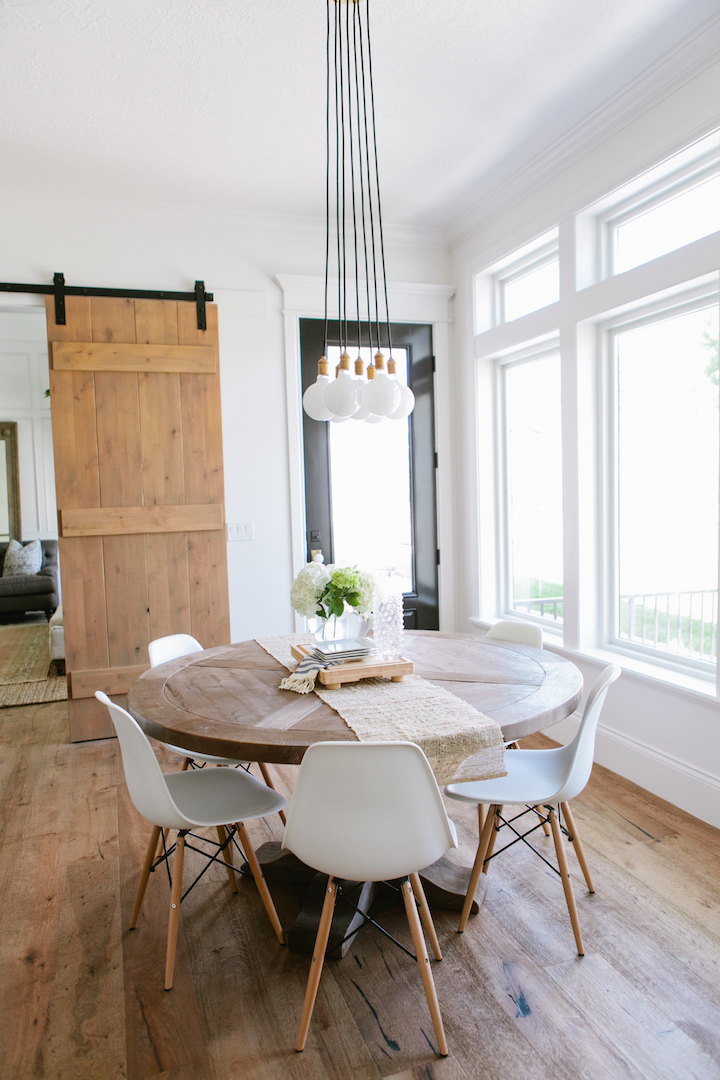
This next wooden round table by House of Jade Interiors is fun because it mixes two styles together seamlessly. The rustic table paired with the modern chairs and fixture coordinates perfectly with the feel of the house. Tasteful and just the right amount of each style creates the perfect combo for this area.

Image via here.

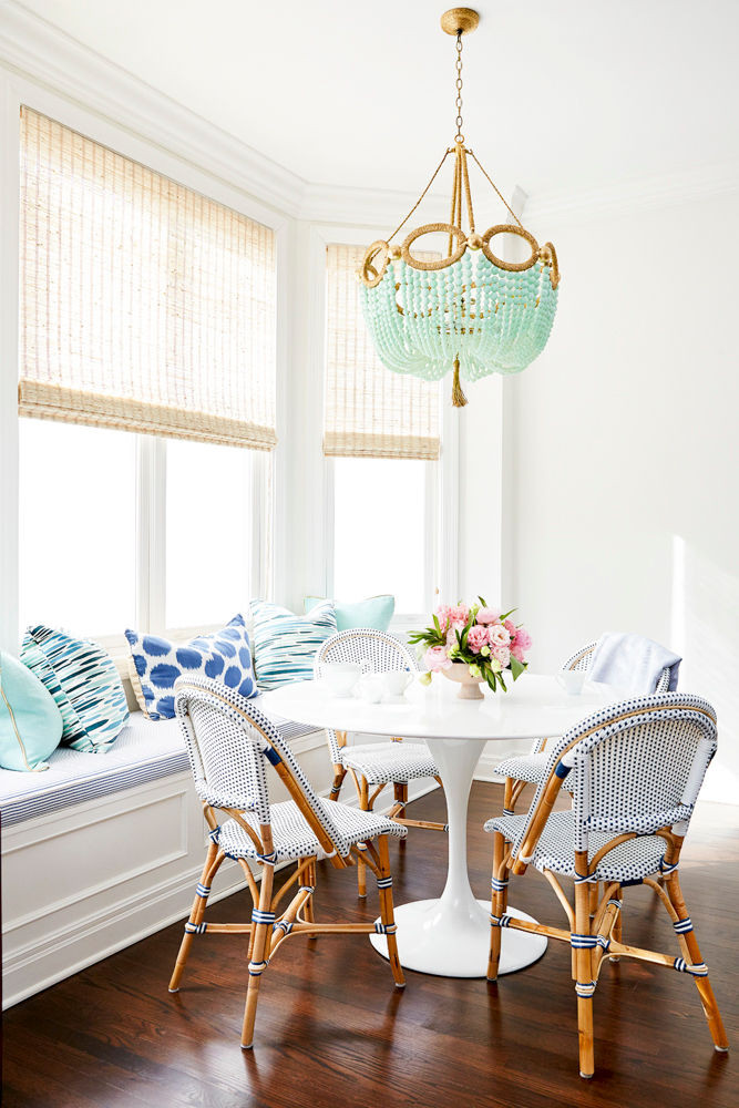
Let’s give tulip tables a minute. They have become quite the little hit in the past year. Typically used in the mod scene, tulip tables have been around for decades. Not anymore. The dining room below proves that the right chairs and styling can put any tulip table right back into now. The classic white tulip table is neutral and can pair well with all decor. Needing to fill a larger space? Try an oval tulip table and have even more chairs and seating for the family. It looks just as good and can fill that dead space the round table couldn’t. I personally love a good bistro chair with a white round tulip table like the one below Some may argue it is too coastal. I beg to differ on this one because bistro chairs are not just for the French or beach anymore. They can fit seamlessly into any style with the right accents.

Image via here.

Tulip table, wood table, or any round table. The style and cozy circle created by a round table is fun and not something you see all the time. Although gaining popularity, the round style is a welcomed change when I see it in homes. So, ditch that square or rectangle and gather the family around the round table tonight.


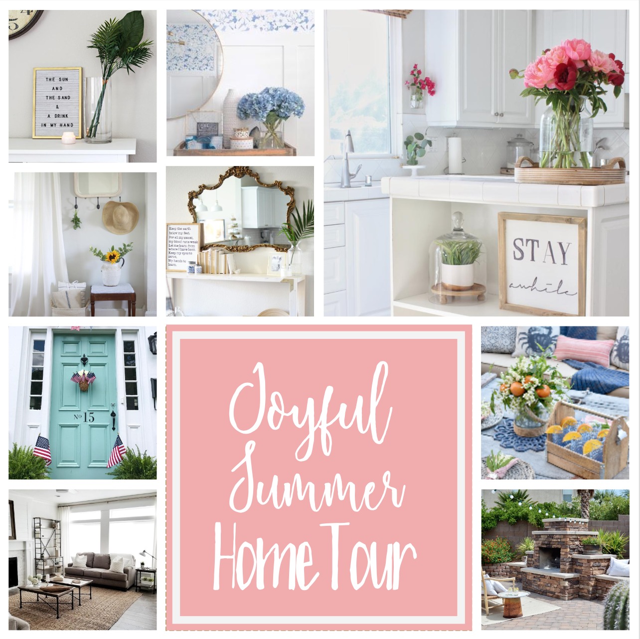
Joyful Summer Home Tour 2017

I am so happy to be a part of the Joyful Spring Home Tour this week. If you’re coming from Farm House on Boone or My Vintage Porch, welcome!  There are so many talented bloggers that I have teamed up with to bring you this tour. Their homes are gorgeous and you will just love having a peek at how they have styled their homes for the summer. Be sure to follow the schedule at the bottom of this post to see all the homes.
Summer is one of my favorite times of the year. It may sound crazy but I love having my kids home from school! There are no schedules or routines. Just fun days of spontaneous activities that we can do. No alarm clocks or rushing our the door. It is nice to just slow down and enjoy the day or whatever may come our way. We really enjoy spending time at all our local splash pads. The cities around us all have splash pads that the kids can play at for free. We usually take a bunch of snacks, water toys, and blankets or lawn chairs. We can easily spend the entire day camped out there playing.

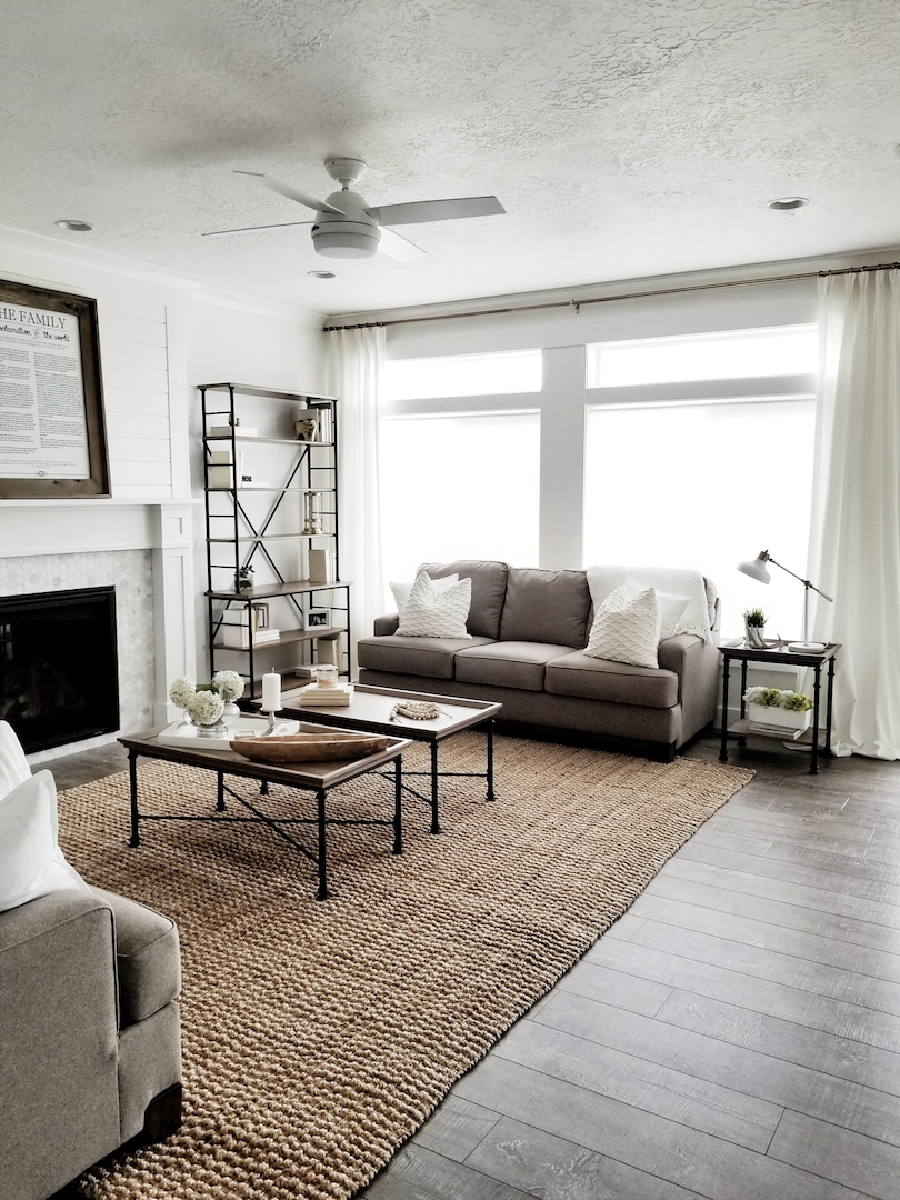
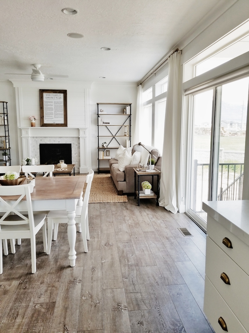
I feel like this laid back summer vibe crosses over into my decor in my home for the summer. I like to keep it simple and clean (big surprise). My mantel has no garland or banners. When I first took down my Easter decor, it felt a little sparse and naked. I quickly got used to the simplicity and now I love it.  The coffee tables keep that neutral look with a few wood and white elements. I really think having a neutral canvas creates a calm atmosphere for a space. It is fun to add in my pops of color for holidays. However, I still love a simple neutral palette, when all that is gone.

My dining table just has a small centerpiece. A brass bowl with some white hydrangeas. I don’t like to put anything too tall in the center of my table. It just gets in the way at dinner time. It makes it easy for the family to pull out a chair, start eating and share the day. We thought about doing built in shelves next to the fireplace when we moved into the house. I found these Ballard Design shelves instead. They were a great price and it is something we can take with us if we ever move.

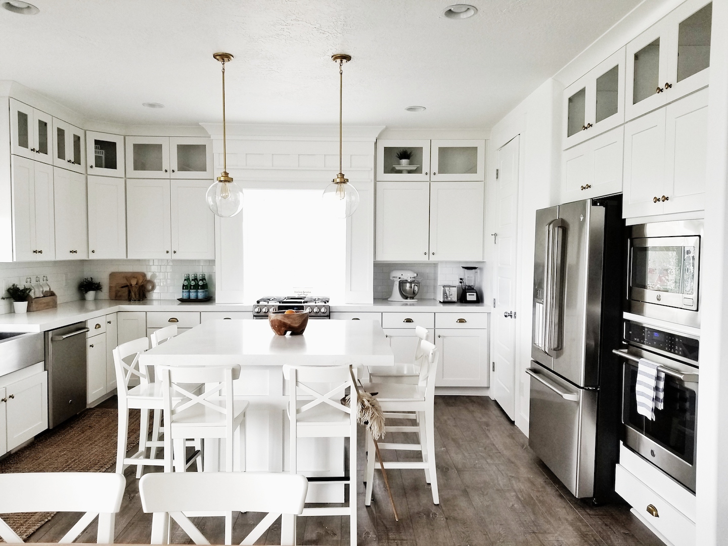
My kitchen is easily the room we spend the most time in. After school snacks (now summer snacks), all the meals we cook and just talking. It is the gathering spot in our home. My daughter left her stick horse on the bar stool. I was going to move it out of the picture. I decided to leave it because it reminds me of the sweet moments we share as a family in this room. It was just fitting for this area. It is fun to hear and see them playing while Mr. Whitelane and I cook (mostly Mr. Whitelane). 🙂

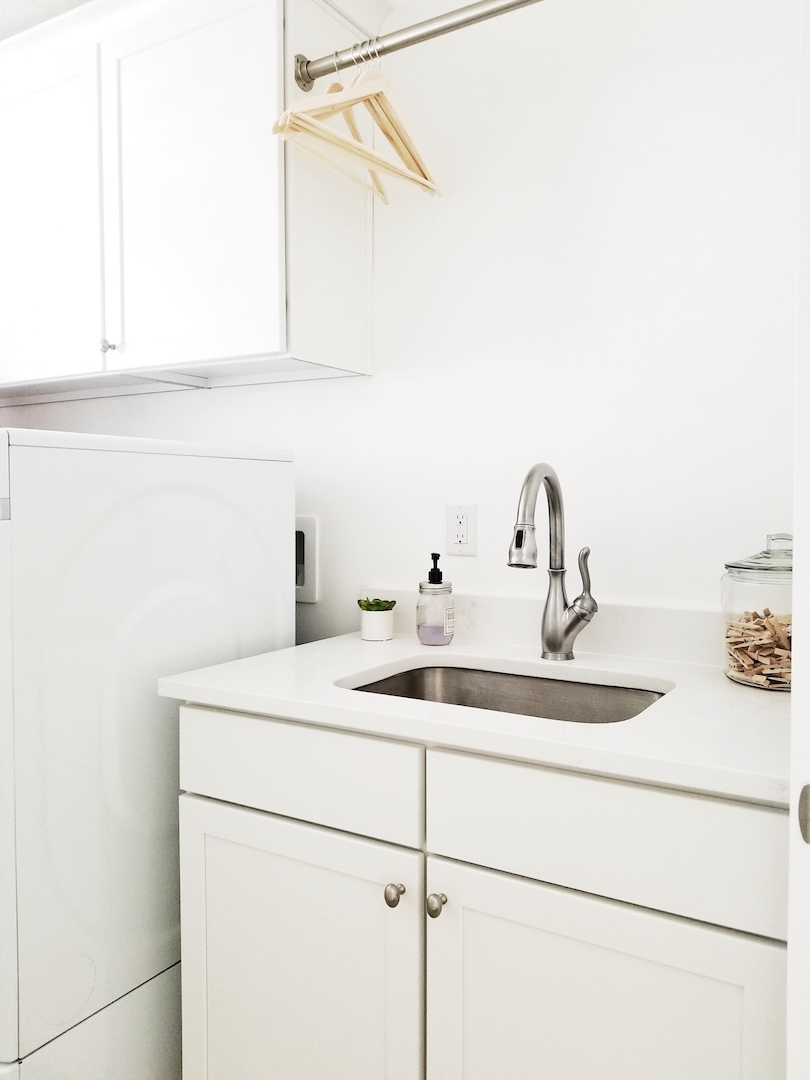
Finally, I wanted to show the summer refresh I did in the laundry room. I know, it’s just a laundry room. I feel like I spend the other half of my life in here though. It might as well be cute, right? It is a narrow room making it a little difficult to photograph. I am so glad we put a sink in this laundry room. It has come in handy so many times. We recently switched out the faucet in the kitchen and put it in here. I like this stainless faucet a lot better than the builder basic chrome faucet that was here previously. Mr. Whitelane and I also added the laundry drying pole across the top of the sink. I am a wierdo about drying certain clothes in the dryer. This drying pole has been a life saver. I also found this cute succulent at the Target Dollar Spot. The soap pump was a Home Goods Find from a few years ago. I finished off this little area of the laundry room with a glass jar of clothespins. I just think it’s cute and adds some depth to the space.

I hope you have enjoyed this little summer tour of mine. Be sure to continue the fun over the next few days and check out the other bloggers in the lineup below. Hop on over to Lisa at Farmhouse on Boone and Natalie at My Vintage Porch next to see their tours today!

June 1st- Laura at Meaningful Spaces, Stephanie at Belle Amour Blog, and Marci at Lemons to Lovelys. 

June 2nd- Hayley at A House with Books, Jordan at JorDecor, and Kim at Kim Power Style.