The following post contains affiliate links and is sponsored by build.com. Read my full disclosure here.
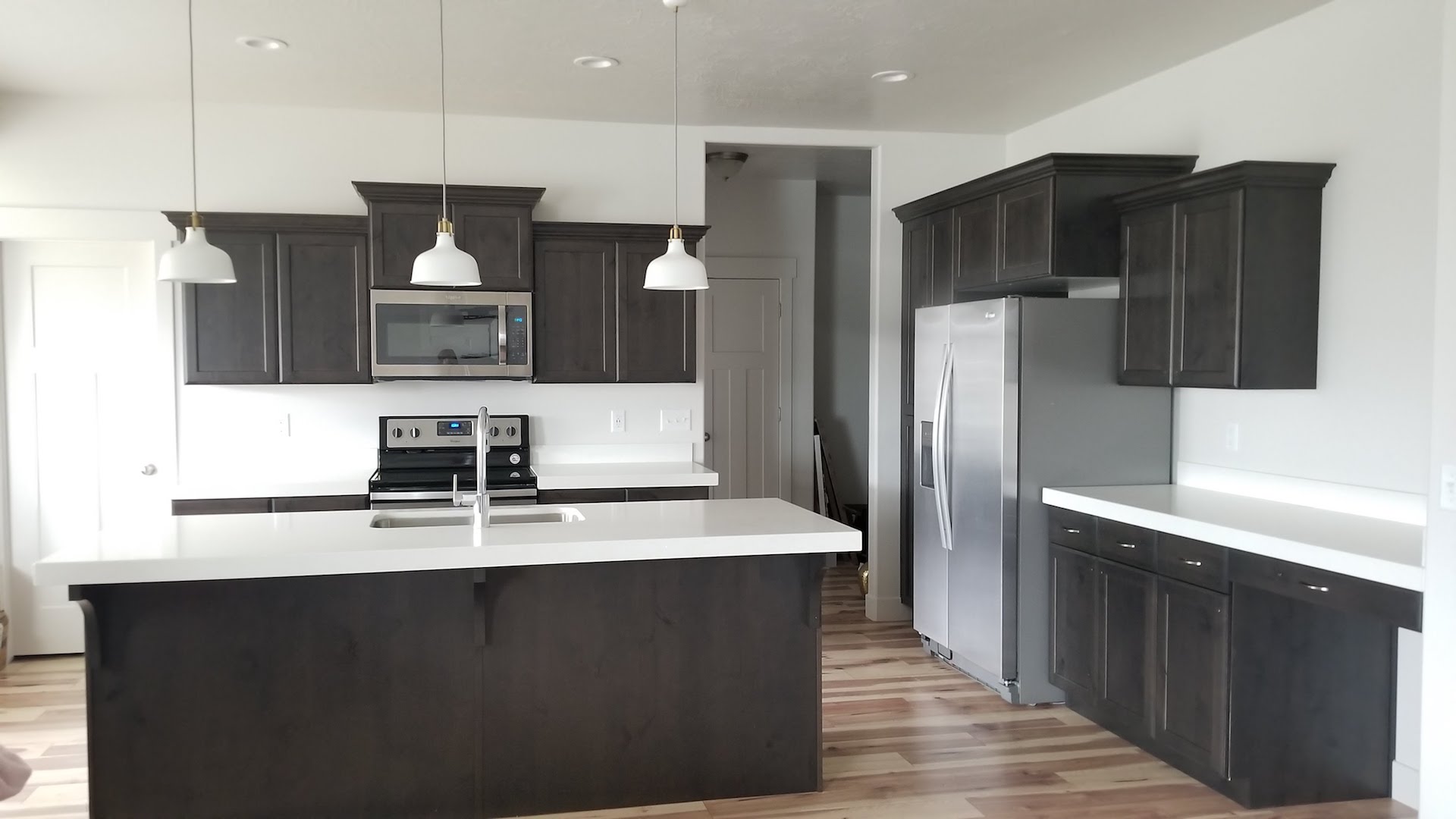
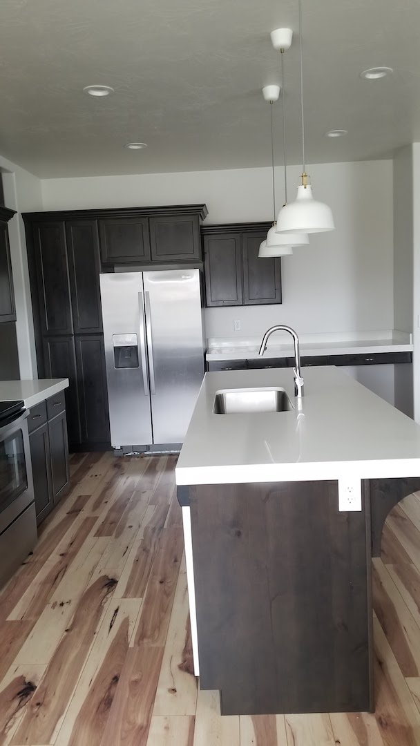
The time has finally come to show you the first reveal of the kitchen. EEEEKKKK! I am so excited I can hardly stand it. Let me first give you a little backstory on this kitchen and show some before photos. This house is fairly new and only about ten months old. We bought it from someone that had lived here for those months. I am not sure if they built the house or if it was just a spec home they picked up from the builder. We knew right away it was a great floor plan. It utilized/ removed all the wasted space we didn’t use in our previous home. The style and finishes were definitely not our favorite. However, they were cosmetic changes that we didn’t waste any time getting started on. Mr. Whitelane and I decided to start with the kitchen and make it fit our style and taste. But first a look at where it all started.
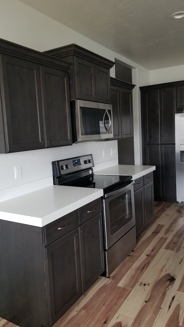
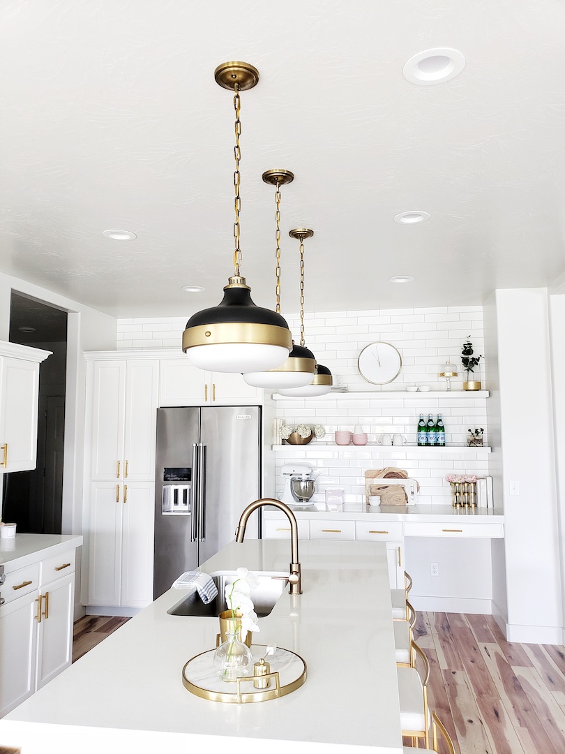
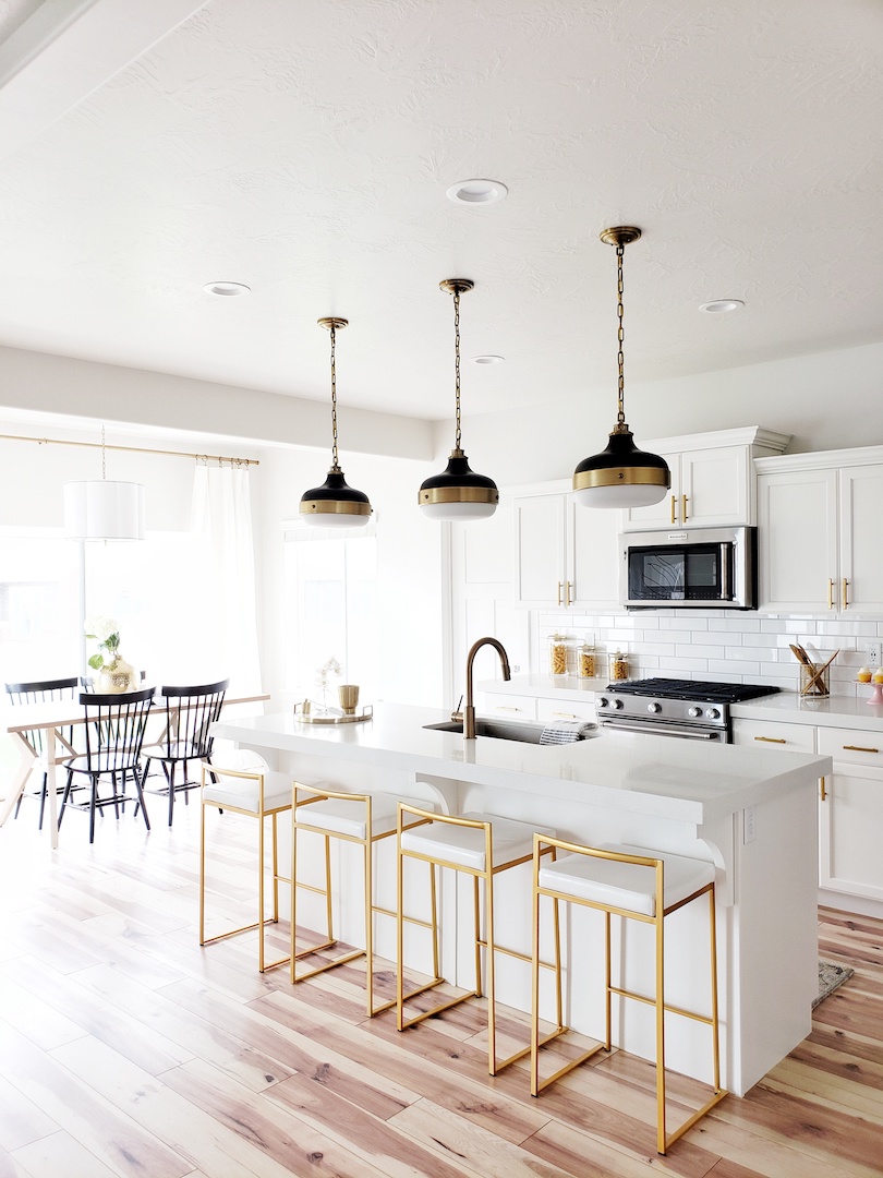
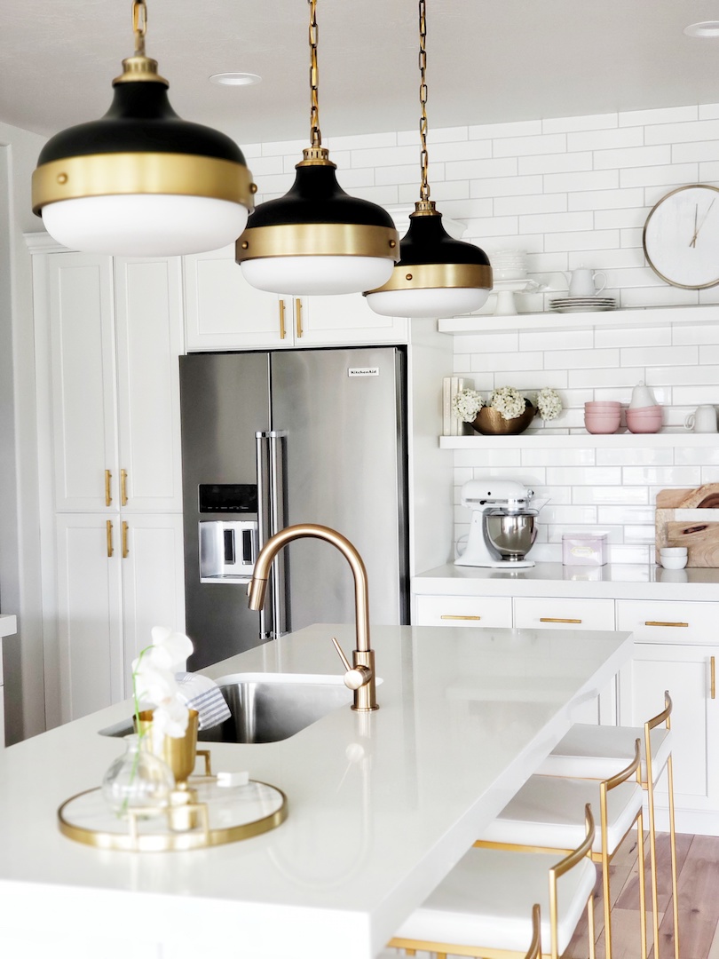
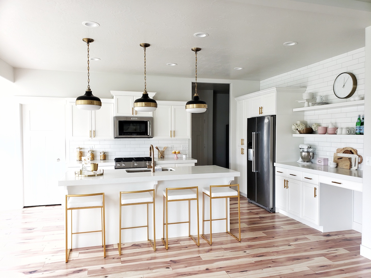
The before photos show how dark and heavy the kitchen was. We all know I love a white kitchen so that was one of the first changes. Painting the cabinets white was a huge impact! They were a dark knotty alder wood so that was a fun challenge that we hired out. Next, we hired Coby to install three by twelve subway tile backsplash and it really helped lighten the kitchen even more. I also thought it would be a good idea to remove the cabinet next to the refrigerator and do open shelves. I love having these shelves to display all the fun nicknacks.
Let’s be honest, the real show stoppers are the Feiss Pendant Lights and Delta Faucet from build.com. Let me introduce you to your new best friend for all the things, build.com. Have you ever seen all the amazingness they offer in ONE place!? One stop shopping at it’s finest. I don’t have a lot of time to try and hunt down all the pieces for a project from multiple websites. Build.com has been a lifesaver because they offer everything you will need in one convenient place. From furniture and decor to appliances, tools, and flooring. They really do have it all. Finally, a DIY’ers (and anyone who shops) dream spot. I also have to say that the prices are really great too.
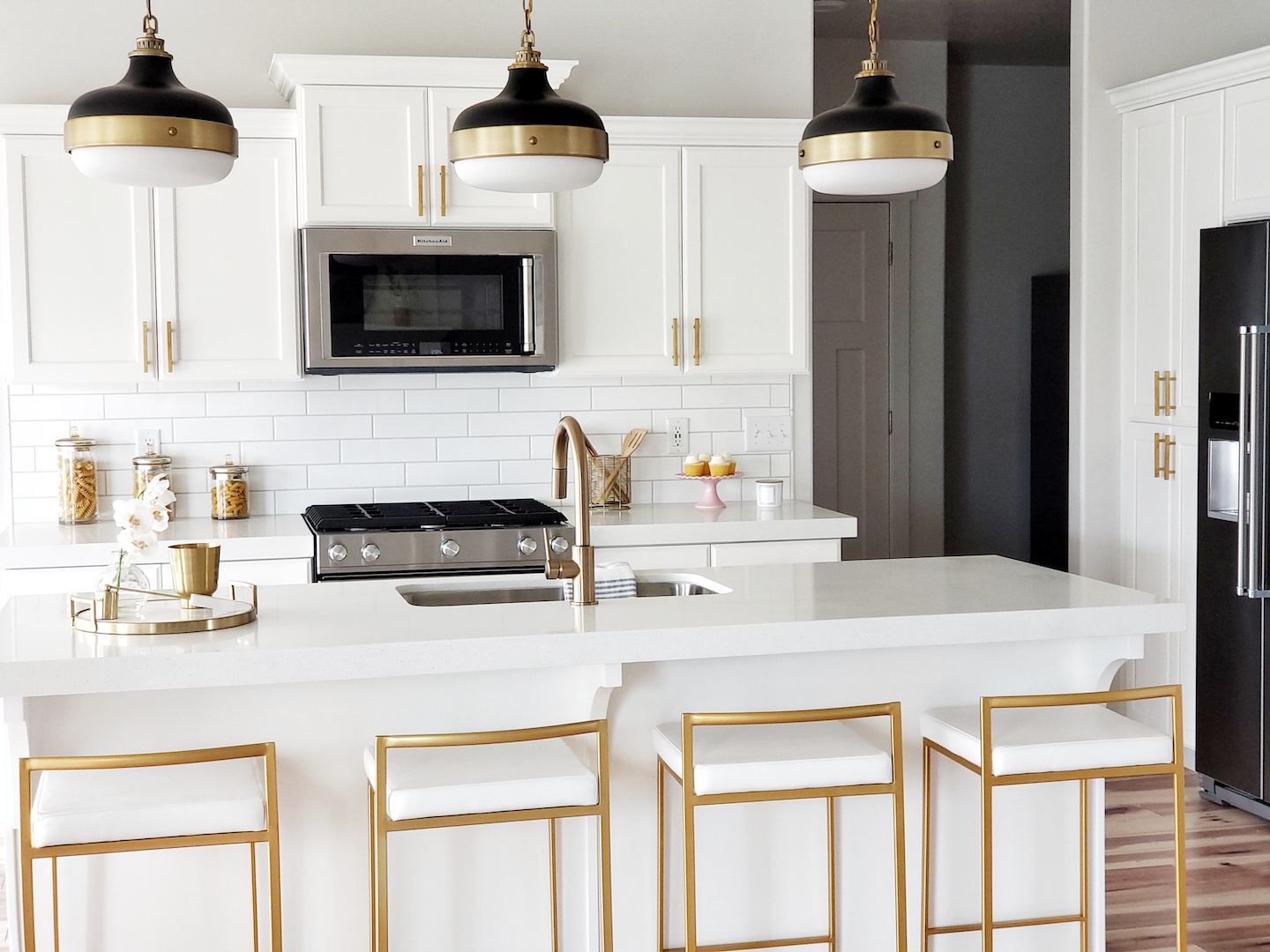
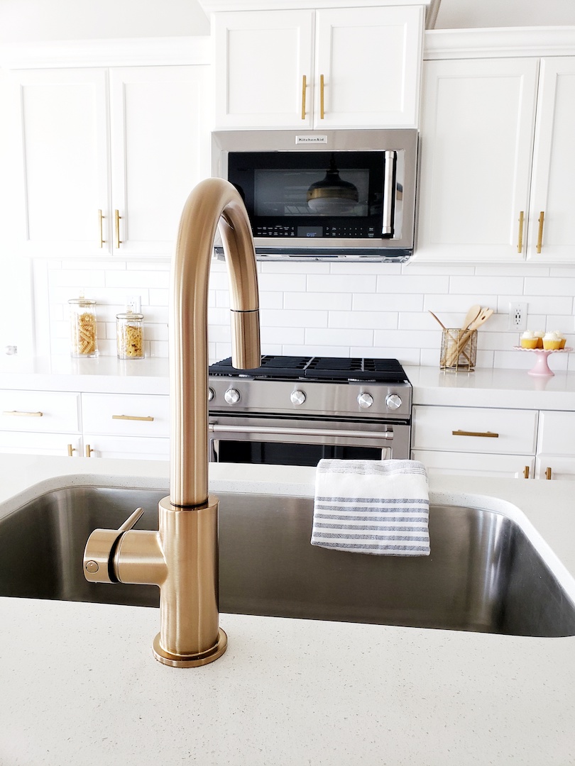
Ok, back to the amazing Feiss Cadence Pendants. I went with the 13″ in matte black and dark antique brass. When they first arrived Mr. Whitelane was hesitant about the size being too large. After all, there are three of these babes across the island. Full disclosure: I got a little worried for a second too. However, once we got them installed, it was pure love! From the second I started dreaming up ideas for the kitchen, these pendants were part of the plan. I love the black and brass together. The Cadence Pendant is just the right mix of chic, industrial modern, and bold. They really do tie everything together in this space while being the eye-catching statement. The brass accents pair perfectly with my champagne bronze Delta Trinsic Facuet.
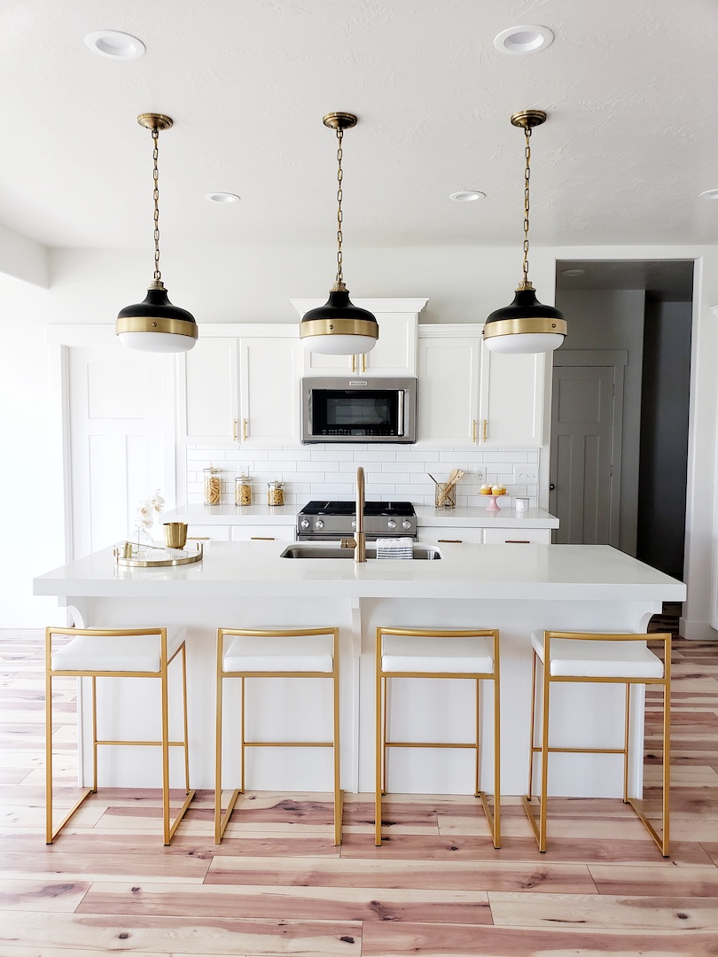
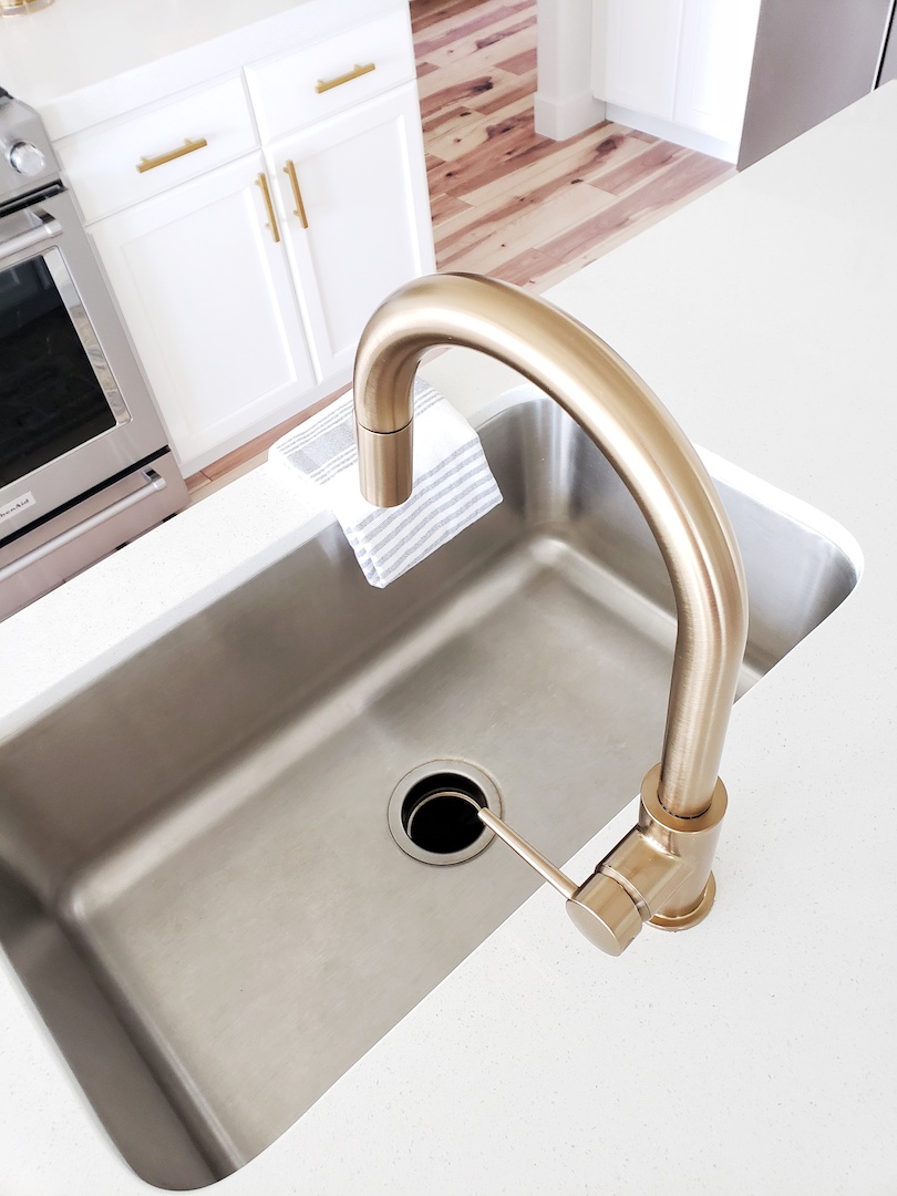
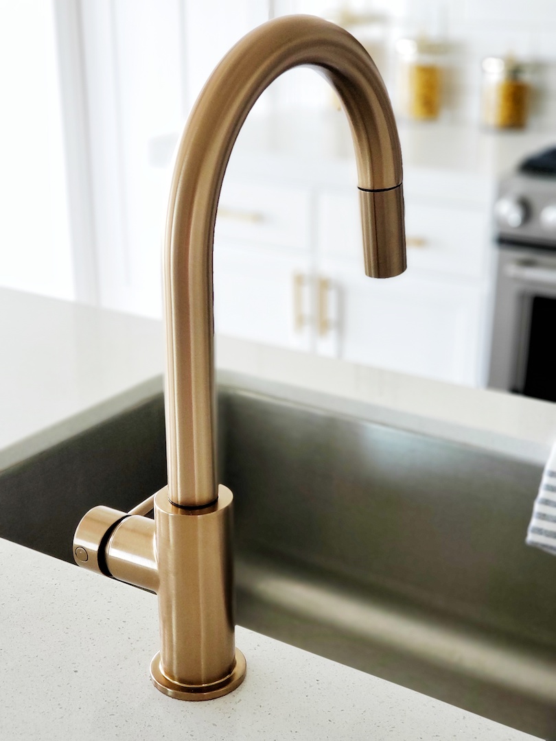
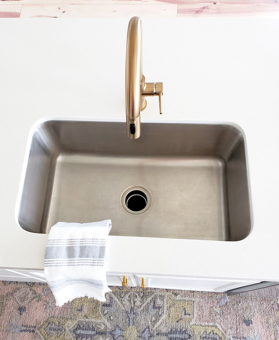
This faucet is what champagne dreams are made of. It is affordable, sleek, and such an elegant piece. The pull-down magnetic docking spray head is probably my fav! Doing dishes never felt so good! At least for now. We will see how long that good feeling lasts. 🙂 I get asked a lot about how I knew the champagne color faucet would match the brass Cadence Pendants. Guess what? It doesn’t matter. They do coordinate perfectly but they don’t have to be an exact match. Designer tip: choosing finishes in the same color palette that coordinate (don’t have to match exactly) creates depth and variety in a space.
Moral of the story, you need this yummy champagne faucet in your kitchen like yesterday! I also want to give a big high five to Mr. Whitelane for installing this beauty all by himself. This Delta Trinsic Faucet was so easy to install and I could not be happier with how perfect it fit into our kitchen update. The best part is that both the faucet and pendants were delivered right to my front door from build.com.
Can you believe what a transformation this kitchen has undergone? It went from the dark and heavy to light and bright. It is amazing what paint, tile, light fixtures, and the perfect faucet can do. This is one of many updates to this house. We are busy over here on our next project that I can’t wait to share. In the meantime, I am headed to do some shopping in my pajamas for that project on build.com. 🙂


Love the stools! ???? Where did you get them?
Thank you! I have a full blog post about the barstools that will be up on Friday, May 18th. They are from LumiSource. They will be linked in my post on Friday. 🙂
I too love the bar stools. Also the dining room chairs, where are they from? Beautiful kitchen,.
Here is the affiliate link to the dining chairs: https://go.shopyourlikes.com/pi/1f2bf00784182a197bbb2b985d9b3473381d9ad8?afId=626526&afCreativeId=2994
To the barstools: https://amzn.to/2ZmhOLF
Gorgeous kitchen! Where are the shelves and gold handles from??
Thank you! The gold handles are from Amazon but I wouldn’t recommend them. The color has already started to fade and rub off. I will be switching them out to a new bar pull. The open shelving is from Ikea (Lack shelf).
What is your wall paint color?
Hi, the color is called “Eider White” by Sherwin Williams.
I love the pendant lights. When I look them up online, the antique brass looks very dark, however your pictures look like a brighter gold color. How bright is the brass band?
They have variations of brass and gold. A good medium tone between the gold and brass- definitely pulls more brassy though.
Wow!! What a dreamy kitchen!
What kinda flooring is that? I love it too.
Thank you! It is a laminate by Inhaus called “desert hickory”.
Great kitchen! Where is that rug from?
Thank you! It is from Target. Here is the affiliate link. It might be sold out :(. I got it a while ago. https://api.shopstyle.com/action/apiVisitRetailer?id=647871901&pid=uid8624-39650932-57
Love the kitchen! I am in process of a build and am putting in the Delta Trinsic champagne faucet. I had my eye on the same Feiss pendants, but wasn’t sure if they’d go with the faucet & hardware I’ve chosen. Glad I found your post and see how great they look. Question…. what are the dimensions of your island?
So glad it helped! I will measure the island when I get home and get back to you.
Can you also let me know the size of the island? I have the same question…wondering if I need two or three of those awesome pendants! Great job! This looks amazing!
Thank you so much! My island is 93.5″ long.
I love the bar stools where can I order them from
Thanks. Here is the affiliate link to the barstools. They come in multiple colors as well. :https://go.shopyourlikes.com/pi/89d33819f2285217558dc179f1b672376a634d36?afId=626526&afCreativeId=2994
What color are the cabinets ?
The cabinets are painted “Chemcraft Stock White.”
Where did you get the lighting?
Here is the affiliate link to the pendant lights. I have really loved them: http://go.shopyourlikes.com/pi/83b46b79e12d2d0e22cd52bc5516767822c176cd?afId=626526&afCreativeId=2994
I love the color of your grout against the white subway tiles. May I ask what color grout you went with?
Thank you! It is Mapei “FROST” grout.
What are the countertops? Love what you’ve done!!
Thank you! The countertops are quartz. I don’t have the name because they were in the house already when we bought it from the previous owners.
Where did u get the kitchen bar stools.?
I love these stools! Super kid friendly too. Here is the affiliate link to the gold bar stools: http://go.shopyourlikes.com/pi/2eb7644bc49bb71036a770bb4c79366d9a44bf87?afId=626526&afCreativeId=2994
Love the open shelving. What is the distance between the shelving? Are these 9ft ceilings?
Thank you! These are 9ft ceilings. The counter to the first shelf is 19″. The first shelf to the second is 17″.
Love LOVE what you’ve done. Those pendants are amazeballs!! I’d love to know the dimensions of your island. They are perfectly spaced above yours. My island will be 4ft by 8ft and I’m not sure if I need 2 or 3 pendants. Also, when you figure out what pulls you are switching to I’d love the source. I also have the delta faucet. Thx!
Thank you so much! Here is the affiliate link to the new pulls http://go.shopyourlikes.com/pi/8e2658b8cfdb7f340bf44bf6e1b78951d56caa11?afId=626526&afCreativeId=2994
My island measures 93.5″ by 38″.
What was your budget?
Hi! I am building a home and I love these floors! These are the look I’m going for but I am wondering your thoughts on laminate flooring. How do you like it? I see you didn’t change them, so are you pleased with them? Thanks!!
Thank you! I didn’t change them because it was not cost effective and I didn’t mind them. I don’t love the quality of this particular laminate because it is not super durable. I would go with an LVP that is similar to laminate but much more durable.
Hi! I know this is an old post but do you happen to have a source for your subway tile? Is it matte or glossy? Love it!
Thank You! It is glossy. I believe this is the link. We did the rectangular/longer subway tile. https://www.flooranddecor.com/ceramic-tile/meringue-ceramic-tile-100565969.html#start=2
You mentioned that the pendants are matte black and dark antique brass. Why does it look darker on the website than your pictures? Are you sure they are the same as the one online? Thank you!!
Yes, they are the same.
I was wondering if the pendant lights you purchased was the same finish as the one on build.com, stated as matte black with dark antique brass because on the website, they don’t look as “golden” as in your pictures. They looked more like ages brass.
Yes, these are the exact lights from the build.com site. Different lighting can make the color look different. They are the matte black with dark antique brass.
Sorry I thought my first message didn’t go through :), So is the true color closer to your pictures or to what I see online? Is it in between? I like the gold I see in your pictures. How has the gold finish been holding so far?
By the way, you did such a great job with the kitchen!
The finish is great and holding up fine. The color is more brassy gold.
Beautiful kitchen. I was considering the delta trinsic faucet too. Ijust wanted to get your opinion on matching faucets and hardware. I was going to get a black pot filler and a gold tone faucet. Is that a no no? Pot fillers are so expensive and the one I found that is affordable does not come in gold.
Your hardware doesn’t have to match your fixtures. However, I would make sure all your fixtures stay the same color throughout the kitchen. Hope this helps!
I have been looking at that faucet. We will be redoing our kitchen in August and I am putting together my list of items. This faucet is on the most affordable side of my list. I like the clean lines and the color will go well with my choice for brass knobs. I have to ask, how is the faucet standing up to cleaning and everyday use? Any insight you share will help me narrow down my list.
It has held up great so far!
Hi! You think a kitchen like that, white with gold, would work with the a dark (medium dark grayish) floor?
I think it could still work!
Hi
Do
You know where the sink is from?
I don’t. It was already in the house when we bought it.
Nice kitchen ! How long is your island in meters ?
We have sold this house so I am not sure what the measurement was. Sorry!