The following post contains affiliate links. Read my full disclosure here.
I wanted to give a little hard finish tour of the basement. Nothing is decorated or styled but construction is complete. I have had so much fun making this space our own. Since we were not able to build this house, designing this basement has made it feel personalized. I wanted to create a space that felt light and airy (even in the basement).
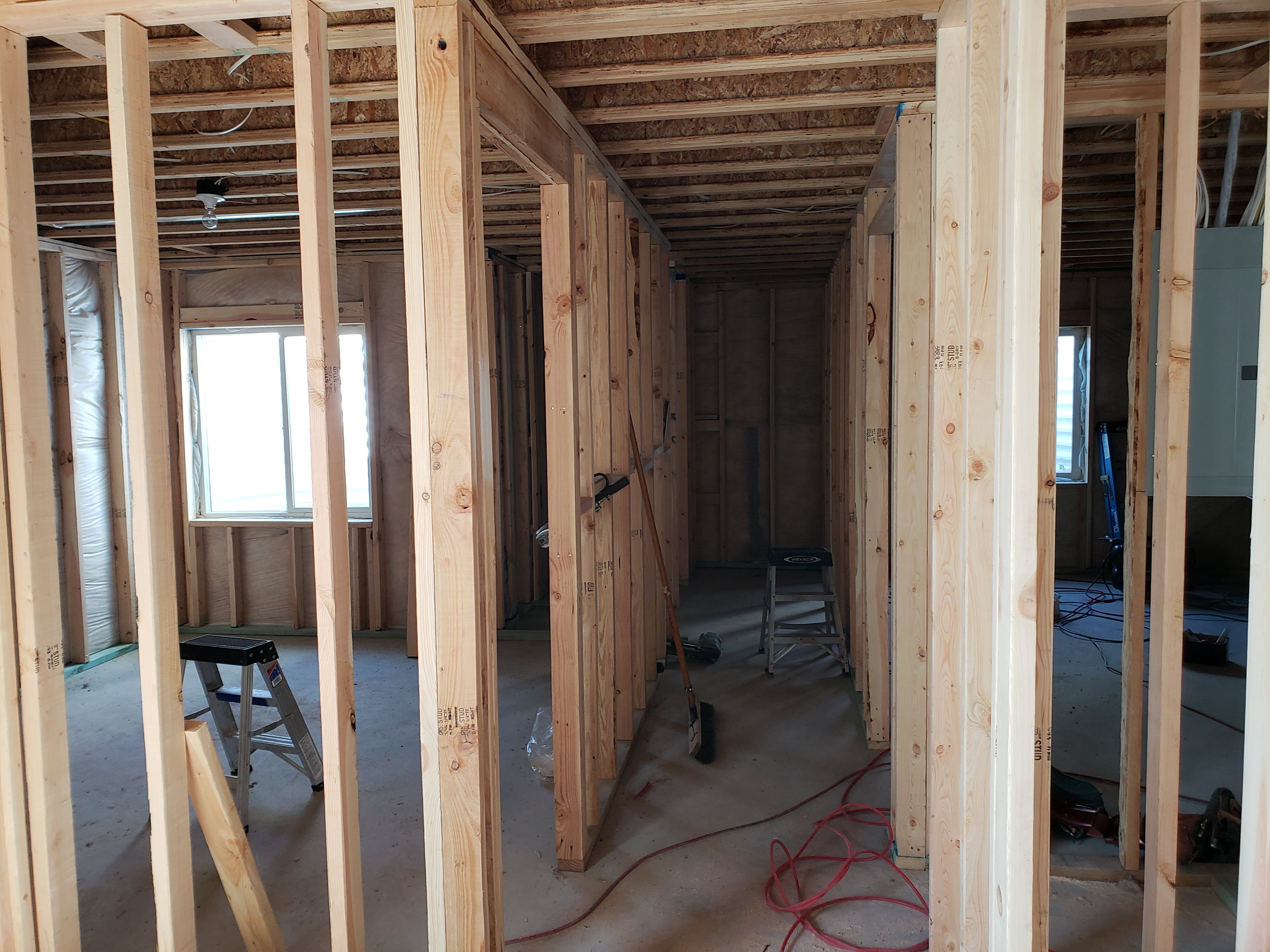
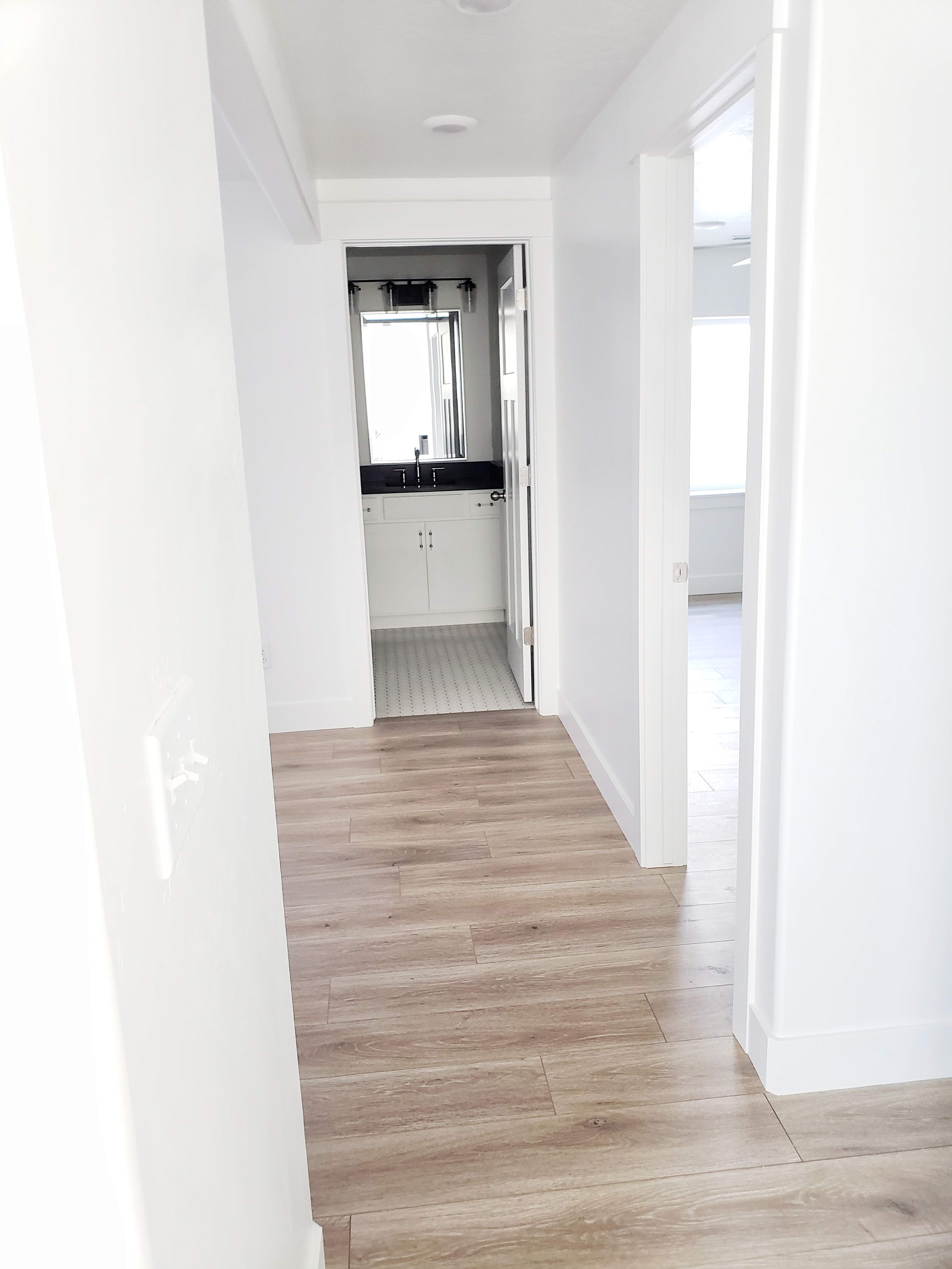
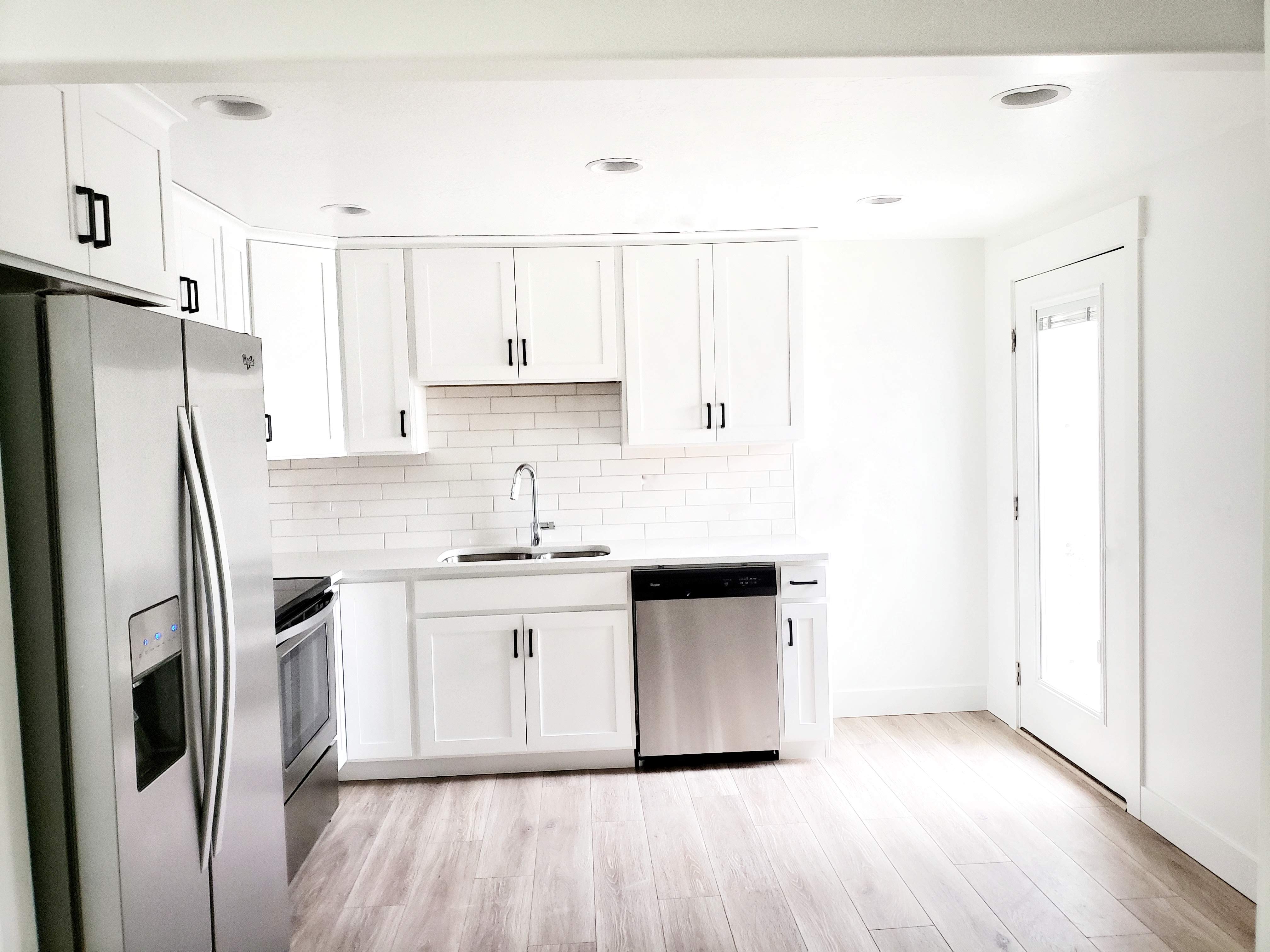
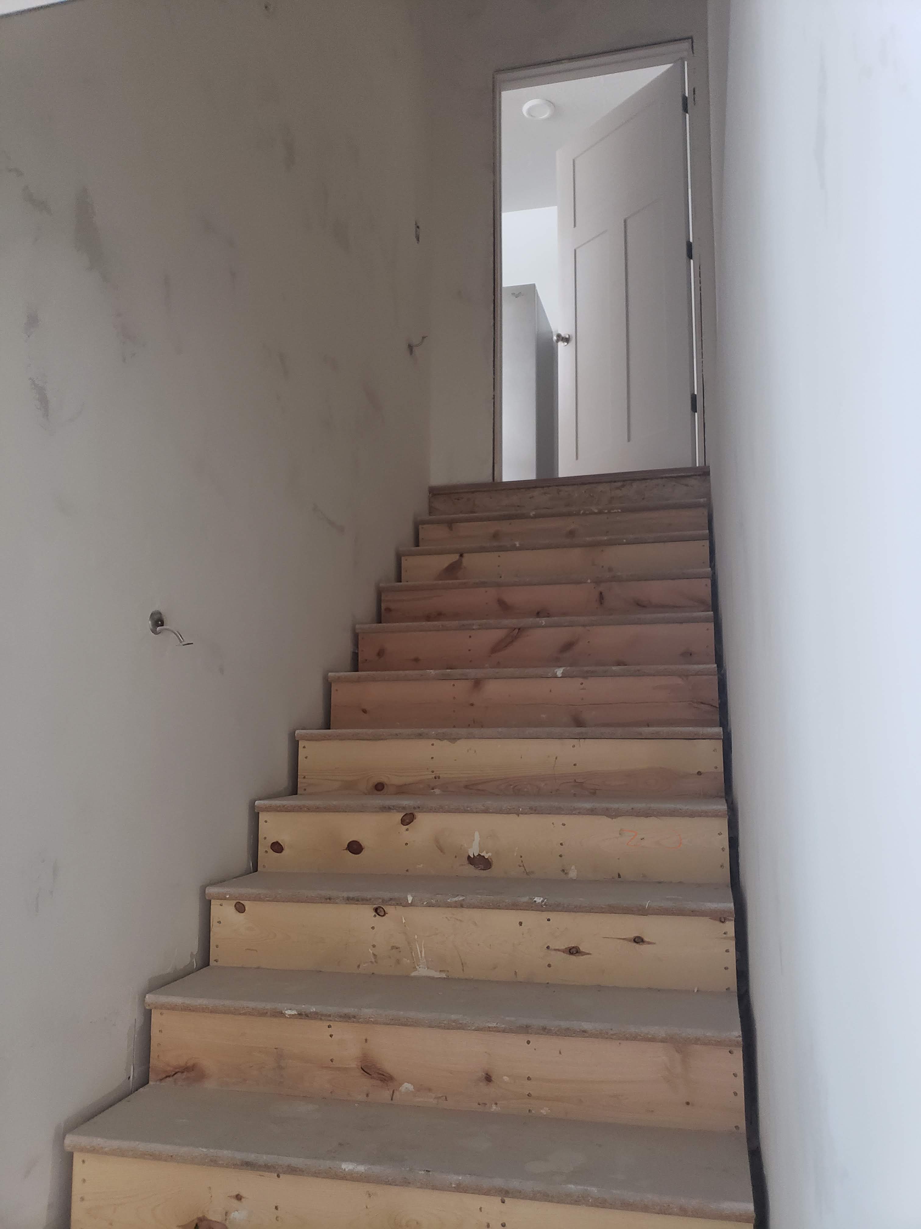
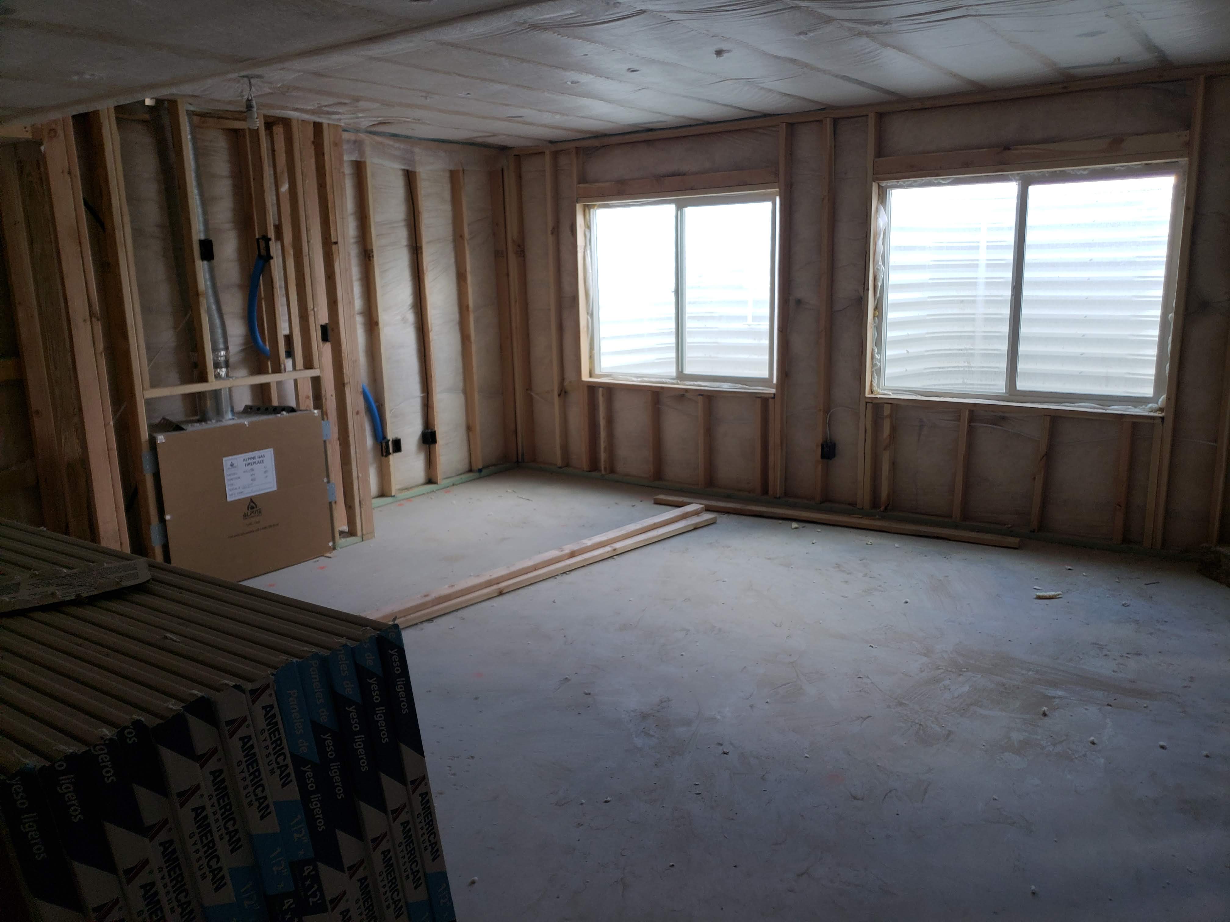
The first step in making this basement feel bright was to open up the kitchen. We put a header across the ceiling to open up the hallway. Next, we decided to go ahead and make this basement a walkout with an entry. This just makes access and usability more functional. We figured we were already down there doing construction so why not go ahead and add the door. You can see the framing from before where the walkout was a window and the kitchen was a bedroom. The wall was completely closed off.
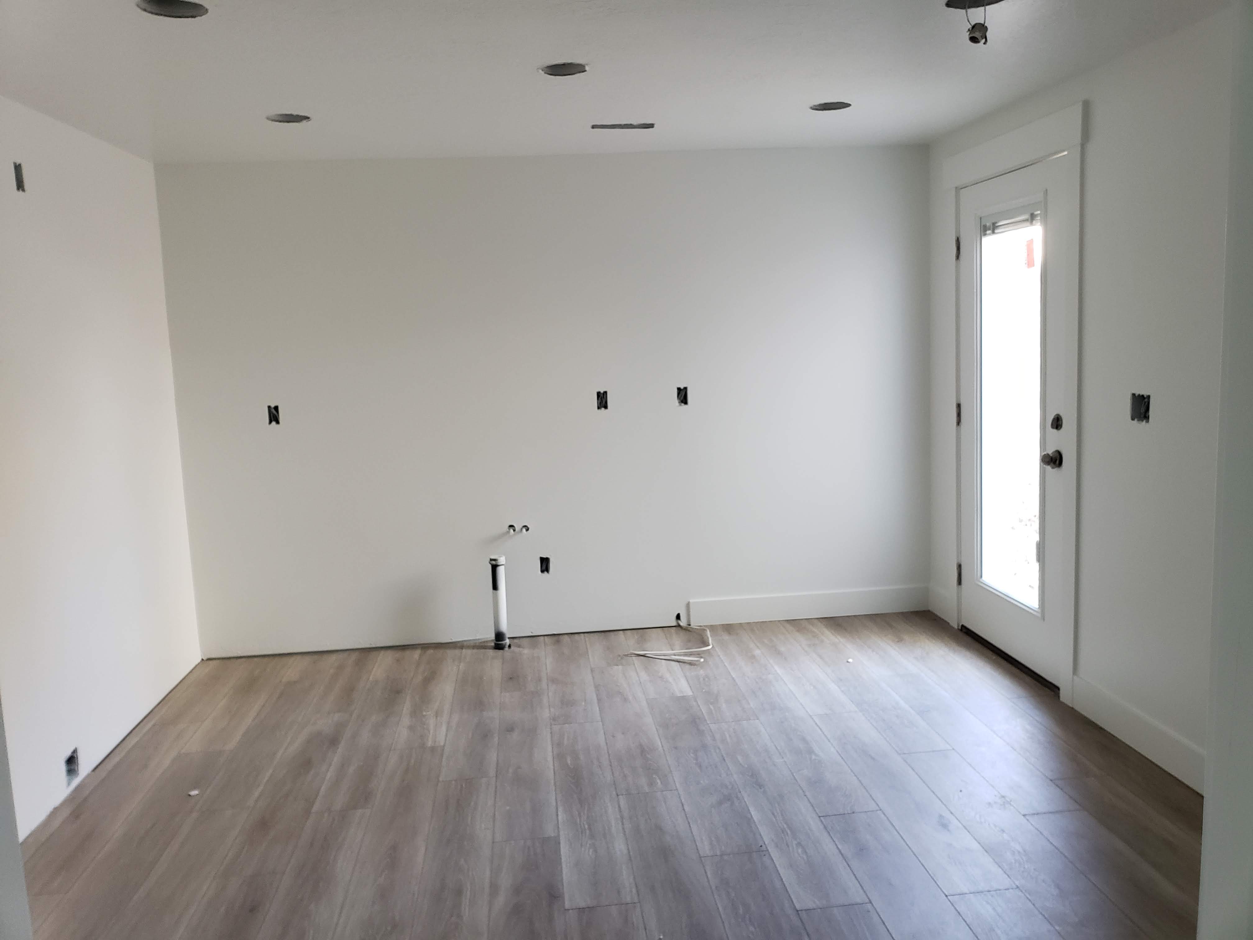
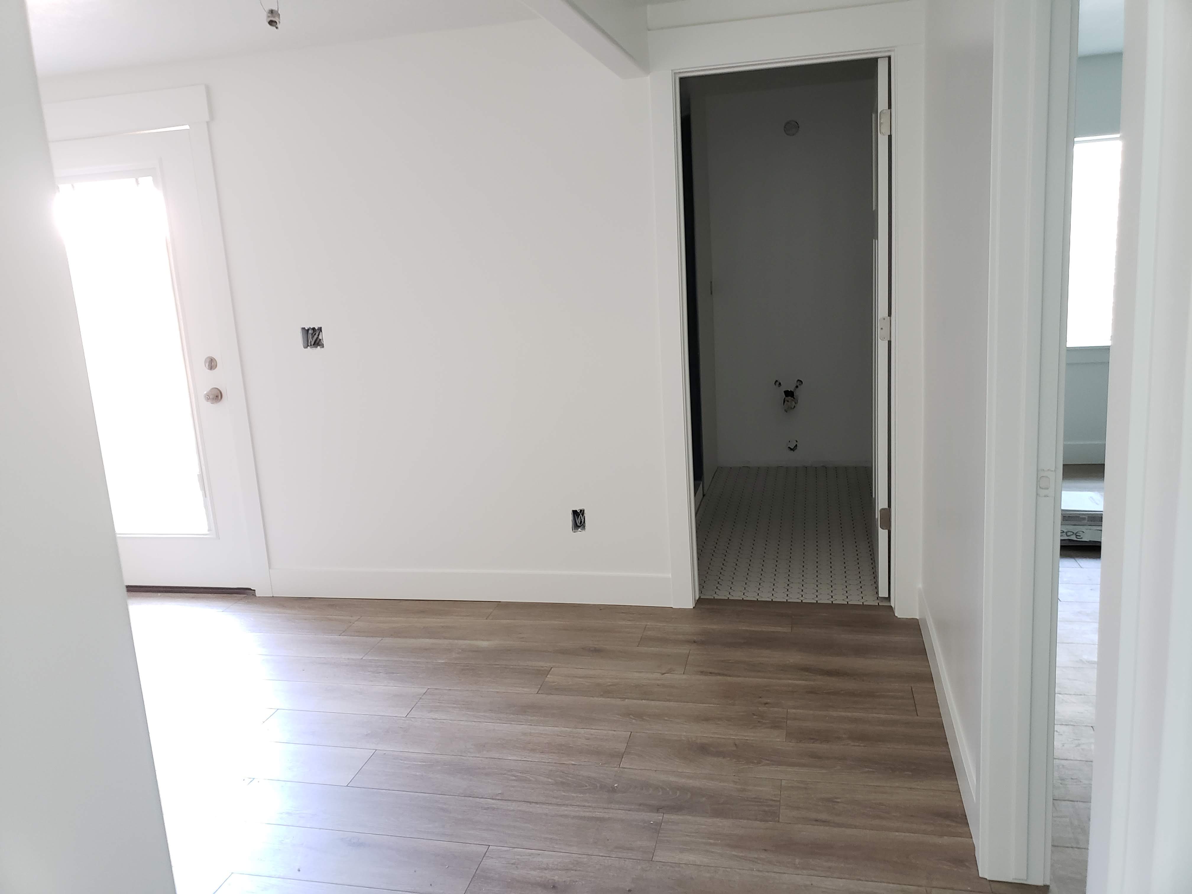
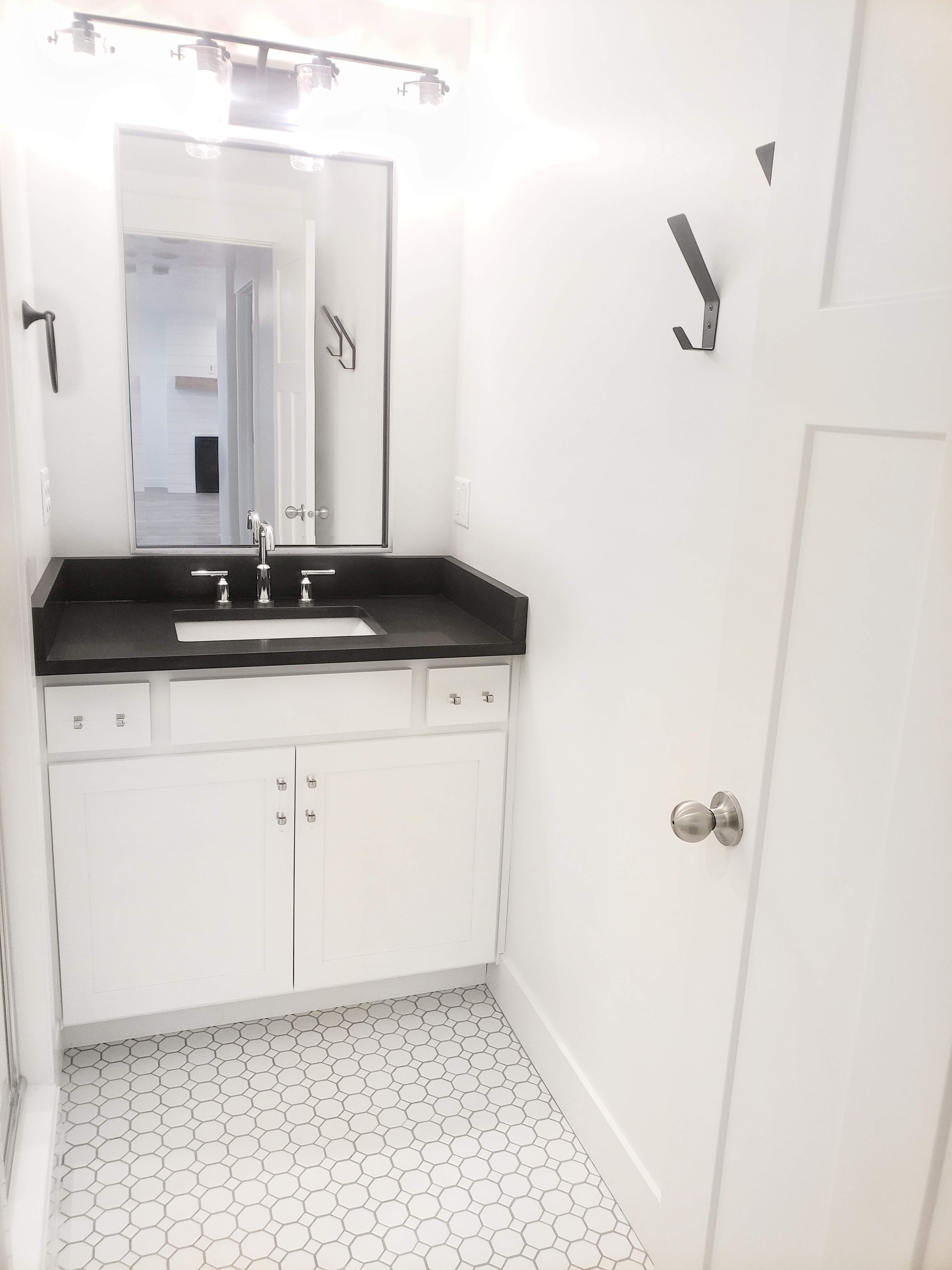
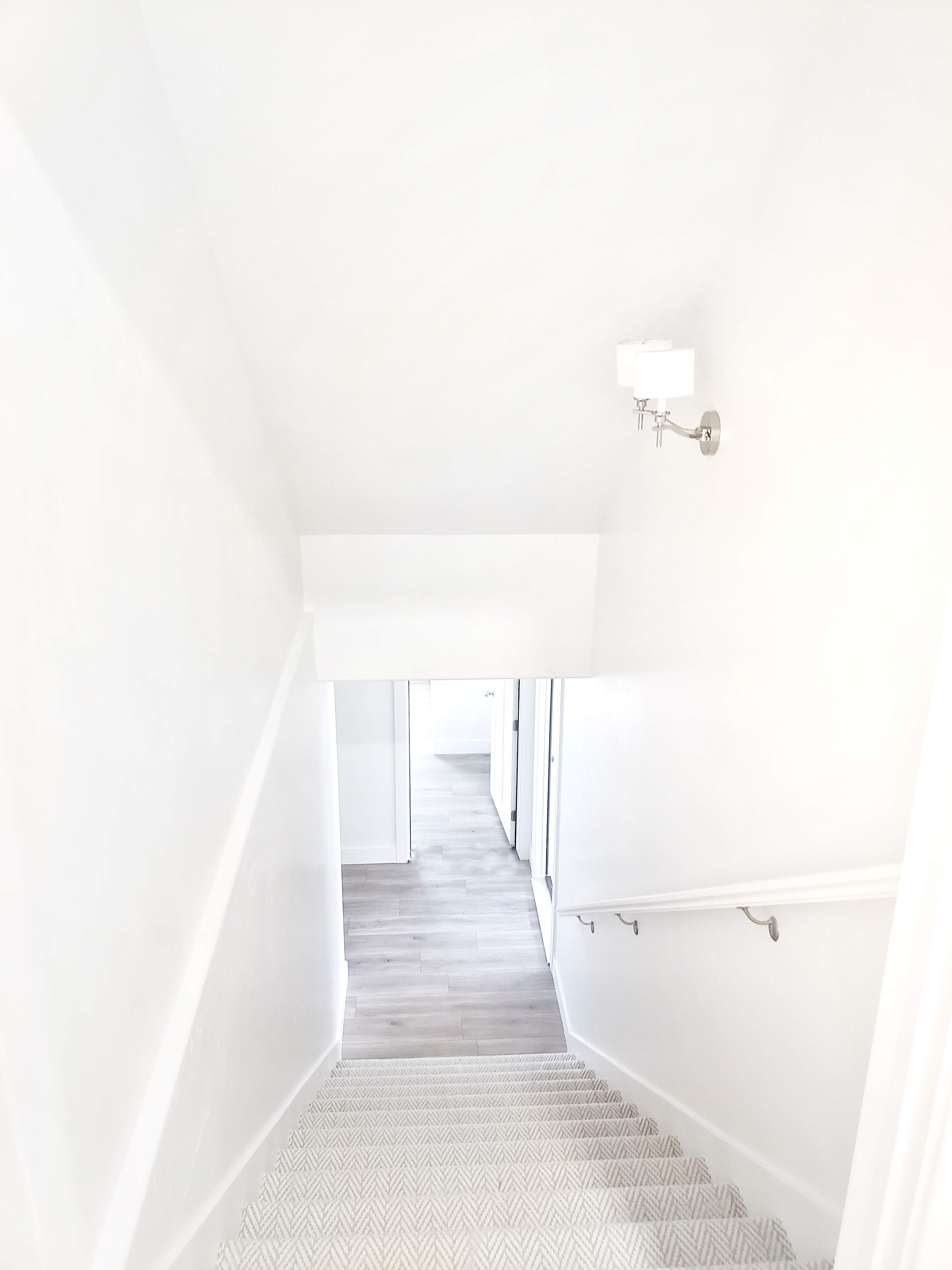
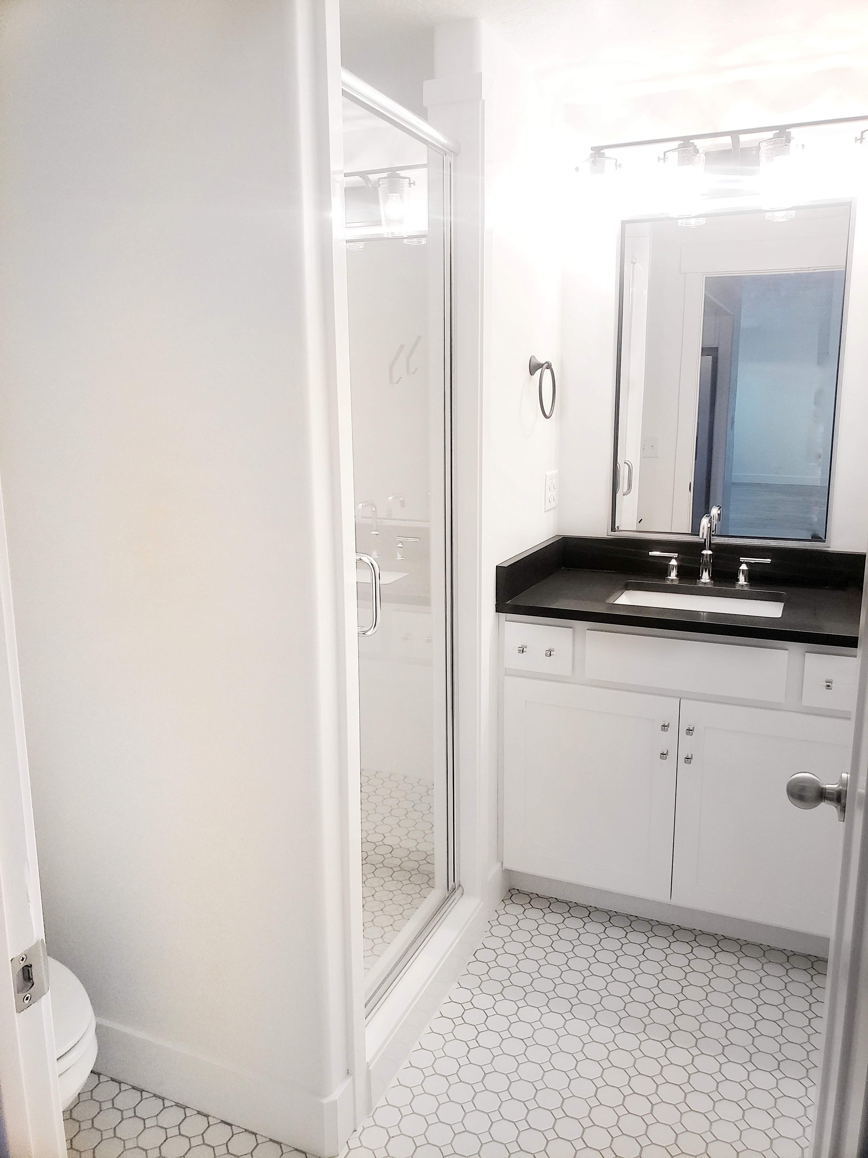
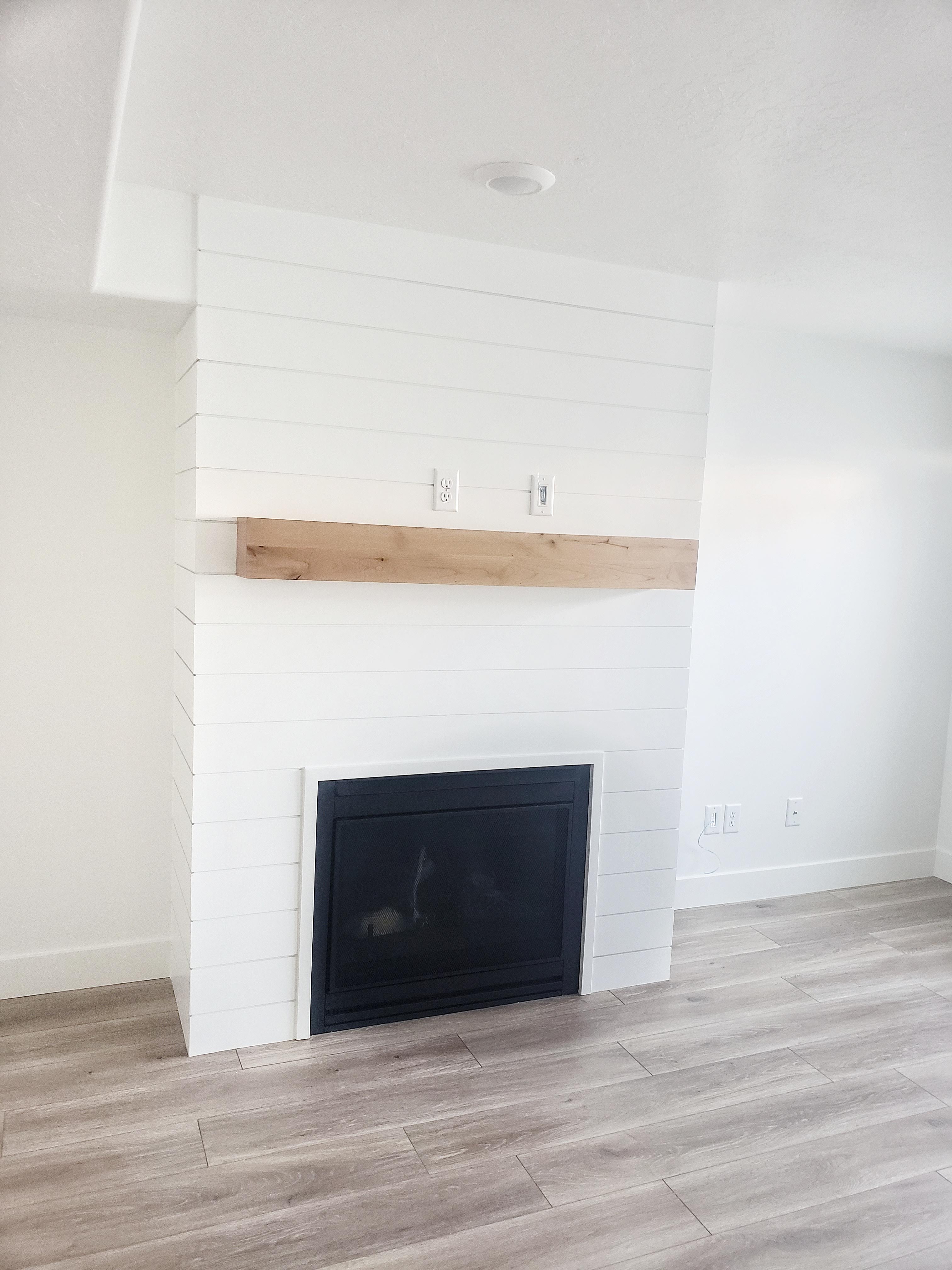
LVP flooring running through the entire space also helped in making everything flow and feel open. LVP is water resistant and very durable. I knew it would be perfect for this basement. The paint color Sherwin Willimas “Pure White” was my go-to for everything in here. The ceiling, doors, trim and walls all got this color. I stuck to a budget-friendly tile in the bathroom that you have seen many times before. The octagon and dot white tile is a classic staple around here.
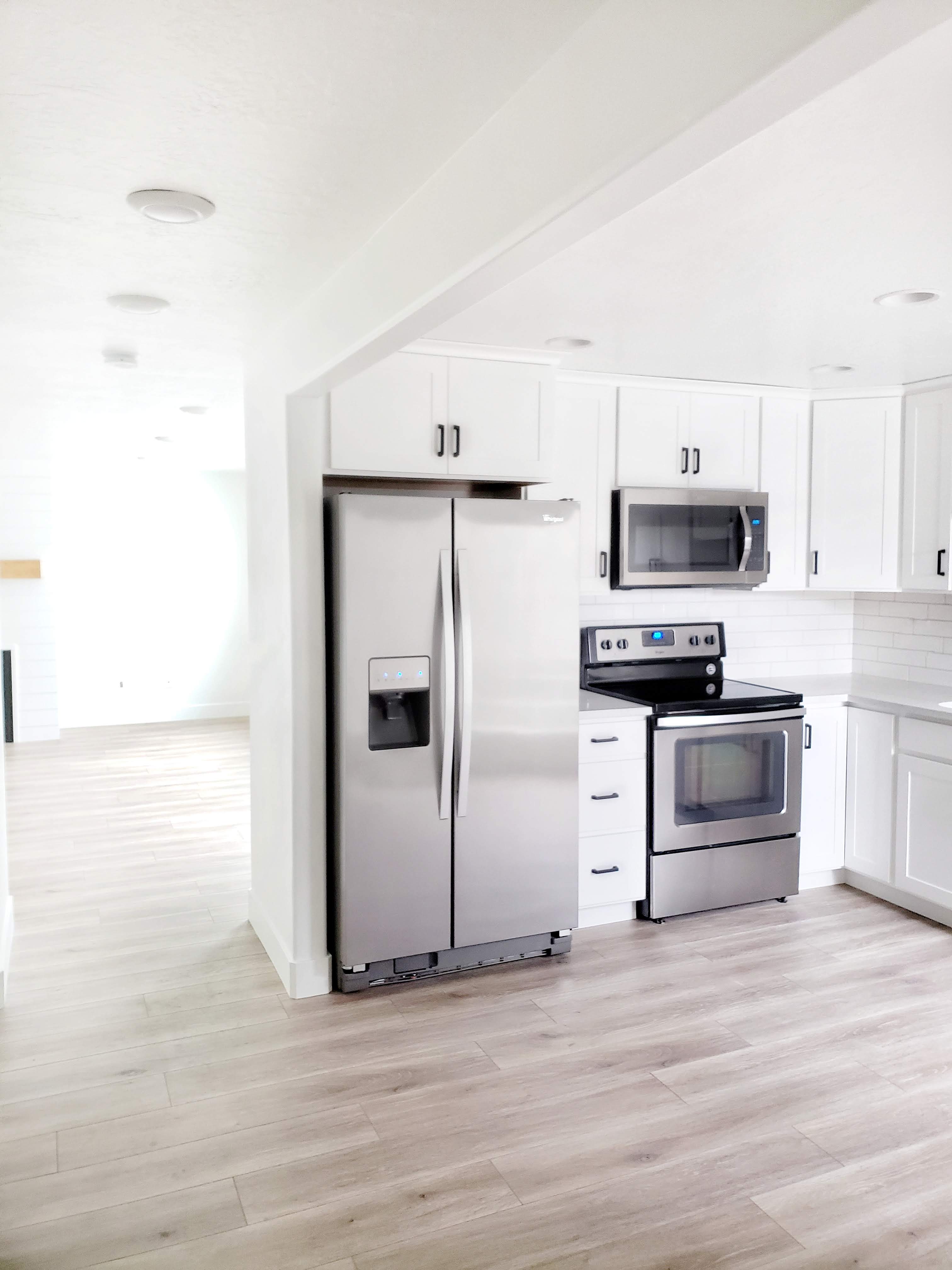
I was able to find a quartz remnant that matched our upstairs kitchen countertops. That was a major score! I also found a little remnant slab of black honed granite that is just perfect for the bathroom too. I decided to pop the black granite with this chrome faucet. Shockingly, I didn’t put any brass or gold in the basement. 🙂 I wanted to keep it light and fresh using chrome accents for finishes. I also used the chrome faucet that came out of kitchen remodel upstairs and moved it to this kitchen. It fits this aesthetic a lot better down here. You may also notice this light fixture from our upstairs bathroom update. That’s right, it used to be brass. I just knew it would look better in this bathroom. I gave this light fixture a quick coat of matte black spray paint to fit this bathroom design. Kind of hard to see the fixture in this bathroom because there isn’t a window. I love it even more in this bathroom though!
The wall sconce and carpet for the hallway were a no-brainer. As soon as I saw this carpet I just knew it was going to be in my house somewhere. The wall sconces have a chrome finish with creamy white shades that complement the carpet tones perfectly. I apparently bought the last one of this sconce on the whole internet. 😉 I literally can not find the light anywhere to link it for you. Sorry!
The bathroom and kitchen hardware was a tough decision. I even took votes on Instagram Stories. I ended up deciding to go with the black bar pulls in the kitchen and a fun acrylic and chrome bar pull in the bathroom.
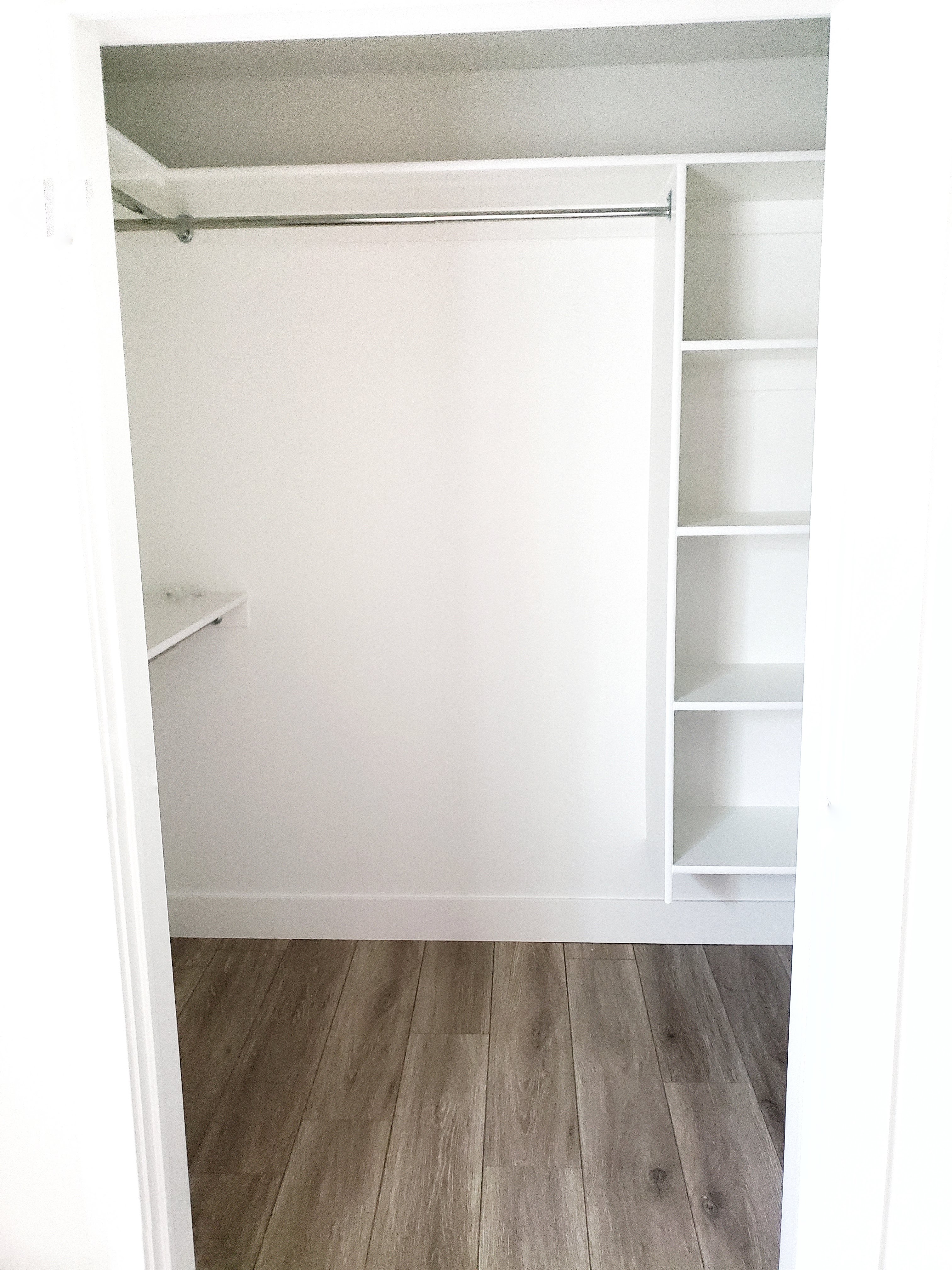
There are also two bedrooms and some major closet storage. You can never have enough storage. Give me all the organizing shelves and racks. 🙂
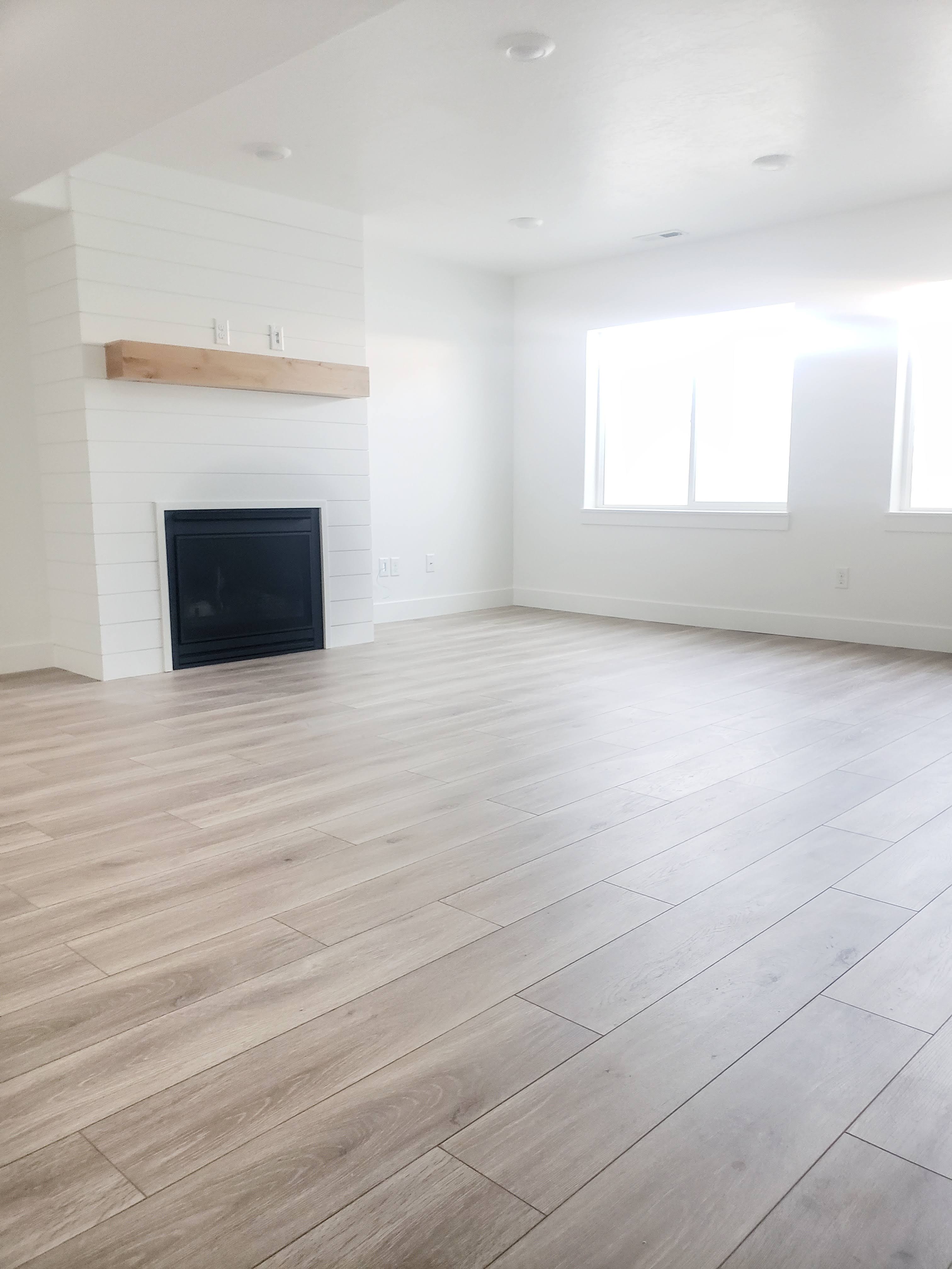
The fireplace is probably my favorite feature in the whole basement. I just love the shiplap with the natural wood mantel. It is the focal point of the living room. Simple while making a statement is just what I wanted.
That is about everything. We are so glad to have the extra space finished. Now to decorate and furnish!


Love the basement! Can you please share the flooring? This is the perfect color I’ve been looking for, thank you!,,
Kim
Thank you. The flooring is from Floor & Decor called AquaGaurd waterproof laminate.
Floor & Decor AquaGaurd waterproof laminate in what color?
I love the flooring as well!! I looked up AquaGuard and it brings up a few different colors. Could you share what the color name is??
Thank you!!
This laminate is beautiful. What is the color?
The Basement looks amazing! Can you please share the white wall color? It’s perfect.
Pure White by Sherwin Williams
Did we ever find the name of the color of the floor?