The following post contains affiliate links & is sponsored by Hudson Valley Lighting. Read my full disclosure here.
I am so excited to have some finished rooms here at our new house. I have been eagerly waiting to show you this dining room and front living room reveal. I could not be happier with how everything came together. I decided to go clean and simple for this little dining nook. I have always wanted a dining nook. Most of our previous homes have been an open concept with the dining room between the kitchen and living. Having the dining room to the side of the kitchen creates a better flow and works for our family. It is still open and bright. I really just like looking out from the kitchen to the living room with no dining room blocking the view.
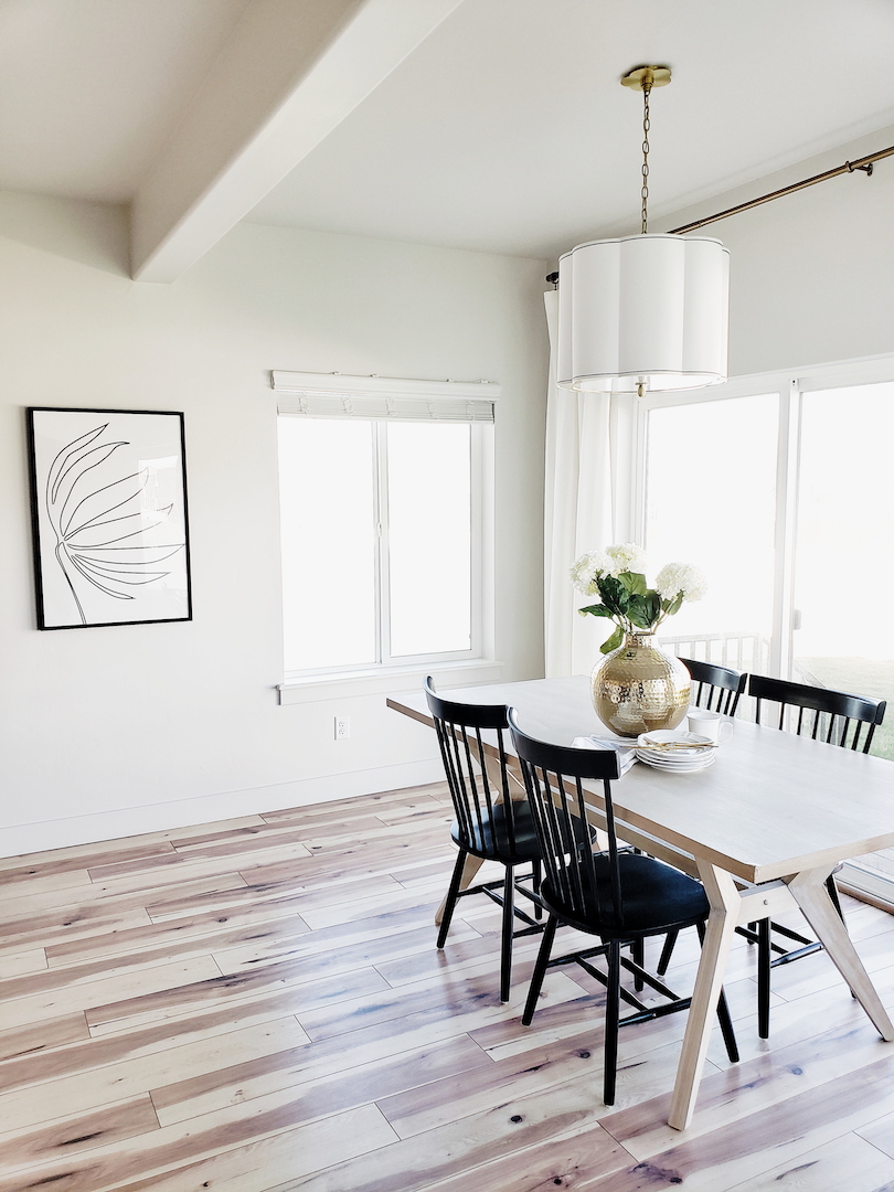
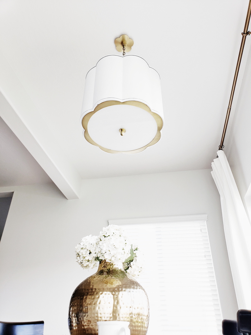
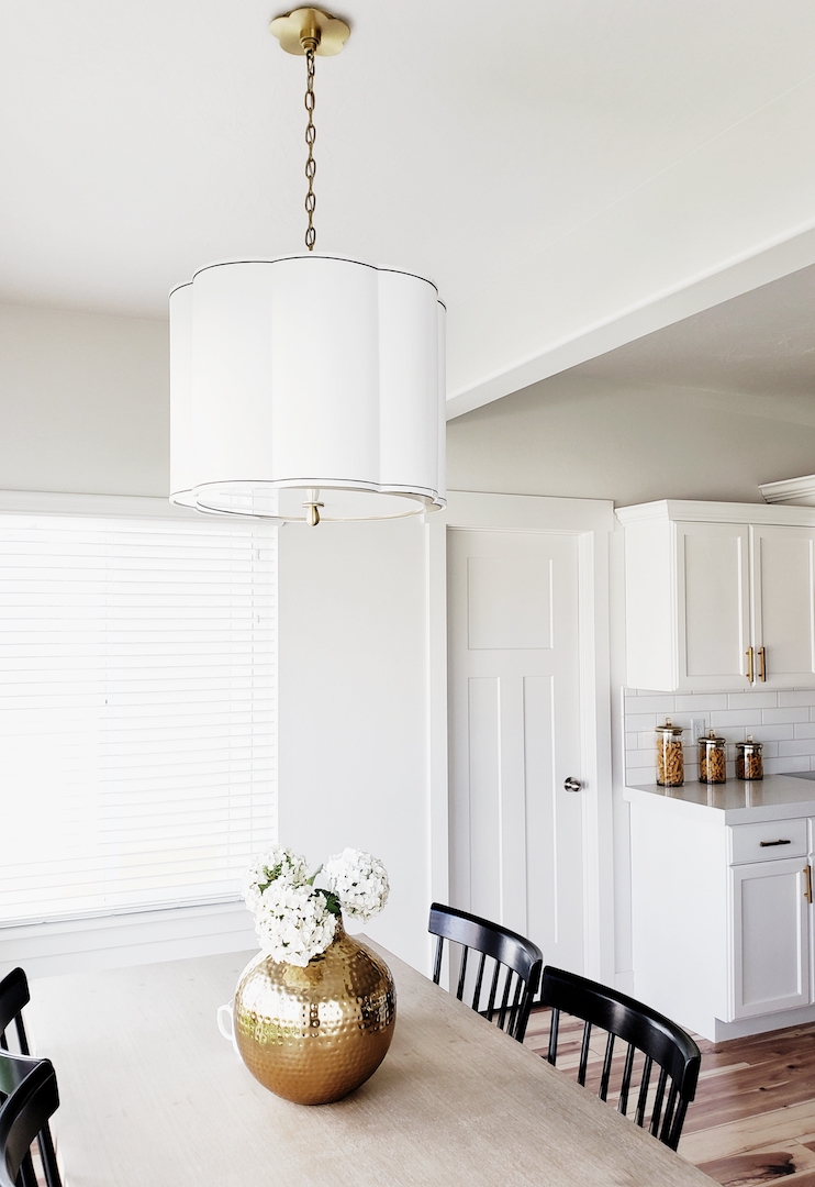
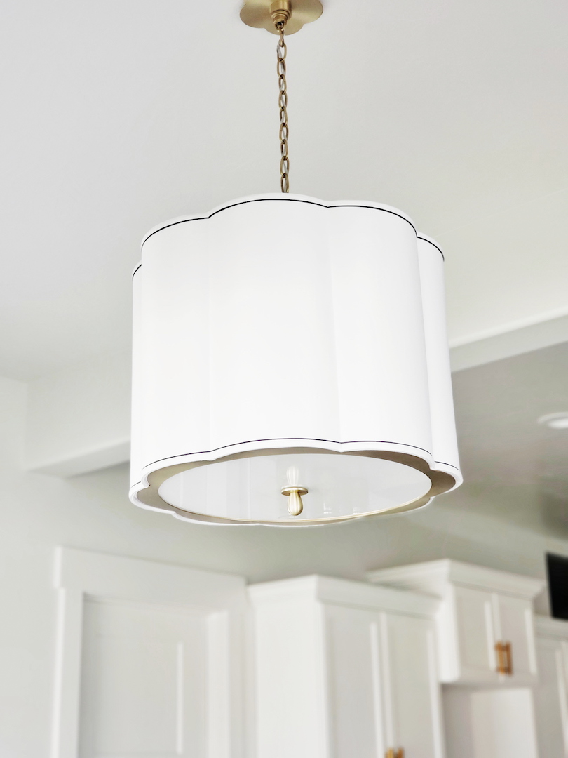
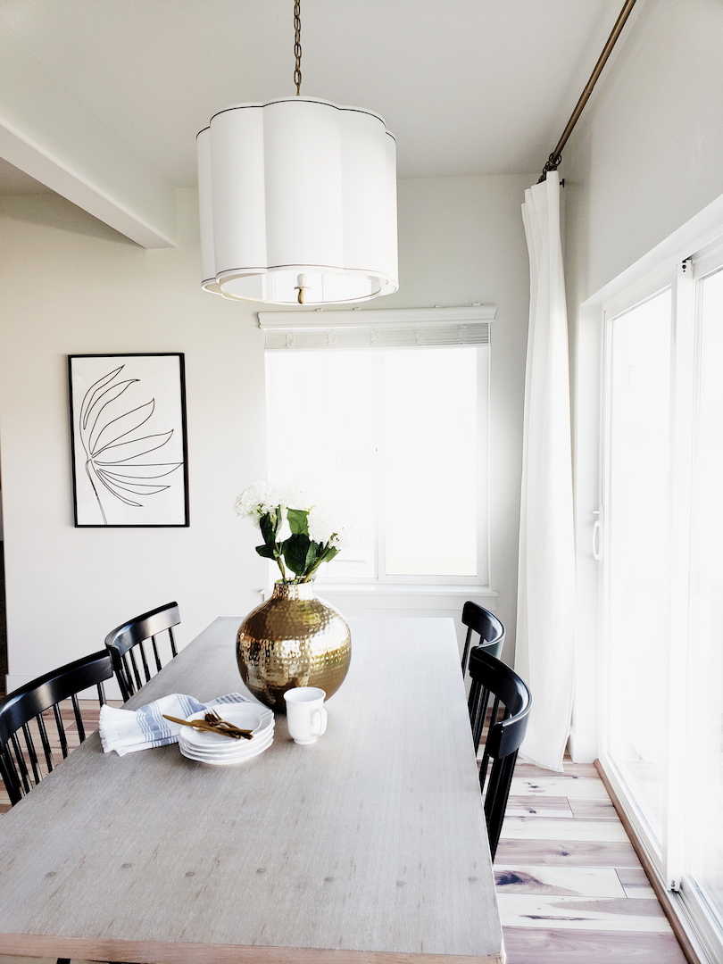
Ok, let’s talk about the gorgeous elephant in the room. I have said it a million times but lighting can make such a huge impact on a space. You can take a builder basic house and transform it into a curated home by just swapping out a few light fixtures. It really does make a statement and sets the tone for the rest of the room. I knew that Hudson Valley Lighting was my go-to for the dining room. I found several gorgeous contenders but then I stopped dead in my search. There it was, the perfect pendant. The Sweeny. Isn’t she a beauty? Look at those scalloped curves and perfect pinstripes. The aged brass chain and plate cover is the icing on the cake. I could go on all day about this pendant.
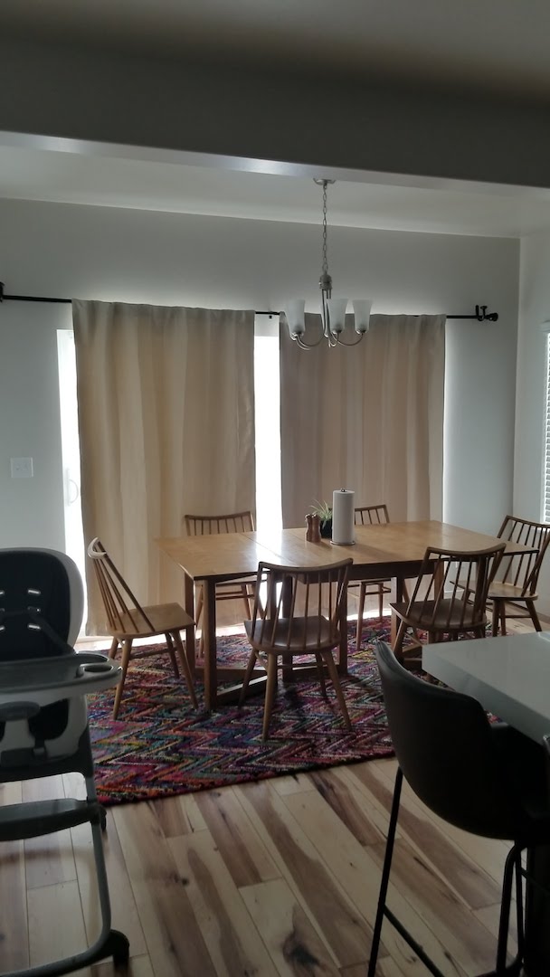
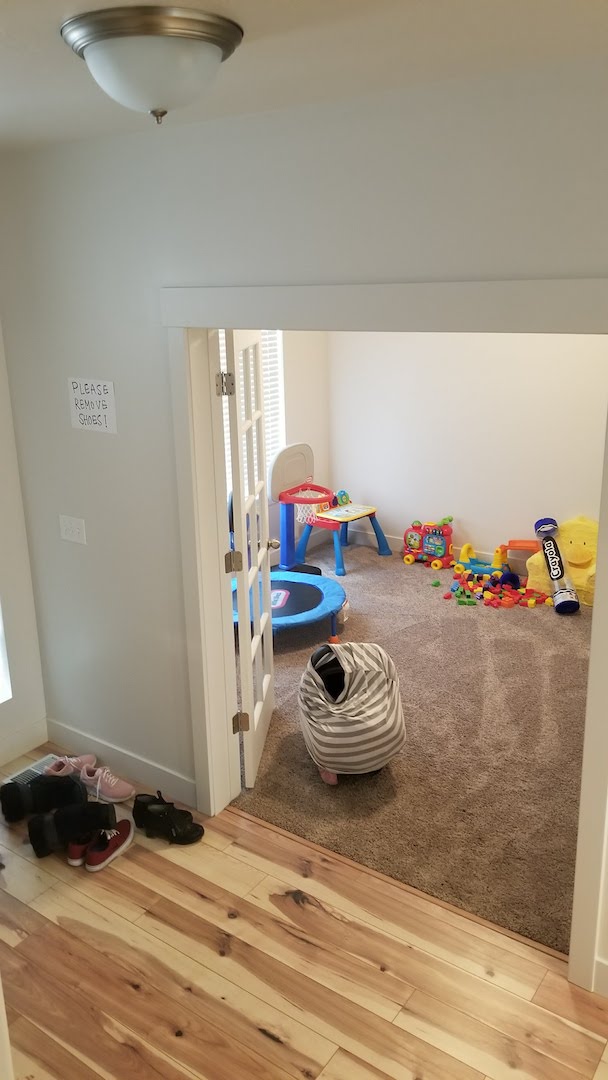
I’ll be honest. My husband was not sold on this light until it arrived and I got it installed. Once he saw it in our dining room he knew it was the one. I mean how could you not love this pendant? I went with the 20″ by 18″ pendant and it is the perfect size for our 72″ table. I almost went with the larger 25″ as well. I really think it would have been fine too. You really can’t go wrong with the Sweeny. You can see what a change this light made for the dining room by looking at the before picture below.
It is retro, modern, and timeless all at the same time. I love that this Sweeny Pendant can blend with so many styles to create the perfect ambiance.
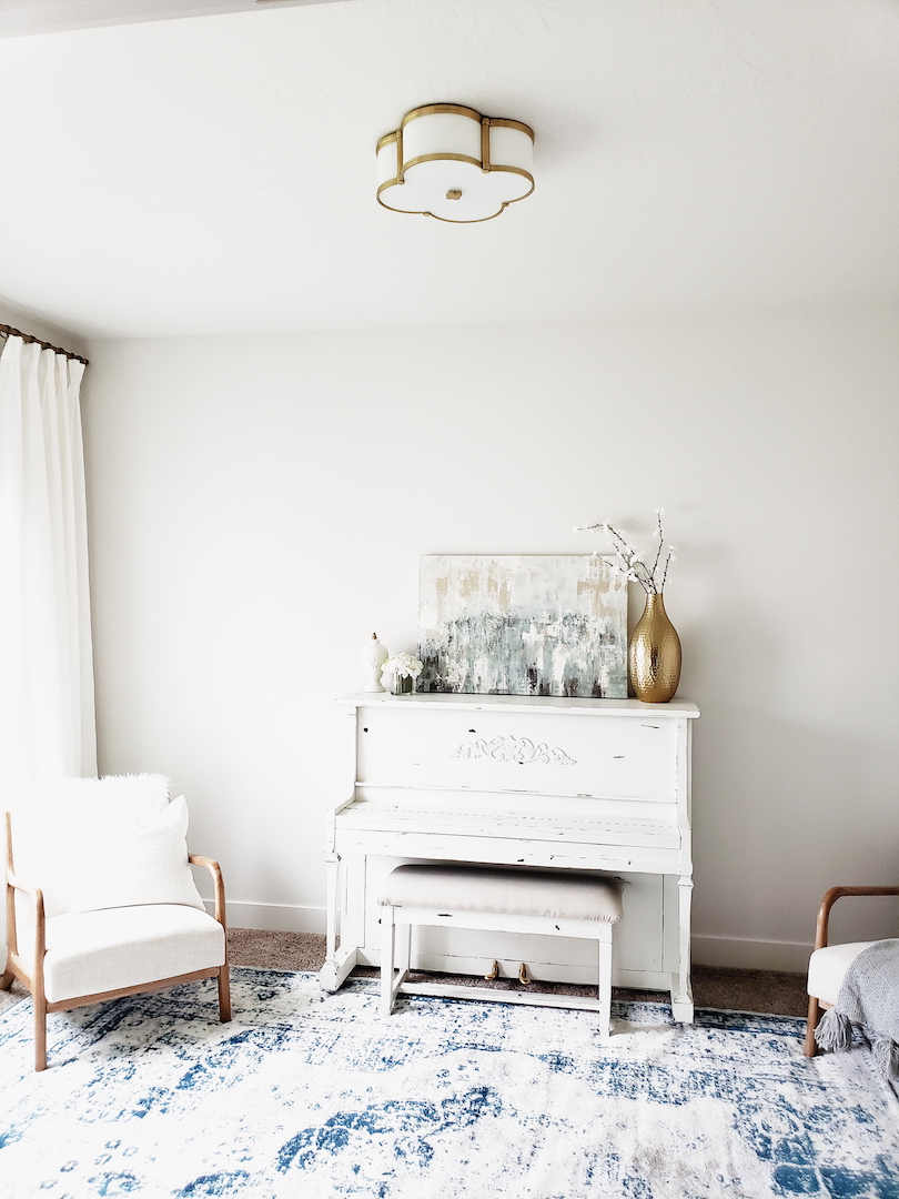
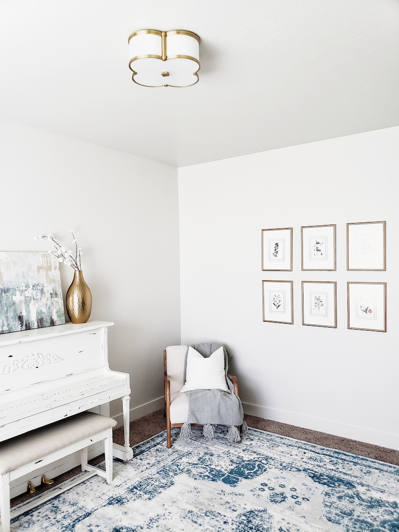
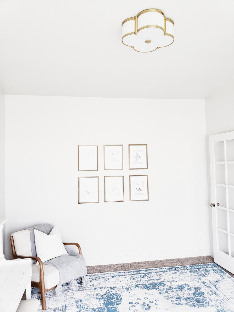
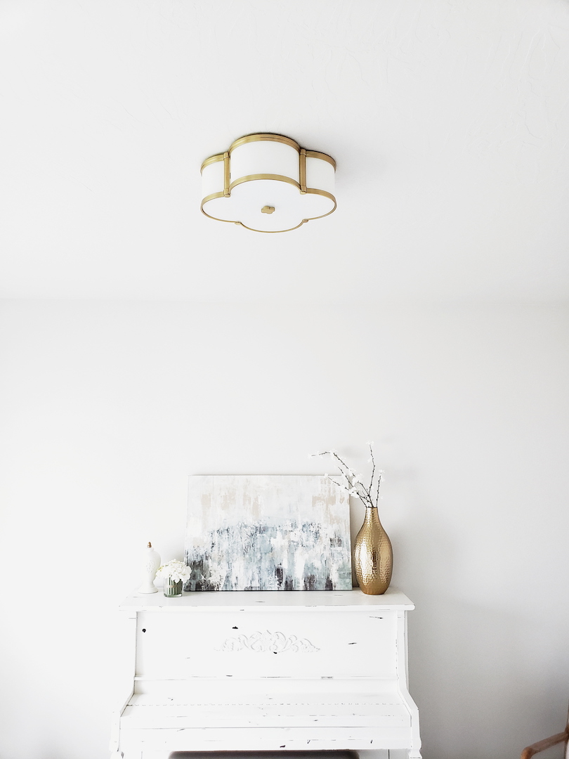
But wait there is more. 🙂 The front room had to get its own ceiling jewelry. This front living room is a lot smaller than in our previous home. However, it still fits the piano and a few chairs. It really works for our little family. Now, to fully appreciate the after you have to see the before. The previous owners used this room as a toy room. There were dome lights everywhere. A classic staple in tract homes. WHY!? They are the worst. Well, guess what? There is the cutest little flush mount that coordinates (in my opinion) with the Sweeny pendant.
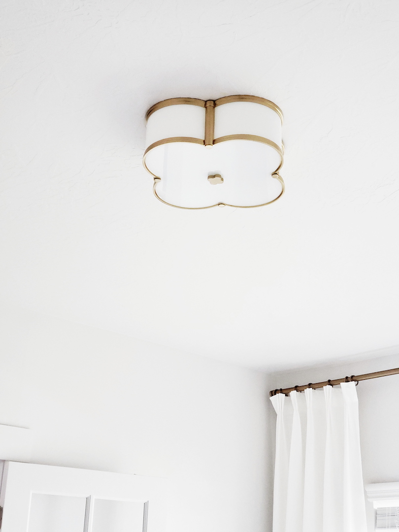
Meet Chandler. How cute is this little guy? The quatrefoil design with opal glass has me all heart eyes. Of course, it is aged brass because that is my new fav color. It flows so well with the touch of soft blue I have in this room. The Chandler is a great stylish alternative to dome lights. It is still a flush mount but with all the wow factor that this room needed. See what I mean? Lighting does wonders for updating a room!
Both light fixtures have been such a great finish to these two rooms. When style meets quality it is a rare combination these days. Often times you can find really cute lighting that has poor craftsmanship and doesn’t last. I have to say Hudson Valley Lighting is definitely well made. A breath of fresh air in the design vertical. I still have a few more rooms to update and I have been obsessing over some of their other lines too. What are you waiting for? Go give your room a whole new look and swap out your basic or outdated lighting!


